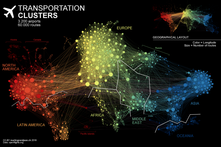
Flight pattern maps are fun to look at and reveal the complexity of air transportation on a daily basis. But, there are other angles to look at this data from. Martin Grandjean used a force-directed graph to focus less on geography and more on volume and connections. Color represents continent, circles represent airports, and circle size represents number of routes.
Major observations: India is more connected to the Middle East than to South and East Asia. The Russian cluster is very visible, connecting airports in Russia but also in many former Soviet republics. Latin america is clearly divided between a South cluster and a Central American cluster very connected with the U.S.
Be sure to catch the animation version.

 Visualize This: The FlowingData Guide to Design, Visualization, and Statistics (2nd Edition)