Martin O’Leary made a Twitter bot, Uncharted Atlas, that posts automatically generated fantasy…
-
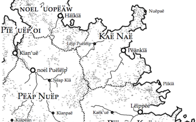
Generate your own fantasy map
-
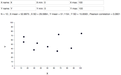
DrawMyData lets you plot points manually and then download the data
When you have graphs to draw or statistical concepts to teach, you need…
-
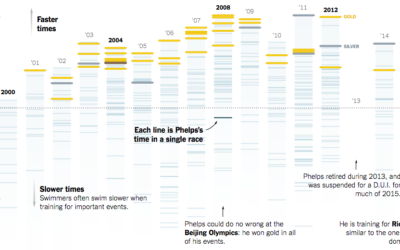
Michael Phelps race times since his first Olympics
That Michael Phelps. He is a crazy man, in the best possible way.…
-
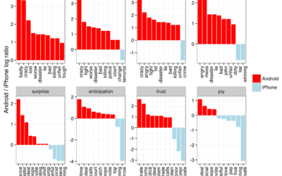
Trump tweets from Android are angrier than from iPhone
Sometimes I check Donald Trump’s Twitter feed, as many find themselves doing and…
-
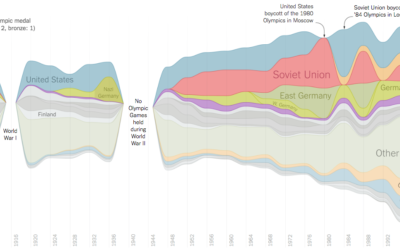
Streamgraph of Olympic medal wins
Gregor Aisch and Larry Buchanan for the New York Times visualized Olympic medal…
-

Household Types, Then and Now
Here’s how common each household type is and was — and how the makeup compares to a few decades ago.
-
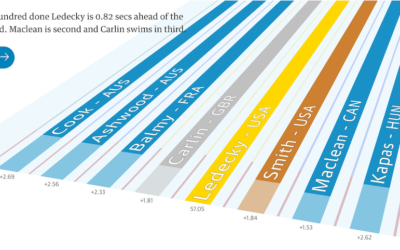
Katie Ledecky domination charted
One of the best parts of the Olympics is watching an athlete from…
-
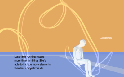
What makes the Olympic athletes great
Rather than a focus on the events and their details, the New York…
-

Games to test your skillz against Olympians, from your computer
The last couple of Olympics, news graphics desks went with gloriously detailed explainers…
-

Building a generator for stuff
There comes a time in every data scientist’s life when an idea for…
-
Practical tips for scraping data
It’s an unpleasant feeling when you have an idea for a project and…
-
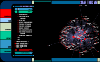
Star Trek character network
Star Trek fans rejoice. Mollie Pettit from Datascope Analytics visualized the interactions between…
-
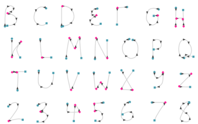
An interactive look at handwriting recognition from 1960s
In the 1960s, the RAND corporation developed a handwriting recognition system using, well,…
-
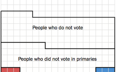
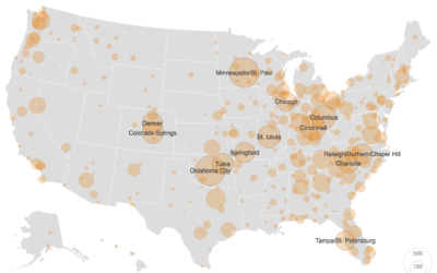
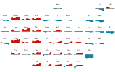
Small percentage of Americans actually picked Clinton and Trump
Alicia Parlapiano and Adam Pearce for the New York Times elegantly show a…
-
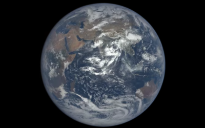
One-year time-lapse of Earth
Time-lapse from space by NASA:
On July 20, 2015, NASA released to the… -
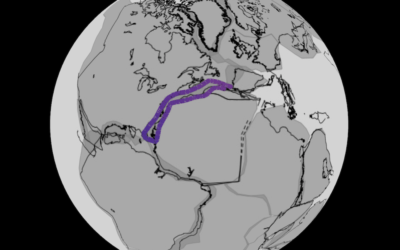
Continental drift, from 240 million years ago to present
Researchers modeled continental drift, going back 240 million years ago, on the scale…
-

What That Election Probability Means
You’re going to see probability values mentioned a lot these next few months. Many people will misinterpret. But not you.
-

Camera really adds tens pounds
Photographic evidence.
-
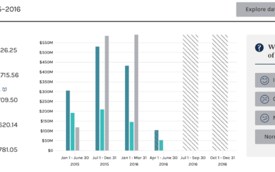
Searchable campaign finance data from the FEC
Every four years, campaign finance data from the Federal Election Commission peeks its…
-
Grid map shows shifting states
You’re likely familiar with the state grid map form used these days. Instead…
Recently for Members
Second Edition
 Visualize This: The FlowingData Guide to Design, Visualization, and Statistics (2nd Edition)
 Visualize This: The FlowingData Guide to Design, Visualization, and Statistics (2nd Edition)
New tools, refined process.
Browse by Chart Type See All →


