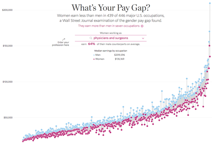
As we all know these days, there exists a gender pay gap across most major professions in the United States. The Wall Street Journal charts the average differences for 446 occupations.
Occupations are charted from least to greatest gap horizontally, and the vertical axis represents salaries. Blue dots represent men’s average salaries and the pink represents women’s, and a vertical line connects the two. So the longer the vertical, the bigger the gap.
There’s an interesting use of the fish eye effect as you mouse over so that you can see the individual lines. There’s also a search box to find an occupation of interest. I just wish the two were closer linked with a zoom on search, instead of only a highlight.
 Visualize This: The FlowingData Guide to Design, Visualization, and Statistics (2nd Edition)