Using faded lines to show the overall changes in a time series and to provide a point of reference for the present.
d3js
-
Members Only
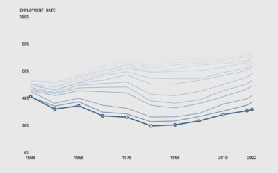
Make the Chart: Interactive Line Chart with Ghost Trails
-
Members Only

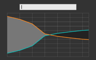
How to Use a Slider to Let Readers Customize Charts
A simple user-controlled slider can help readers look at a dataset from their own point of view.
-
Members Only
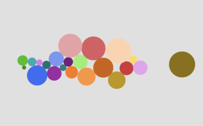
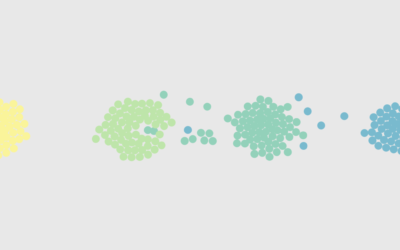
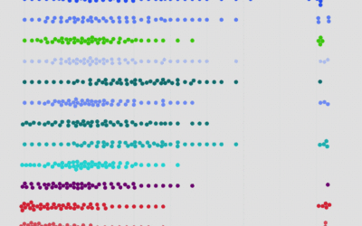
How to Make an Animated Beeswarm Chart
Beeswarm charts are useful to highlight individual categories or entities. Animating them can help highlight change over time.
-
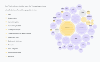
Tour of the D3 ecosystem
D3.js, a flexible JavaScript library useful for visualization, can feel intimidating at first.…
-
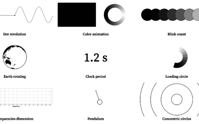
Visualizing periodicity with animations
Pierre Ripoll provides several ways to visualize periodicity using animation. Moving dots, rotating…
-
Members Only
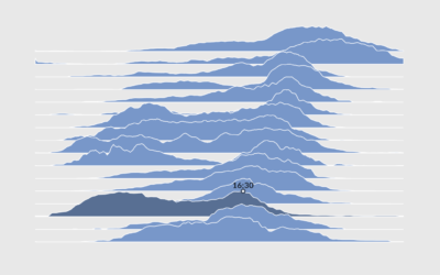
How to Make Interactive Frequency Trails with D3.js
Layering time series data or distributions with this method can change the feel and aesthetic versus a multi-line chart or small multiples. In some cases, frequency trails let you show more in less space.
-
Bird’s-eye view of D3.js
D3.js can do a lot of things, which provides valuable flexibility to construct…
-

Getting Started with D3.js
Learn how to build a custom visualization using D3.js and get acquainted with the popular JavaScript library.
-
Members Only
How to Make a Moving Bubble Chart, Based on a Dataset
Ooo, bubbles… It’s not the most visually efficient method, but it’s one of the more visually satisfying ones.
-
Members Only

Avoiding D3, Using D3, and Why I Use D3
D3.js can be used for a lot of things, and for some people it’s too much to deal with.
-
Members Only

How to Make an Interactive Map of Geographic Paths
With latitude and longitude coordinates, there are a number of ways to map geographic data using D3.js and Leaflet.
-
Members Only
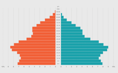
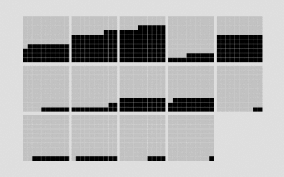
How to Make an Animated Pyramid Chart with D3.js
Compare distributions side-by-side with a pyramid chart. Observe the change over the years by animating it.
-
Members Only
How I Made That: Animated Square Pie Chart
Also known as waffle charts. Using animated transitions between values, you can allow for comparisons between categories.
-
Link
Automatic label placement along path →
Noah Veltman refined his label placement method, particularly useful for area graphs.
-
Members Only
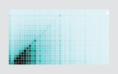
How I Made That: Interactive Heatmap
Add interaction so that you can show different segments of the data and allow comparisons.
-

Visualization song release
Ukranian band Obiymy Doschu released a new song Razom. “It’s a uplifting and…
-
Members Only
How I Made That: Interactive Beeswarm Chart to Compare Distributions
The histogram is my favorite chart type, but it’s unintuitive for many. So I’ve been using the less accurate but less abstract beeswarm.
-
Members Only
How I Made That: Searchable Time Series Chart
When there are too many options or categories, it can be helpful to make the data searchable.
-
Link
d3-annotation 2.0 →
Next iteration of library for annotation. Made me delve into d3.js v4.
-
The Hitchhiker’s Guide to d3.js
Ian Johnson provides some good direction for those looking to get their feet…
Recently for Members
Second Edition
 Visualize This: The FlowingData Guide to Design, Visualization, and Statistics (2nd Edition)
 Visualize This: The FlowingData Guide to Design, Visualization, and Statistics (2nd Edition)
New tools, refined process.
Browse by Chart Type See All →


