A symbol is used for each unit to place emphasis on individuals or objects.
In a cross between unit charts and variable width bar charts, we can show total counts and relative proportions at the same time.
Show individual data points by splitting bars into smaller cells.
Make the unit chart less abstract with icons that represent the data, or use this in place of a bar chart.
Add visual weight by using individual items to show counts.
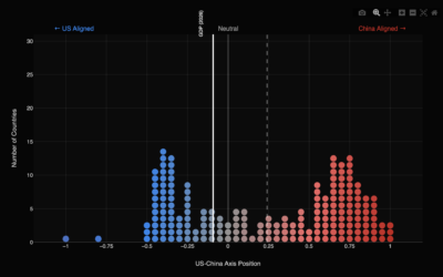
Focaldata calculated United Nations voting patterns by country, relative to the United States…
The administration continues to add expenses for the country and insist tariff revenues…
Wildfires and hurricanes continue to grow more common, so insurance companies have more…
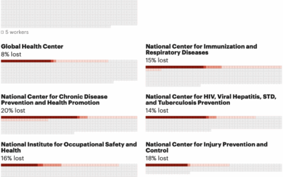
The U.S. federal government does not release official numbers for the cuts to…
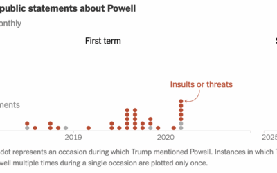
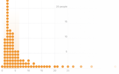
For the New York Times, Christine Zhang counted Trump’s comments about Jerome Powell,…
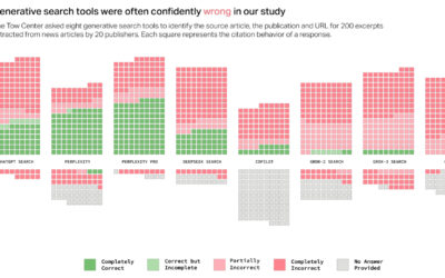
When you enter a query in traditional search engines, you get a list…
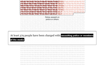
1,580 people were charged with federal crimes for the riot at the U.S.…
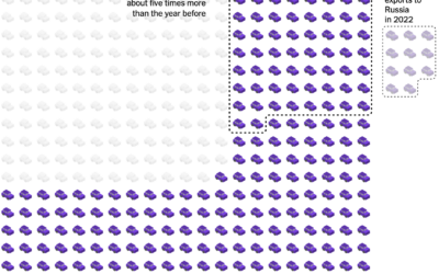
China exported next to zero vehicles in 2010, but from 2020 to 2024,…
For the Apple Women’s Health Study, which uses cycle tracking data from iPhones…
Most of Apple’s suppliers and manufacturing happen outside the United States and in…
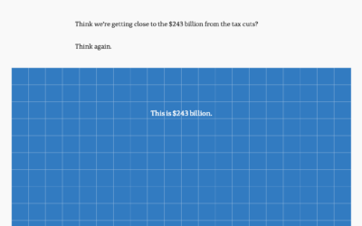
To show the scale of tax cuts and Australia’s budget, ABC News takes…
Most people have a job and receive wages in return, but that starts to change when you get into the higher income groups.
Here’s a fun interactive from The Washington Post to earmark the world reaching…
From the listener perspective, we pay our monthly or annual fees and just…
Sergio Peçanha and Yan Wu, for The Washington Post, used a combination unit…
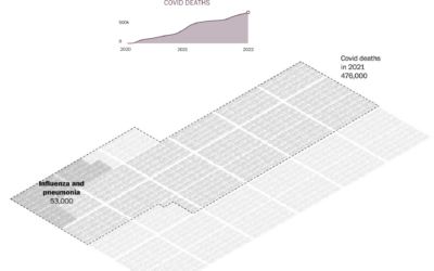
To broadly show how people have lived in the U.S. during these past…