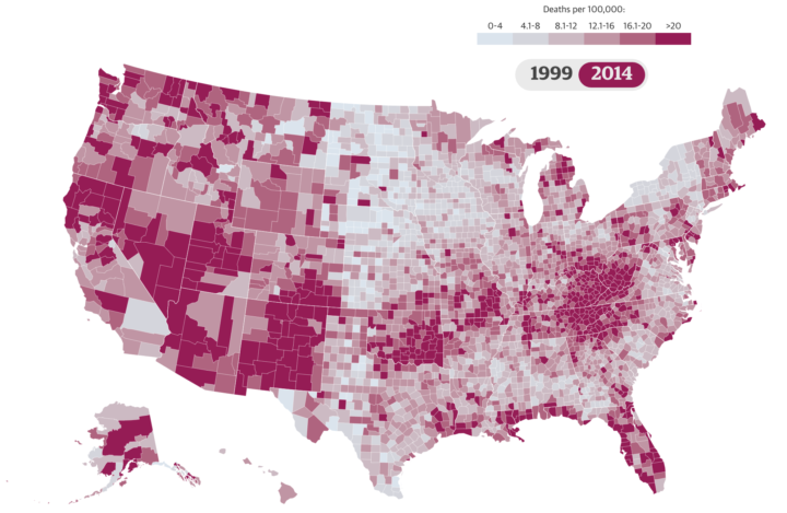
Nadja Popovich for the Guardian delves into America’s drug overdose epidemic, starting with an animated map that shows changes from 1999 to 2014.
On initial look, the map looks like your standard county map, but there’s a small wrinkle in the design that makes the geographic spread over time much easier to see. The switch in the top right corner, to toggle between 1999 and 2014, looks like any other. But instead of just a quick flip between 1999 and 2014, the map shifts with annual data, so you can see a smooth transition instead of an abrupt contrast.
Other options, like small multiples or a scroll bar might have worked as an overview, but this route brings focus and eliminates much of the guesswork.
 Visualize This: The FlowingData Guide to Design, Visualization, and Statistics (2nd Edition)