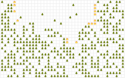
American immigration history is chock full of policies and restrictions, and you can…
-
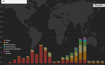
Immigration history
-
Members Only
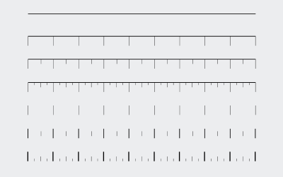
How to Customize Axes in R
For presentation purposes, it can be useful to adjust the style of your axes and reference lines for readability. It’s all about the details.
-
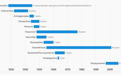
Antibiotic history and the winning bacteria
We take antibiotics. Bacteria dies, but some lives, evolves and develops a resistance…
-

Try to win the lottery
The Powerball Lottery is big news in the United States right now. The…
-
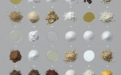
Visual breakdown of additives in food
In their book Ingredients, Dwight Eschliman and Steve Ettlinger explore additives in common…
-
Simulate the world as an emoji system of rules
We tend to think of life in terms of cause and effect. Do…
-
Link
Colors from images in R →
A how-to to break down images into just their colors.
-
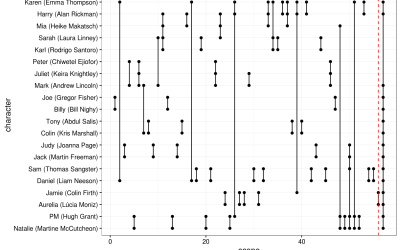
Analysis of Love Actually
Forget about Shakespeare. Let’s look at a real classic: Love Actually. Somehow I…
-
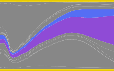
Causes of Death
There are many ways to die. Cancer. Infection. Mental. External. This is how different groups of people died over the past 10 years, visualized by age.
-
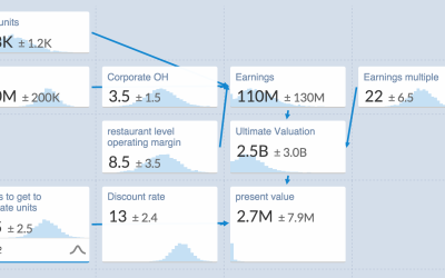
An uncertain spreadsheet for estimates
A lot of data you get are estimates with uncertainty attached. Plus or…
-
Link
geomnet →
An R package for “Network visualization in the ‘ggplot2’ framework” by the folks at Iowa State.
Recently for Members
Second Edition
 Visualize This: The FlowingData Guide to Design, Visualization, and Statistics (2nd Edition)
 Visualize This: The FlowingData Guide to Design, Visualization, and Statistics (2nd Edition)
New tools, refined process.
Browse by Chart Type See All →


