Nick Evershed, for The Guardian, describes Noisycharts, an experimental component for their in-house charting tool:
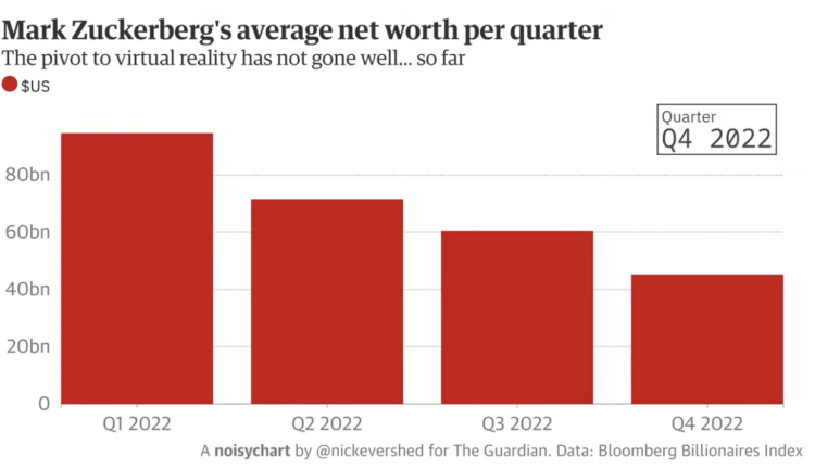
What does rising global carbon dioxide sound like? Or the crash of the pound? How about Sydney’s record-breaking rainfall, or the share value wiped out following Facebook’s pivot to virtual reality?
While all of these things have been frequently graphed, now we can turn them into audio as well.
Noisycharts is a new tool created by Guardian Australia to easily turn data into sound, with an animation to accompany it.
One of the examples uses a modulated dog bark to demonstrate how the sounds can match with the context. That seems like a fun path to explore.
Unfortunately, it’s not meant for public use (yet?). For that, you might want to check out TwoTone.

 Visualize This: The FlowingData Guide to Design, Visualization, and Statistics (2nd Edition)


