Visualization for Clarity
How to communicate data to people.
Why do we visualize data? There are many reasons, but we can split them into two main categories: analysis and presentation.
Analytical visualization is about exploration. In the 1970s, statistician John Tukey described exploratory data analysis, which is when you use charts to understand a dataset. You don’t know what the data has to say yet, so you quickly look at the data from various angles. You are both the maker and consumer of the charts.
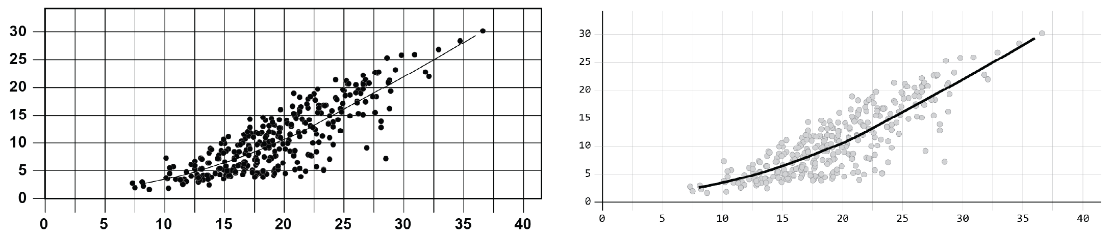
Presentative visualization is about communication. You know what the data has to say, and you use charts to help others understand a dataset. You are the maker and your audience is the consumer of the charts.
This course is about presentative visualization and how to shift your process. It’s about how to visualize data to communicate to people. It’s about how to communicate data beautifully and clearly.
You will learn to:
- Design for an audience
- Pick the right visualization
- Make readable graphics
- Bring it all together
This course is not about how to use a specific tool, so you can learn with the software that you want and focus on design.
Who this Course is for
This course is for people who have made a chart or two but want to communicate data in a way that is more readable, less confusing, and more fun to look at.
You learn about the design process, which starts with the data, works through asking and answering questions, and finishes with a data graphic that provides readers with clarity.
With a greater emphasis on process, the course is tool-agnostic. Use the software (or paper and pencil) that you want. Use Excel. Use Tableau. Use Python. Use R. Use Illustrator.
Course Format
This course has a reading component and a practice component.
- You get practical advice and visualization examples in each lesson, so you see how to apply principles to the data. Quizzes at the end of each section test your knowledge.
- Exercises help you apply principles and to practice chart-making.
- When you complete the lessons, there is an optional final project.
Suggested duration: 1 week. This mostly depends on how much time you want to spend on practice exercises.
Your Guide
I’m Nathan Yau. I have a PhD in statistics from UCLA, with a focus on visualization for presenting data to everyone. My visualization work leans towards analytical but has also reached millions of people. Find more about me here.
Membership
Become a member on FlowingData to get full access to this course and others, plus hundreds of tutorials and guides. Learn to make any chart, the process of data design, and how to communicate with data.