Life Satisfaction and Age

People were asked to score their life satisfaction from 0 to 10, where 10 is the best possible life and 0 is the worst possible life. This is the average score by age. It might be time to rethink life.
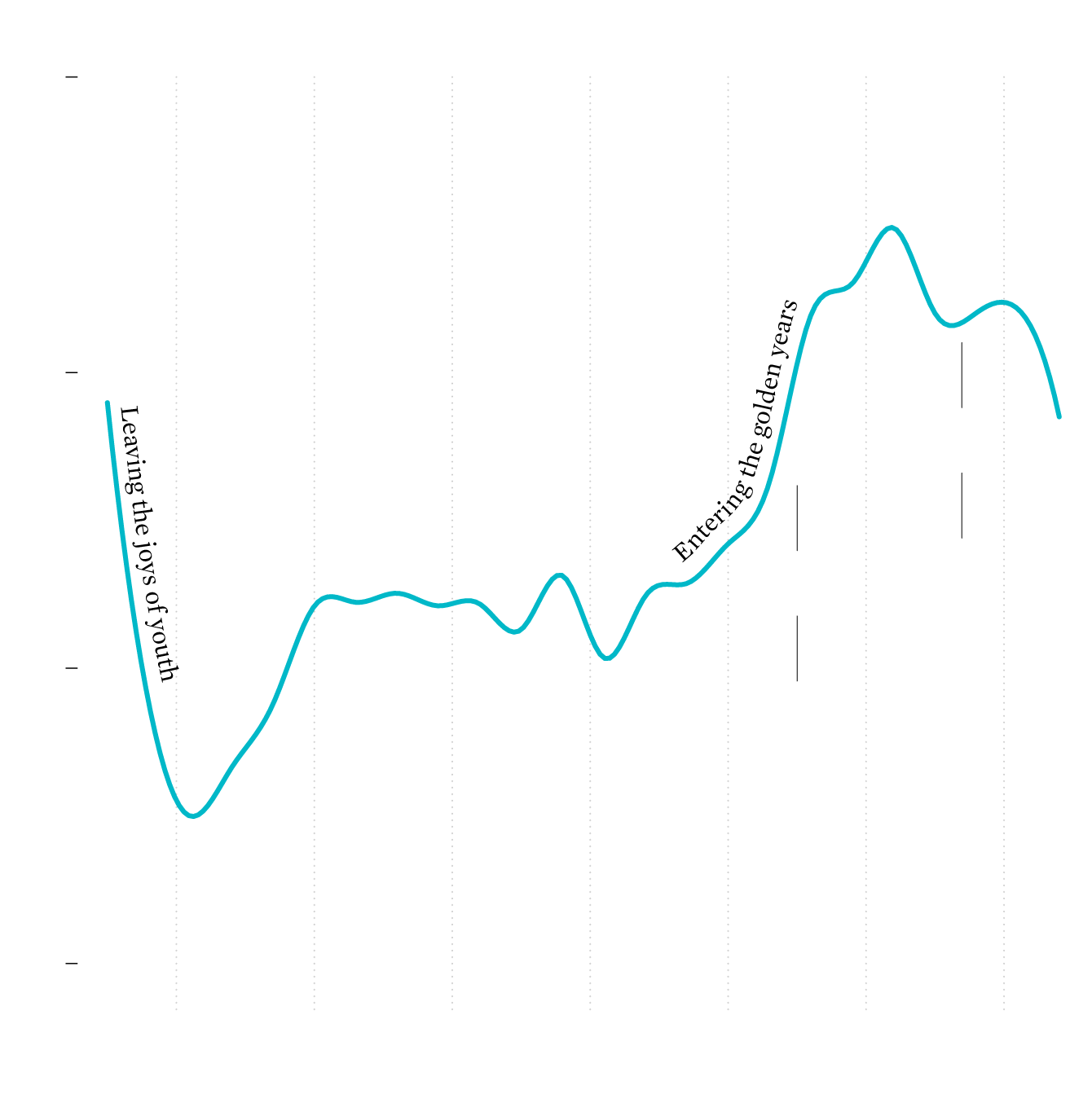
AVERAGE SCORE

8.0

Peak of

satisfaction

7.5

LIFE

EXPECTANCY

Trough of work and responsibilties

RETIREMENT

AGE

7.0

Pit of uncertainty and the unknown

6.5

20

30

40

50

60

70

80

YEARS OLD

SOURCE: AMERICAN TIME USE SURVEY, BY: FLOWINGDATA

AVERAGE SCORE

8.0

Peak of

satisfaction

7.5

LIFE

EXPECTANCY

Trough of work and responsibilties

RETIREMENT

AGE

7.0

Pit of uncertainty and the unknown

6.5

20

30

40

50

60

70

80

YEARS OLD

SOURCE: AMERICAN TIME USE SURVEY, BY: FLOWINGDATA

This is based on data from the well-being module of the American Time Use Survey. I was expecting to see a trend line similar to the above, but I didn’t think it’d be so clear.

See also: our feelings at work.

Notes

I downloaded the ATUS data for 2012, 2013, and 2021 via IPUMS. The smoothed age line uses three-year bins.

Become a member. Support an independent site. Make great charts.

See What You Get

Learn to Visualize Data See All →

Small Maps and Grids

Maybe you want to make spatial comparisons over time or across categories. Organized small maps might do the trick.

How to Make a Grid Map with Histograms in R, with ggplot

Layout multiple charts in a single view. Then adjust the scales appropriately for maximum comparability and a unified graphic.

How to Make Marimekko Charts in Excel

Marimekko charts, or mosaic plots, allow you to compare categories over two quantitative variables.

Mapping With Shapefiles in R – Getting Started

Geographic data is often available as a shapefile, and there’s plenty of heavy software to get that data in a map. R is an open source option, and as a bonus, much of the work can be done in a few lines of code.

Favorites

The Most Unisex Names in US History

Moving on from the most trendy names in US history, …

A Day in the Life: Work and Home

I simulated a day for employed Americans to see when and where they work.

The Best Data Visualization Projects of 2014

It’s always tough to pick my favorite visualization projects. Nevertheless, I gave it a go.

10 Best Data Visualization Projects of 2015

These are my picks for the best of 2015. As usual, they could easily appear in a different order on a different day, and there are projects not on the list that were also excellent.