Visualization in R
Learn the fundamentals of visualizing data in R. Then make any chart you want.
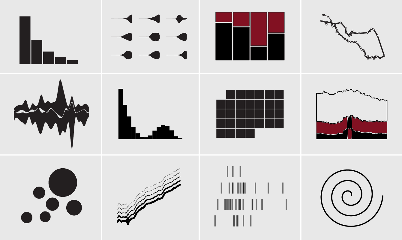
This self-guided course walks you through the fundamentals of visualizing data in R. Familiarize yourself with the language, quickly make plots, and customize and build your own. Practice with exercises and quizzes.
Who This Course Is For
This course is geared towards beginners with little to no experience visualizing data in R. However, those with R experience might find the exercises and additional resources helpful to improve knowledge depth.
Learning Objectives
The goal of this course is to setup visualization foundations in R so that when you finish, you can apply what you learn to your own data.
- Start at the beginning with setup.
- Learn R essentials.
- Make your first charts.
- Learn how to customize and refine for publication-ready graphics.
You will see a mix of tools, mirroring my own process for visualizing data. While some like to stick to specific packages in R, I adjust for what works for a particular project, which provides flexibility and quicker results.
Course Outline
There are five main lessons, each wrapping up with practice exercises, additional resources, and a quiz.
- Introduction to R
- Variables, Data Types, and Data Structures
- Referencing Data
- Functions
- Saving Work
- Debugging Code and Finding Help
- Chart Basics
- A Plot Function
- Plot Real Data
- More Chart Functions
- Extend with Visualization Packages
- Data Exploration
- Load Different Types of Data Files
- Get a Quick Look
- Ask Questions
- Try Different Encodings
- Munge
- Beyond Defaults
- Adjust Aesthetics with Graphical Parameters
- Display Multiple Charts at Once
- Make Custom Charts
- Finished Charts
- Improve Readability
- Bar Chart Alternatives
- Export Work
Why R
R is a statistical computing language that lets you explore and analyze datasets. You can quickly use established chart types in a few seconds, or you can build your own from scratch. Or do both.
Instead of working within the limits of click interfaces, you get the flexibility to make just about any type of chart.
Course Format
Learn by example. You will work with real datasets, and then have the opportunity to apply what you learn to your own data with practice exercises. Additional resources are provided at the end of each lesson if you want more depth.
Suggested duration: 4 weeks. This mostly depends on how much time you want to spend on practice exercises. The course is self-guided, so you could even work through the entire thing over a couple of days.
Your Guide
 I’m Nathan Yau. I have a PhD in statistics from UCLA, with a focus on visualization for presenting data to everyone. My visualization work leans towards analytical but has also reached millions of people. Find more about me here.
Membership
Become a member on FlowingData to get full access to this course and others, plus hundreds of tutorials and guides. Learn to make any chart, the process of data design, and how to communicate with data.