This is how I pick charts.
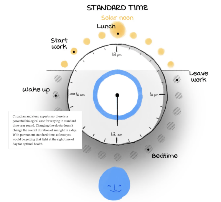
Daylight saving time ends in the United States this weekend and ended already in other places. This can only mean one thing, which is that we must hem and haw about whether to shift our clocks or not. Aaron Steckelberg and Lindsey Bever, for The Washington Post, illustrated the sleep challenges that arise when we have to change measured time, which is easy to shift with button presses, against our less malleable internal time, which is more in tune with sunlight.
Scrolling through, it started to feel like too many layers on top of that clock, but my main takeaway, and I think we can all agree on this, is that we should all get to sleep and wake whenever we want. Boom, problem solved.
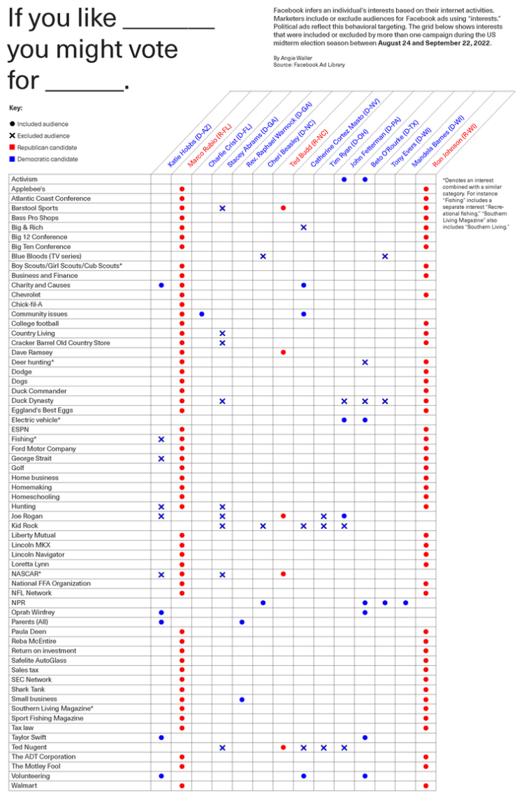
By Angie Waller, this table shows how Facebook thinks you’ll vote based on what you like. It’s a straightforward view that’s fun to look at. In particular, I like the excluded audiences for certain topics marked with an x.
I often see ads that are completely unrelated to my interests, and a small part of me feels like I’m winning in some way, even though I’m almost definitely losing.
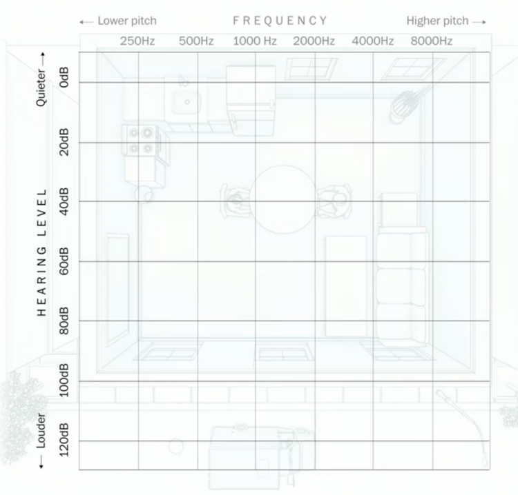
Using an audiogram as a backdrop, Amanda Morris and Aaron Steckelberg, for The Washington Post, explain what hearing loss sounds and looks like.
Hearing level, or volume, is on the vertical axis, and frequency, or pitch, is on the horizontal axis. Objects in the illustration are placed based on where they reside in the coordinate system, which is pretty great. Put on headphones for the full effect.
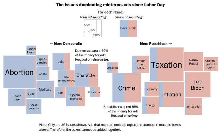
Midterm election day is just about here in the U.S., so the political ads are running. Harry Stevens and Colby Itkowitz, for The Washington Post, show the spending breakdown by political party and topic. Bigger squares mean more spending, and more blue or more red mean more Democrat or Republican, respectively, share of the spending.
The chart reminds of the Shan Carter classic from 2012, which visualized word usage at the National Convention. Same split and sort, but with circles.
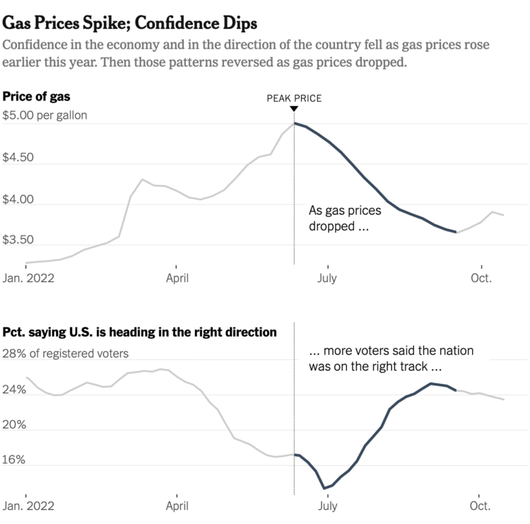
Everywhere you go, gas prices show up on big boards, like a proxy measurement for the times.
When gas prices are really low, something exciting is happening, and in my case when I was a teen, your mom tells you to drive across town to line up for the gas that dropped under a dollar. When gas prices are high, like they are these days, something must be up.
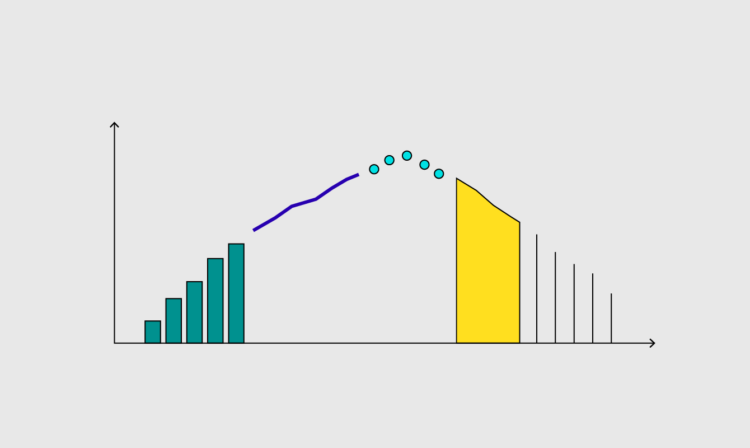
Emily Badger and Eve Washington, for The New York Times, show how that feeling is tied to consumer confidence:
Philip Bump, for The Washington Post, used connected scatterplots to show how gas prices are tied to approval ratings:
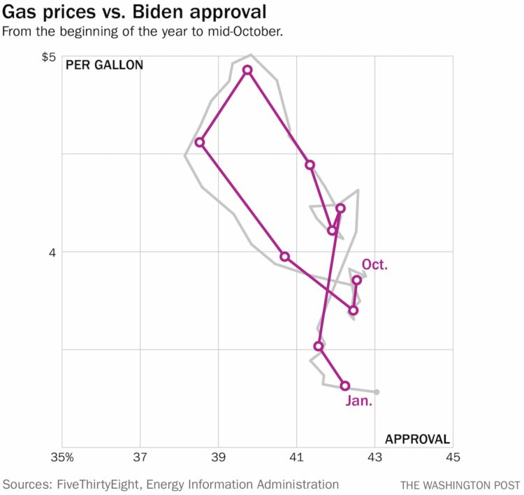
Connected scatterplots are kind of a tricky read at first, but approval and prices appear to go up and down at the same time. Look at it like a regular scatterplot at first, and then follow the line for time.
I wonder what this looks like if you go farther back. I’m guessing similar. What else is tied to gas prices? Will electricity prices eventually replace the familiar gas prices? Is it reasonable to tie our hopes and dreams to the price of a gallon? Is sentiment flipped for people who primarily ride bikes to get places? I have so many questions.
Here’s the good stuff for October.
Are people happy at work? The American Time Use Survey asks people to score their happiness from 0 to 6, where 0 is not happy at all and 6 is very happy. Here’s how people answered

When you’re used to looking at the world through a certain lens, such as a certain rectangular geographic projection, your mental model tends to mirror the view. John Nelson goes over a handful of misconceptions, through the eyes of North Americans.
Chris Gilliard, for The Atlantic, describes self-surveillance that people pay for in exchange for small conveniences at the expense of privacy:
The conveniences promised by Amazon’s suite of products may seem divorced from this context: I am here to tell you that they’re not. These “smart” devices all fall under the umbrella of what the digital-studies scholar David Golumbia and I call “luxury surveillance“—that is, surveillance that people pay for and whose tracking, monitoring, and quantification features are understood by the user as benefits. These gadgets are analogous to the surveillance technologies deployed in Detroit and many other cities across the country in that they are best understood as mechanisms of control: They gather data, which are then used to affect behavior. Stripped of their gloss, these devices are similar to the ankle monitors and surveillance apps such as SmartLINK that are forced on people on parole or immigrants awaiting hearings. As the author and activist James Kilgore writes, “The ankle monitor—which for almost two decades was simply an analog device that informed authorities if the wearer was at home—has now grown into a sophisticated surveillance tool via the use of GPS capacity, biometric measurements, cameras, and audio recording.”
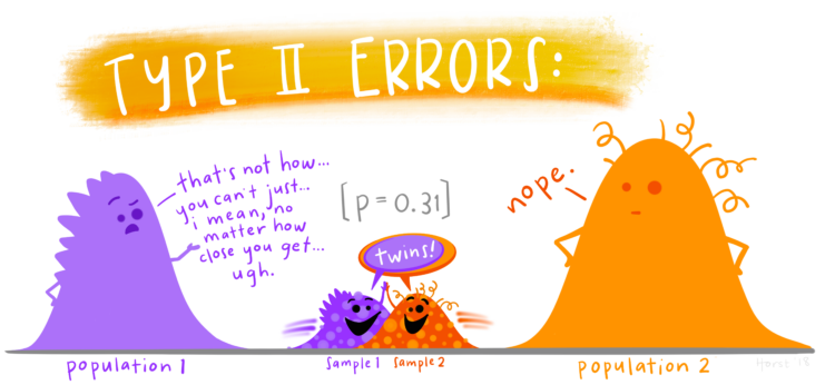
Allison Horst often illustrates data science concepts and tools with anthropomorphized shapes and animals. She recently cataloged her illustrations, which are open source and entertaining if you are a nerd.
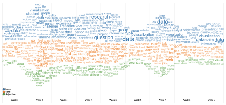
I hear it all the time from chart purists. “I love the streamgraph!” and “Word clouds are the best!” and “I wish there was an easy way to combine a streamgraph and word cloud to see textual changes over time, because that would be ultimate!” Lucky for you, WordStream by Tommy Dang, Huyen N. Nguyen, and Vung Pham combines the best of both worlds.
They released the work a few years ago, but now it comes as an interactive tool on the web. Upload your comma-delimited file with time and text columns and you get a chart. Adjust sizes, parts of speech, and the metrics you want to represent for the ultimate words over time.
All it needs is an export button and research papers may never be the same.
You need data to visualize. Luckily, it’s not too complicated.
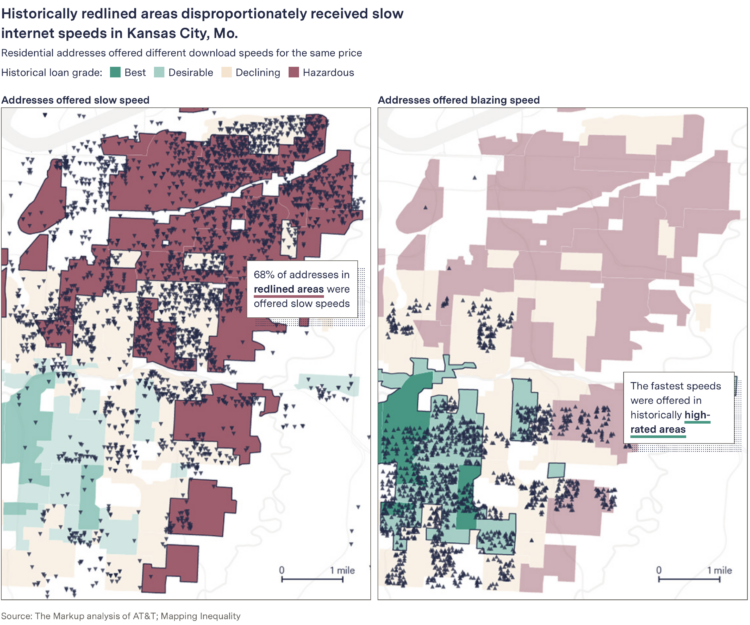
When you pay for internet, it seems like a reasonable expectation that if you pay the same monthly rate as someone a few blocks from you, you get a similar speed. This is commonly not always the case. Leon Yin and Aaron Sankin, for The Markup, with the analysis:
The Markup gathered and analyzed more than 800,000 internet service offers from AT&T, Verizon, Earthlink, and CenturyLink in 38 cities across America and found that all four routinely offered fast base speeds at or above 200 Mbps in some neighborhoods for the same price as connections below 25 Mbps in others.
The neighborhoods offered the worst deals had lower median incomes in nine out of 10 cities in the analysis. In two-thirds of the cities where The Markup had enough data to compare, the providers gave the worst offers to the least-White neighborhoods.
When you compare by Mbps per dollar, you get prices hundreds of times more expensive for crawling internet.
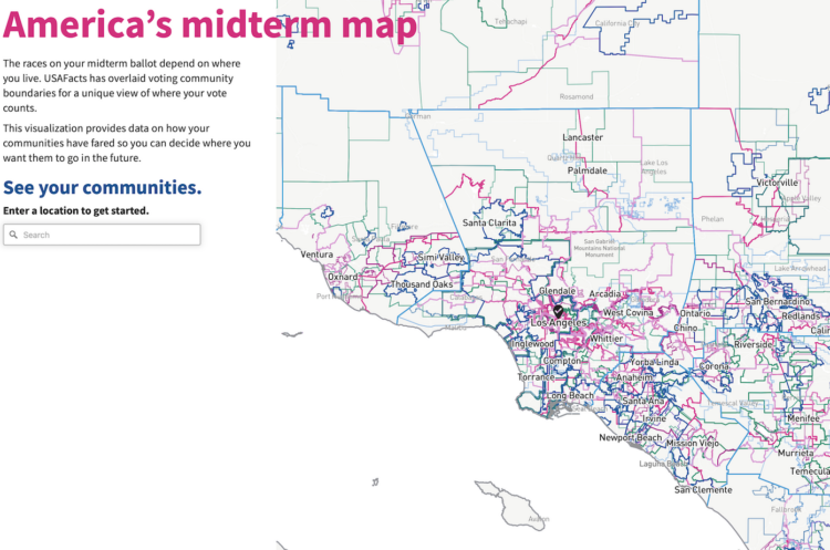
We tend to talk about elections as this uniform thing. People vote for some other people. But who we vote for, who we vote with, and when we vote for who varies depending on where you look. USAFacts mapped all the different communities for the upcoming midterm elections, so you can see the elections where you are. Select other places and compare.
I played a small part on the data side of this project. Pulling data from a mixed bag of sources and linking them over consistent time and geography was a fun challenge.
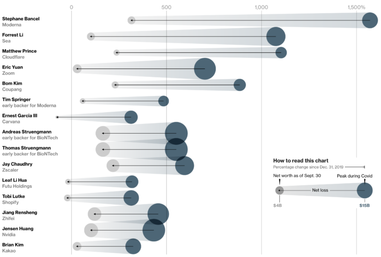
With Covid came sudden shifts in daily life and work, which gave rise to certain companies that were able to fill specific needs. Some individuals’ net worth increased many times over. But as things move back closer to where they were pre-Covid, sudden wealth is also moving back. Bloomberg zeros in on the billionaires whose net worth increased and then decreased because of the life changes.
The chart above uses scaled bubbles to show the shifts from peak to present. The horizontal axis represents percentage change since the end of 2019.
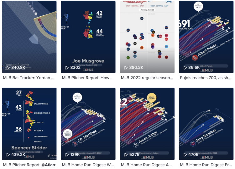
With Chartball, Andrew Garcia Phillips has visualized sports data for a while, publishing to various mediums — Twitter, Tumblr, posters, and YouTube — to show animated and engaging insights on how individual teams and players perform. It’s clearly a passion project, because no one would make this many charts if they didn’t enjoy it.
TikTok might be the best fitting platform for his short animations focused on a single insight. Here’s an example:
@chartball MLB Pitcher Report: @Atlanta Braves Spencer Strider vs. @Colorado Rockies Sept. 1, 2022 @mlb #baseball #dataviz ♬ It Was A Good Day – Ice Cube
This makes me wonder (1) how other animations and datasets would work in this short video format and (2) if you add music to any animated chart does it instantly make it more fun, because I think it does. [Thanks, Sarah]
It’s growing more common for landlords to use software to set the rental prices of their properties. This of course leads to software companies promising optimized pricing for maximum profit, which leads to higher rent for residents. Heather Vogell, Haru Coryne, and Ryan Little, for ProPublica, look closer at the practice, with a focus on pricing company RealPage:
To arrive at a recommended rent, the software deploys an algorithm — a set of mathematical rules — to analyze a trove of data RealPage gathers from clients, including private information on what nearby competitors charge.
For tenants, the system upends the practice of negotiating with apartment building staff. RealPage discourages bargaining with renters and has even recommended that landlords in some cases accept a lower occupancy rate in order to raise rents and make more money.
One of the algorithm’s developers told ProPublica that leasing agents had “too much empathy” compared to computer generated pricing.
Oh.
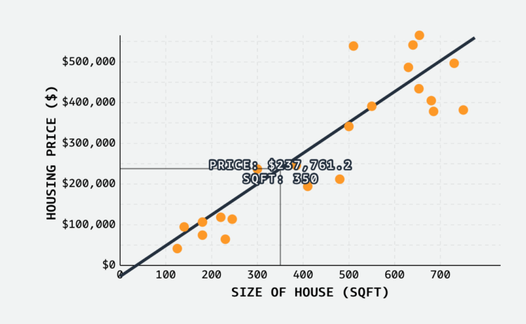
MLU-Explain continues with their visual explainers for machine learning and statistical concepts. Most recently, Jared Wilber gets into linear regression. Towards the bottom of the explainer, there’s an interactive chart that lets you place dots on the plot and the fitted line updates as you go. Nice.
There’s always room for improvement — no matter how long you’ve been at it.
 Visualize This: The FlowingData Guide to Design, Visualization, and Statistics (2nd Edition)
New tools, refined process.


