• Membership
  • Newsletter
  • Projects
  • Learning
  • About
  • Member Login
  • Statistical personality quiz matches you to fictional characters

    May 17, 2022

    Topic

    Statistics  /  personality, quiz

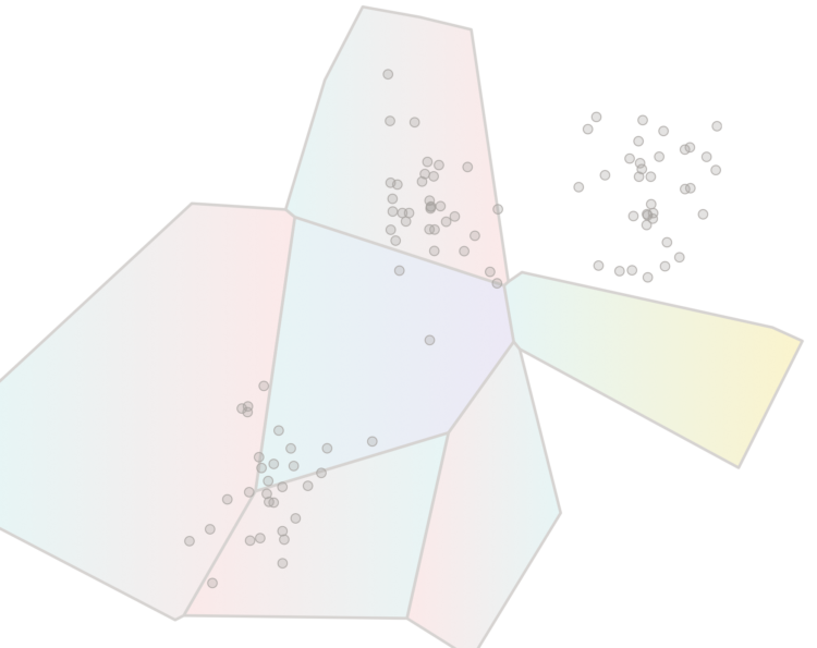
    The Open-Source Psychometrics Project, which seems to have been around for a while, provides personality quizzes as an exercise in data collection and personality education:

    This website has been offering a wide selection of psychological assessments, mostly personality tests, since late 2011 and has given millions of results since then. It exists to educate the public about various personality tests, their uses and meaning, the various theories of personality and also to collect data for research and develop new measures. This website is under continuous development and new tests and information are being added all the time.

    One of the more recent quizzes matches your personality with fictional characters, and the results seem oddly close? I took the short version, and out of 2,000 characters, I was a 92% match to Data from Star Trek. I’m not totally sure how I feel about that.

    You can also download anonymized data collected through the project.

  • Reaching 1 million deaths

    May 16, 2022

    Topic

    Infographics  /  coronavirus, mortality, New York Times

    The New York Times narrated the path to one million Covid deaths in the United States. They start with one million dots, each one representing a death. As you read, the dots arrange into trends and significant events over these past years.

    As we have talked about before, it’s impossible to communicate the true weight of a single death, much less a million, but the individual dots provide a visual foundation to better understand abstract trends.

  • Inflation based on your spending

    May 13, 2022

    Topic

    Infographics  /  calculator, inflation, New York Times

    We’ve been hearing a lot about inflation rates lately on a national scale. However, how inflation impacts you depends on what you spend your money on. Ben Casselman and Ella Koeze for The New York Times provide an estimate for you.

  • Data Underload  /  age, people, time use

    How Much Time We Spend Alone and With Others

    Oftentimes what we’re doing isn’t so important as who we’re spending our time with. Based on data from the American Time Use Survey, this is a simulated day for 100 people.

    Read More
  • Chart used as drink label

    May 11, 2022

    Topic

    Data Art  /  food, ingredient, labels

    For Swee Kombucha, Bedow used a stacked chart as a food label to show the ingredient breakdowns for various beverages. The greater the area is, the more ingredient by volume there is in the drink.

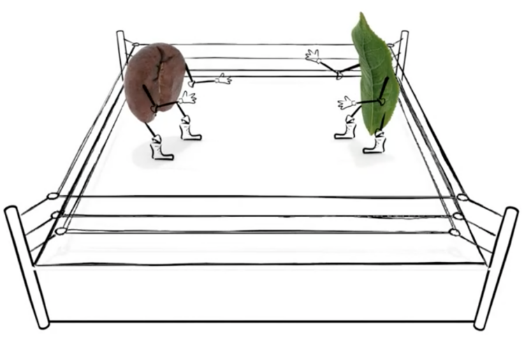
    This project takes me back. See also nutritional facts redesigned, alcoholic beverage pie charts, the engineer’s guide to drinks, and coffee drink breakdowns. The two-year span from 2010 to 2011 was quite the renaissance period for beverage percentages.

  • Scale of one million deaths

    May 10, 2022

    Topic

    Infographics  /  Axios, coronavirus, mortality, scale

    The United States is about to reach one million confirmed Covid deaths, or already passed the mark if you consider excess deaths. There’s no way to truly feel that number, but Axios visualized the scale, with comparisons against city populations and historical events.

    A diamond shape represents counts, and as you scroll, shapes fill the screen until you only see the tips. The shapes overflow beyond what we can or want to understand. The time series line on the bottom shows cumulative deaths over time, leading towards the one-million mark.

  • F1 Racing results plotted as lightning

    May 9, 2022

    Topic

    Statistical Visualization  /  Formula 1, Joey Cherdarchuk, race

    Joey Cherdarchuk used a lightning metaphor to visualize the outcomes of races from the 2021 season. The x-axis represents how far ahead or behind the each racer is compared to the average. The y-axis represents laps. Racing and thunder sounds play in the background for dramatic effect. I’m into it.

  • Formula 1 car redesign

    May 9, 2022

    Topic

    Infographics  /  car, Formula 1, New York Times

    The rules around a car’s aerodynamics for Formula 1 racing changed a lot this year, which means new challenges and big shifts in team rankings. Josh Katz and Jeremy White, for The New York Times, illustrated the changes and how modifications affect a car’s performance.

  • Global warming bike path

    May 6, 2022

    Topic

    Data Art  /  climate change, Ed Hawkins, physical

    The @LpzfuersKlima team have completed painting a giant representation of the Warming Stripes on the Sachsenbrücke in Leipzig, thanks to crowd funding.
    Already starting conversations for those using the bridge. #ShowYourStripes pic.twitter.com/OFY9Jeq1zH

    — Ed Hawkins (@ed_hawkins) April 27, 2022

    It amazes me how many places in the world Ed Hawkins’ Warming Stripes appears. My favorite has still gotta be the shower tiles.

  • Members Only

    Chart Tool Snob

    May 5, 2022

    Topic

    The Process  /  tools

    Use the tool that works for you.

  • Number of abortions in each state, by restriction status

    May 5, 2022

    Topic

    Statistical Visualization  /  abortion, Roe v. Wade, Washington Post

    The Washington Post has a set of charts showing the current status of abortion in the United States. The treemap above shows counts by state in 2017, based on estimates from the Guttmacher Institute.

    Twelve percent took place in states that have trigger bans, laws passed that would immediately outlaw most abortions in the first and second trimesters if Roe were overturned. (Those states are already some of the most restrictive.) And 27 percent occurred in states that plan to enact other new restrictions.

  • Map of clinics at risk of closure

    May 4, 2022

    Topic

    Maps  /  Bloomberg, clinics, Roe v. Wade

    If Roe v. Wade is overturned, over 200 clinics would potentially have to close. Bloomberg mapped it, along with charts showing more than half of child-bearing people in the United States with new restrictions.

  • Beef and the rainforest

    May 4, 2022

    Topic

    Maps  /  beef, rainforest, sustainability, Washington Post

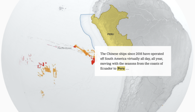
    People like beef. To raise more cattle, companies need more land. Sometimes to get more land, companies turn to unethical methods. Terrence McCoy and Júlia Ledur for The Washington Post:

    By reviewing thousands of shipment and purchase logs, and analyzing satellite imagery of Amazon cattle ranches, The Post found that JBS has yet to disentangle itself from ties to illegal deforestation. The destruction is hidden at the base of a long and multistep supply chain that directly connects illegally deforested ranches — and ranchers accused of environmental infractions — to factories authorized by the U.S. government to export beef to the United States.

  • Procedural dungeons in R

    May 4, 2022

    Topic

    Coding  /  game, Matt Dray, R

    Matt Dray is developing a package in R that runs a text-based game. Part of that game requires procedural dungeons that are different each time you play.

  • State policy if Roe v. Wade were overturned

    May 3, 2022

    Topic

    Maps  /  abortion, Roe v. Wade, Washington Post

    If Roe v. Wade were overturned, abortion policies would change in many states. From last year, Daniela Santamariña and Amber Phillips, for The Washington Post, mapped what would happen.

  • Scale of atoms

    May 3, 2022

    Topic

    Infographics  /  atom, CERN, scale

    [arve url=”https://www.youtube.com/watch?v=7WhRJV_bAiE” /]

    I’ll probably never tire of these sort of videos. It starts at human scale and then zooms in closer and closer until it gets to quarks.

  • Tucker Carlson word usage and patterns

    May 3, 2022

    Topic

    Infographics  /  New York Times, Tucker Carlson

    Tucker Carlson hosts a nightly show viewed by millions. The New York Times analyzed the changing structure of the show and Carlson’s recurring speaking points, over a span of 1,150 episodes. NYT shows the results with a mix of audio and video clips and wideout views like the one above, which mark episodes that use specific types of rhetoric.

  • A test for a potentially flawed study on randomness and age

    May 2, 2022

    Topic

    Statistical Visualization  /  age, Pudding, randomness

    In 2017, a study posited that human behavior complexity peaks at age 25 and then declines, especially after age 60. The researchers estimated complexity through people’s ability to make up random patterns. Russell Goldenberg and Arjun Kakkar, for The Pudding, let you put the theory to the test and discuss why the original researcher’s findings were questionable.

  • Nuclear energy rebrand

    April 29, 2022

    Topic

    Infographics  /  branding, nuclear, Washington Post

    Nuclear energy has bad memories linked to it, which tends to draw fear from the general public. Harry Stevens, for The Washington Post, explains why some feel the fear is unwarranted:

    This explanation vastly oversimplifies a great deal of sophisticated engineering. However, the basic concept of a steam-powered electricity plant had been worked out by the late 1800s. “The only thing the 20th century gave us was a new way to make steam by heating it with nuclear fission,” said James Mahaffey, a retired nuclear engineer who has written several books on nuclear energy.

    The piece includes cartoon circles with eyes to describe a fission chain reaction. Classic Stevens. Stevens should include cartoon eyes in every piece he makes for his own bit of branding.

  • Members Only

    Visualization Tools and Learning Resources, April 2022 Roundup

    April 28, 2022

    Topic

    The Process  /  roundup

    Here’s the good stuff for April.

  • Page 61 of 392
  • <
  • 1
  • ...
  • 58
  • 59
  • 60
  • 61
  • 62
  • 63
  • ...
  • 392
  • >

Analyze, visualize, and communicate data usefully, beyond the defaults.

Become a member →

Recently for Members

May 8, 2025
When the data is not what it seems

May 1, 2025
Finding the Right Charts

April 24, 2025
Visualization Tools, Datasets, and Resources – April 2025 Roundup

April 17, 2025
Breaking Out of Chart Software Defaults

April 15, 2025
Line Chart with Decorative Neon Accents

Browse by Chart Type See All →

Organogram Bar Chart Race Mosaic Plot Density Plot Parallel Coordinates Ternary Plot Surface Plot Step Chart Stacked Bar Chart Glyph Chart

Browse By Topic

  • Visualization

    Seeing data

  • Maps

    Seeing geographic data

  • Infographics

    Explaining data

  • Networks

    Connecting data

  • Statistics

    Analyzing data

  • Software

    Working with data

  • Sources

    Getting data

  • Design

    Making data readable

Get the Book

Visualize This: The FlowingData Guide to Design, Visualization, and Statistics

Available now.

Order: Amazon / Bookshop

Made by FlowingData

  • The Process

  • Data Underload

  • Chart Everything

  • Guides

  • Books

  • Shop

  • About
  • Contact
  • Newsletter
  • LinkedIn
  • Instagram
  • Bluesky
  • RSS
Copyright © 2007-Present FlowingData. All rights reserved.