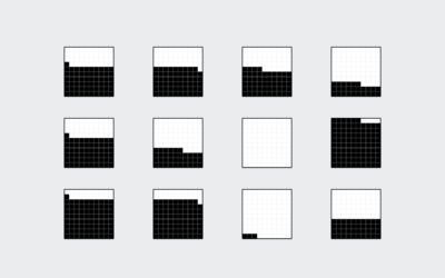
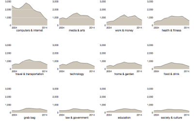
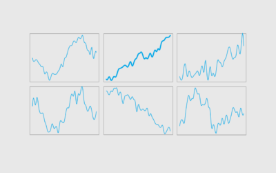
Use smaller versions of the same chart type to compare across categories.
This week we make it easier to compare multiple charts when differences are small but significant.
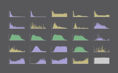
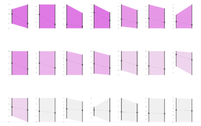
Also known as trellis charts, lattice chart, or whatever you want to call them, the technique lets you compare several categories in one view.
Instead of traditional pie charts that rely on angles and arc lengths to show parts of a whole, try this easier-to-read version.
The relatively new and lesser known time series visualization can be useful if you know what you're looking at, and they take up a lot less space.
Small multiples are great, and the right interactions can make them even better. A primer and a how-to.
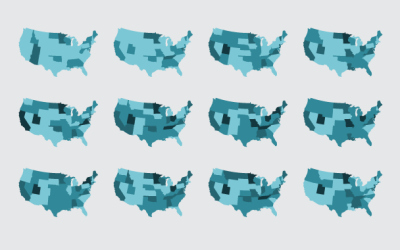
Maybe you want to make spatial comparisons over time or across categories. Organized small maps might do the trick.
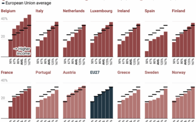
There is always ample discussion about progressive tax rates in the United States.…
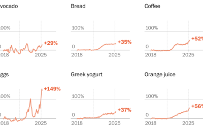
Washington Post Opinion has a tracker updated weekly that groups items by everyday…
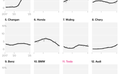
I like this chart set from Bloomberg that shows the top brands, ranked…
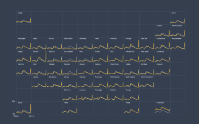
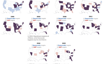
We mostly hear about a handful of swing states these days, as presidential…
People are waiting longer to have kids or not having kids at all, which leads to more dual income households with no kids.
In high school, we spend most of our days with friends and immediate family. But then we get jobs, start a family, retire, and there's a shift in who we spend our days with.
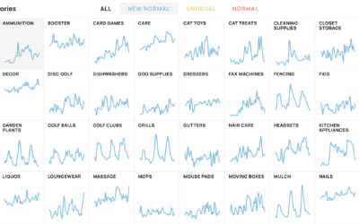
Schema Design, Google Trends, and Axios collaborated on The New Normal, looking at…
Our everyday routines changed over the past year, and with the 2020 American Time Use Survey, we can see by how much.
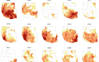
In what’s become a recurring theme almost every year, the western United States…
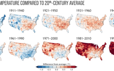
Every decade the National Oceanic and Atmospheric Administration releases climate normals to provide…
Niko Kommenda for The Guardian used small multiples to show 90 of the…
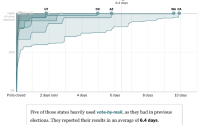
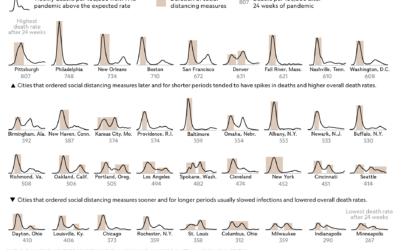
For The Washington Post, Ashlyn Still and Kevin Schaul charted how long it…
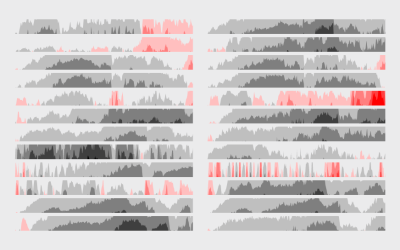
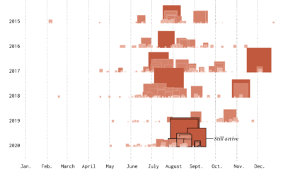
The wind was blowing smoke and ash from wildfires further up north from where I live. The sky turned an eerie orange. I wondered about past fires and made the chart below.
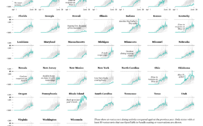
Restaurants are reopening for dining across the United States. Some states are doing it faster than others.
For National Geographic, Nina Strochlic and Riley D. Champine look back at the…
For each month in her child’s first year, Amanda Makulec took a picture…