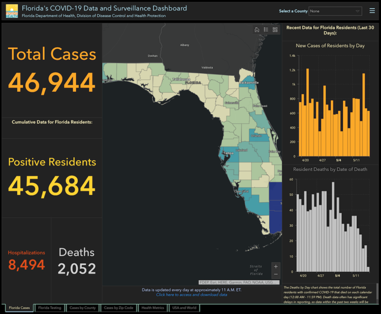
-
Members Only
-
The Washington Post asked Democratic candidates a series of policy questions. To see which one agrees with you most, the Post made a quiz:
Now, it’s your turn to answer. Below are 20 questions we found particularly interesting, mostly because they reveal big differences between the remaining major candidates. We haven’t asked the campaigns about every topic, but this selection tries to cover a variety of issues. Answer as many as you like.
It was also a good way to catch up on what candidates currently stand for. I’ve found it hard to keep up lately.
-
When I think government structure, I tend to think in general overviews where you have some branches that check and balance each other. But when you look closer, within organizations that make up the bureaucracy, you’ll find lots of variation. Peter Cook laid it out for the United Kingdom with org charts for each department.
And apparently org charts are also known as organograms? Where have I been on this one? [Thanks, Peter]
-
From 1928, the year of the first Academy Awards, to 2019, there have been 455 nominations for Best Director. Of those, 18 of them went to non-white men.
-
[arve url=”https://www.youtube.com/watch?v=wAIZ36GI4p8″ loop=”no” muted=”no” /]
In 2007, Noah Kalina posted a time-lapse video showing a picture of himself every day for six years. Pop culture swallowed it up. There was even a Simpsons parody with Homer. After another six years, it was a video for twelve years’ worth of photos. Kalina has kept his everyday project going, and the above is the new time-lapse for two decades.
This brings back graduate school memories for me as I argued for personal data collection as a diary instead of just for quantified self. I often led with Kalina’s project as a primary example. He ages, his background changes, and his camera improves, but the angle stays the same.
It’s a very tiny window into his life, played out over time, but I bet for Kalina it means a bit more. [via kottke]
-
It’s difficult to emphasize how much life changes when a child comes into the picture. Caitlin Hudon made a chart to show how her daily schedule shifted dramatically.
For a while, it seems like all of your free time is gone for good, but ever so slowly, you get a little bit of it back as they grow more independent.
-
Based on a Morning Consult/Politico survey, most people don’t know where Iran is:
As tensions between the United States and Iran rise in the aftermath of the American drone strike that killed the country’s most powerful commander, Gen. Qassem Soleimani, a new Morning Consult/Politico survey finds fewer than 3 in 10 registered voters can identify the Islamic republic on an unlabeled map.
The data is noisy, with selections in the ocean, and in the world view, with selections of the United States and Canada. So I’m not totally sure what to make of that, but it’s clear a lot of people don’t know where Iran is, which might be part of why Americans don’t have a clear opinion about the current affairs.
All I can think about are these geographic stereotype maps from 2010.
-
Outside of Australia, it can be a challenge to get a grasp of how bad the bushfires actually are. There have been some attempts that overlay a map of Australia over various locations, but they’ve varied in accuracy. This scrolling unit chart by Reuters Graphics makes the comparison more concrete.
Each square represents a square kilometer, a counter at the top ticks up as you scroll, and geographic points of reference appear as you go down. Effective.
-
Members Only
-
How to Make Line Charts in Python, with Pandas and Matplotlib
The chart type can be used to show patterns over time and relationships between variables. This is a comprehensive introduction to making them using two common libraries.
-
In 2018, there was a squirrel census count at Central Park in New York. New York Times graphics editor Denise Lu participated in the citizen science project “to collect the kind of data that underlies the work I do every day.” Lu did a short but interesting piece on her experience counting squirrels.
You can download the data via NYC Open Data.
Now I’m wondering if I should apply to be a 2020 Census counter. Um, for people, not squirrels.
-
The New York Times zoomed in on southeastern Australia where the fires have hit the worst. They also used small multiples to show the scale of the fires the past few months against previous years.
-
With all of the maps of fire in Australia, be sure to check out this piece by Georgina Rannard for BBC News on how some of the maps can easily be misinterpreted when seen out of context.
-
For The Guardian, Niko Kommenda and Josh Holder provide a visual guide to the bushfires in Australia:
Satellite data from Nasa showed a stark increase in the number of fire detections in November and December compared with previous years. Satellites detect fire “hotspots” by measuring the infrared radiation emitted by the blazes.
In previous years, between 2,000 and 3,000 such hotspots were recorded each December in the south-east, while in 2019 the number reached 227,000.
There’s an animated time series chart that changes the range of the y-axis, which I think is a good way to demonstrate the scale of the current fires.
-
From Kim Warp for The New Yorker. Ha. Ha. It’s funny because it’s true.
It reminds me of Amanda Cox’s dress size graphic for the NYT.
[Thanks, Mike]
-
Ridgeline charts or frequency trails use parallel lines that overlap on the fluctuations, which creates a 3-D effect at the peaks. Andrei Kashcha used this method to show elevation around the world in an interactive map.
Click-and-drag to any location, and you get something like the above. You can also change parameters like maximum peaks, line density, and color. Even get your results printed on a mug.
Kashcha posted his code on GitHub.
See also James Cheshire’s population lines from 2014.
-
One of the best ways to feel old is to look to your past and realize how long ago it was. Wait Buy Why demonstrates with a bunch of timeline splits. For example: “Remember when Jurassic Park, The Lion King, and Forrest Gump came out in theaters? Closer to the moon landing than today.
I feel like there was an xkcd comic about this, but the closest I could find in my notes was a tweet from Neil deGrasse Tyson: “Just an FYI: The year 1980 is as far in today’s past as 1947 was to 1980.”
Update: From xkcd, there was one on Movie Ages and another on Timeghost. (Thanks, @ilarischeinin and @CultureOverTime.)
Yay. We’re all old. Eventually.
-
Members Only
-
For The Upshot, Emily Badger and Quoctrung Bui looked for major urban developments in the United States by comparing satellite imagery of past to present:
To grasp the scale of this decade of change, The Upshot worked with Tim Wallace and Krishna Karra from Descartes Labs, a geospatial analytics company, using a tool that has itself evolved significantly over this time: satellite imagery. With its growing power and precision, we can see both intimate details — a single home, bulldozed; a tennis court, reinvented — and big patterns that recur across the country. Here, we show some of the most consequential changes over the last 10 years, as seen from above.
The resolution is impressive (but still creeps me out a little bit). And while maybe not as fun to watch as a time-lapse, the two-snapshot treatment provides more contrast, which makes it easier to see the change. I also like the two small dots on the right of each image to indicate progress while scrolling.
-
My main goal for FD this year was to make charts.
I hoped to make one chart per week, along with the newsletter and tutorials, which would force me to focus and spend less time dwelling on a dataset. I didn’t quite get to one per week, but I made about twice as many graphics as I did last year. I’ll take it.
Instead of long-ish, in-depth analyses, I usually looked at one dataset from various angles, making one or two graphics per angle. Basically, instead of essays, I opted for small collections of short stories.
So, here are the most popular topics/datasets and their accompanying charts.
Read More