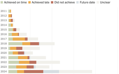
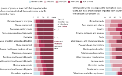
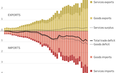
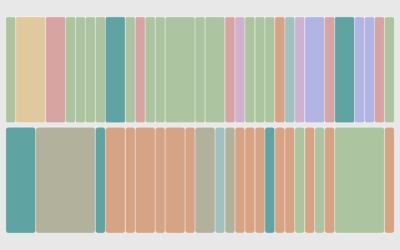
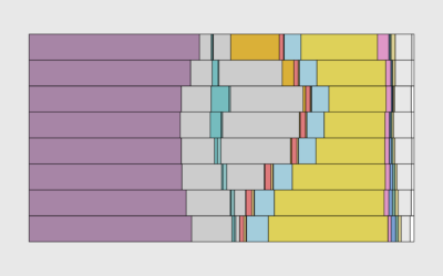
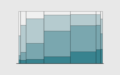
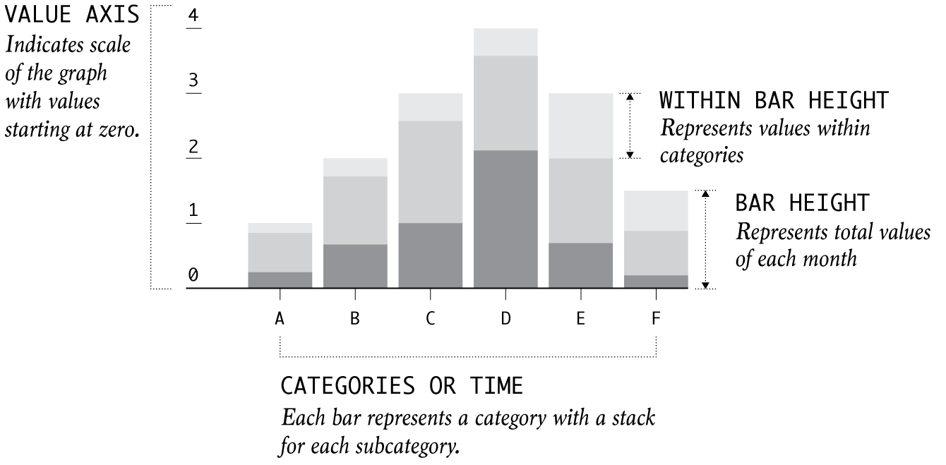
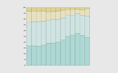
With the stacked version of the bar, compare subcategories across groups. Try not to show too many subcategories though, or it’ll clutter quick.
Show current evolution against expected historical variability and add one or more series that could account for the difference.
There are many ways to show parts of a whole. Here are quick one-liners for the more common ones.
You probably knew that coronavirus deaths have been in the several thousands per…
With this straightforward unit chart, wcd.fyi shows which generation each Senate member belonged…
It used to be that climate changed seemed like something far off in…
It seems like there’s been more player movement than usual over the years. Didn’t players used to play on a single team for the entirety of their careers?
As you might expect, early voting volume is high across the country. In…
FiveThirtyEight publishes win probabilities for NBA games throughout the season. During the playoffs,…
Google released a search trends dataset earlier this month. Using this dataset, Adam…
When this all started, Covid-19 was impacting large cities at a much higher…
With mail-in ballots looking to be more common than ever this year, NYT’s…
For NYT’s The Upshot, Tim Wallace and Krishna Karra looked at how the…
With Joe Biden calling for 100% clean electricity, John Muyskens and Juliet Eilperin…
I'm terrible at names, but maybe data can help. Put in your sex, the decade when you were born, and start putting in your name. I'll try to guess before you're done.
What percentage of households fall into lower-, middle-, and upper-income levels when you adjust for household size?
We looked at prime dating age and when people usually marry. Now it's time for the next step in the circle of life.
Democrat Doug Jones won in the senate race against Republican Roy More last…
When people move to different jobs, here's where they go.