
This issue of The Process is public.
Hi,
I don’t know about you, but I’ve been finding it hard to concentrate the past week or so. I keep getting guidelines on washing hands and reassurances from the kids’ school that everything is sanitized multiple times per day. There are empty shelves at the stores with toilet paper and hand sanitizer. It all just feels very uneasy.
And, as I’m sure you heard, the World Health Organization classified Covid-19 as a pandemic. Naturally, I continued voraciously consuming information about the coronavirus. Here’s a rundown of the useful visuals that have crossed my way. They didn’t help with the uneasiness, but they at least provide a window into what’s happening.
What It Is
For The New York Times, Jonathan Corum and Carl Zimmer explain what the SARS-CoV-2 Coronavirus is and what it does with illustrations.

The vertical format works well here to show the various stages in the life cycle of a virus.
Who Is Affected
Generally speaking, everyone is affected. Events have been canceled, lectures halted, and schools closed. Sporting events are happening in empty arenas (Uh, scratch that. Seasons are being suspended until further notice.) The stock market is falling.

But that’s all secondary for now, as thousands are affected directly. There’s a lot of uncertainty around how many people actually have Covid-19, because most estimates are based on confirmed cases, which varies by country, by testing, and reliability of sources.
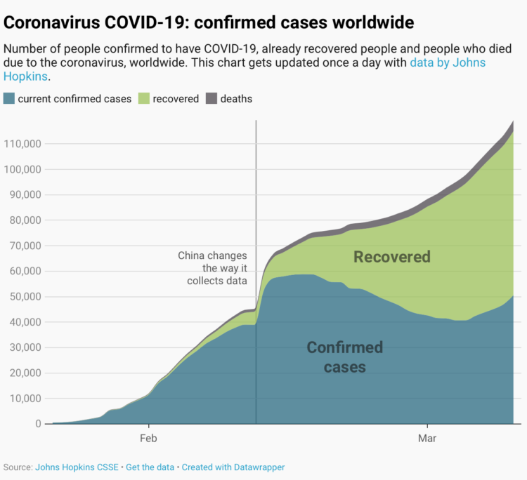
Still though, the estimates provide an idea. Datawrapper put together a series of charts for people to use and to visualize the data responsibly.
As data visualization designers, we have a responsibility towards our audience – an audience that might not be aware that each data visualizations tells a story instead of simply “showing the facts”. Our responsibility is to show the data truthfully. The story we want to tell with our coronavirus visualizations is not about panic, but about calm caution and putting things in perspective.
It appears that older adults are more susceptible and kids are less so.
Here are results from an analysis by the China CDC:
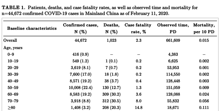
So while in most cases the symptoms are mild, it’s important to minimize the spread to keep others safe.
The Spread
It appears to have started in China and then spread from there. The New York Times has been updating a tracker:
![]()
This helps with a global view. You can see the status of the current knowns.
However, you also want to know where things might be headed, which is full of uncertainty. 3Blue1Brown talked about exponential growth and epidemics in the context of Covid-19:
With such growth in mind, I direct your attention to this chart by John Burn-Murdoch for Financial Times:
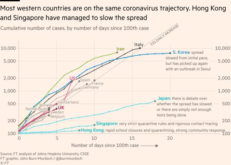
It shows the current trajectories of several countries, using a time offset of “number of days since the 100th case.” From Burn-Murdoch:
Case numbers since outbreaks began in several countries have tracked a ~33% daily rise. This is as true for UK, France, Germany as Italy; the latter is simply further down the path
…
Meanwhile the jury is still out on Japan: is the flatter curve the positive result of measures like early school closures, or a misleading trend due to Japan’s very low testing rates?
It’s on a logarithmic scale by the way. More from Burn-Murdoch on that:
In the initial outbreak phase, a virus like this spreads exponentially not arithmetically, i.e a log scale is the natural way to track the spread
If we show case numbers on a linear scale, it would look like UK, US etc have little to worry about: they’re down here and Italy is way up there! You’d also be asking readers to calculate an exponential curve in their head to see if two countries are on the same trajectory ???
…
A chart should convey a message and allow people to answer useful, real-world questions about real-world phenomena [like exponential growth]
The log scale version of this chart does that, where the linear scale version would be a) less useful and b) more panic-inducing
I agree.
What We Can Do
Wash your hands. Don’t touch your face. You’ve probably heard the CDC guidelines a hundred times by now.
We want to slow down the spread, so that even if a lot of people get the coronavirus, the health care system can handle the load if the infection rate is slow enough. This graphic (and many versions of it) is what we seem to have agreed to be our target:
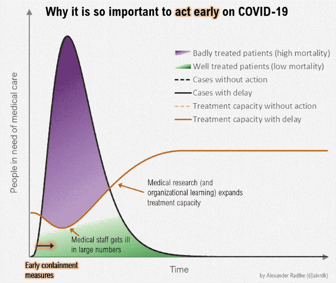
The version above is by Alexander Radtke. We want to “flatten the curve.” Rosamund Pearce for The Economist made the original version of the graphic:
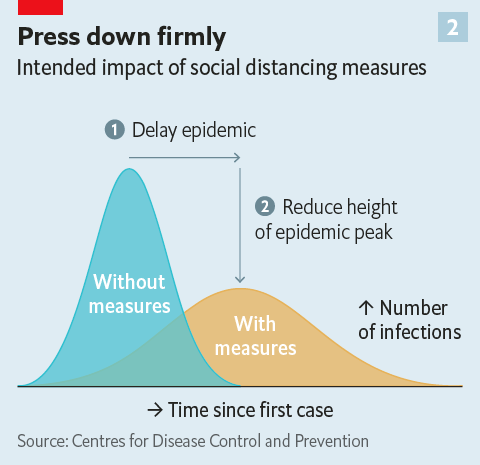
Update: The CDC published a similar curve in a February 2007 report (thanks, Adam):
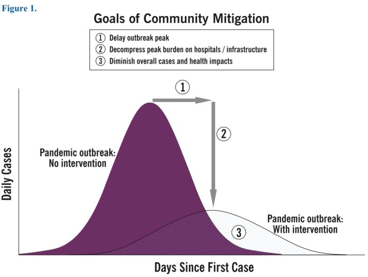
So let’s flatten the curve, yeah?
I know a lot of you are working from home these days. It’s my preferred working environment, but in case it’s not your thing, Alice Goldfuss provides a good guide for getting through the day.
Thank you for supporting FlowingData as a member. Stay safe. Talk next week.
n.
 Visualize This: The FlowingData Guide to Design, Visualization, and Statistics (2nd Edition)