Symbols are used and various dimensions represent different variables in a dataset.
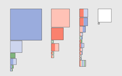
Using geometric shapes as an encoding can provide another dimension to your charts.
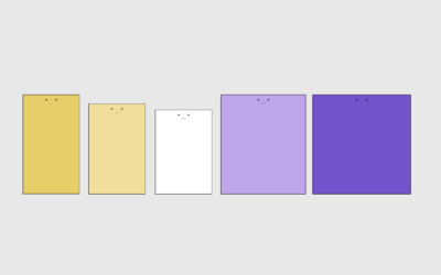
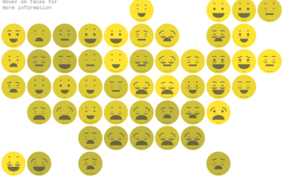
The goal of Chernoff faces is to show a bunch of variables at once via facial features like lips, eyes, and nose size. Most of the time there are better solutions, but the faces can be interesting to work with.
About half of people have private health insurance through an employer. However, the other half get their insurance from elsewhere or through a combination of sources.
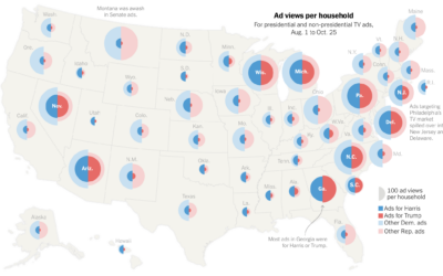
For NYT Opinion, Gus Wezerek compared ad views per household: To figure out…
Are more Americans heavier than you or are they lighter? The following chart compares your weight against other adults.
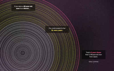
The Washington Post goes with a tree ring metaphor to compare life expectancy…
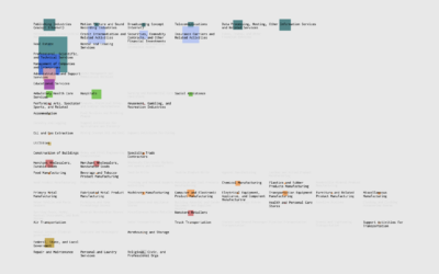
If you're searching for a new job, it's worth looking in different industries instead of doing more of the same elsewhere.
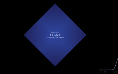
The United States is about to reach one million confirmed Covid deaths, or…
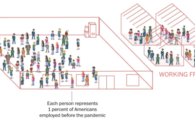
To broadly show how people have lived in the U.S. during these past…
I looked at the percentages of people with a given number of kids in the family and the order they were born.
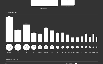
After an unsuccessful battery search, the natural next step was of course to look up battery sizes and chart all of them.
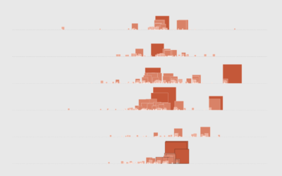
Based on data from CAL FIRE, Erin Ross, for Axios, plotted California wildfires…
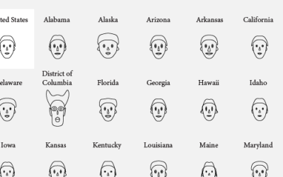
Lazaro Gamio for Axios used Chernoff Faces that look like emojis. This visualization…
The Beer Judge Certification Program lists 100 styles of beer. Here's a chart for all of them.