I’m just gonna put this right here, from @_daviant: “Another day another stupid Excel chart”.
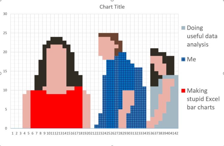
I’m just gonna put this right here, from @_daviant: “Another day another stupid Excel chart”.
 Visualize This: The FlowingData Guide to Design, Visualization, and Statistics (2nd Edition)
New tools, refined process.