It is like a pie chart. But with a hole. It looks like a donut. That’s why it’s called a donut chart.
There are "better" ways to show proportions over time, but sometimes you just want an animated donut.
There are many ways to show parts of a whole. Here are quick one-liners for the more common ones.
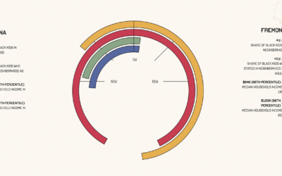
Aaron Williams, for The Pudding, shows upward mobility through his own experiences, moving…
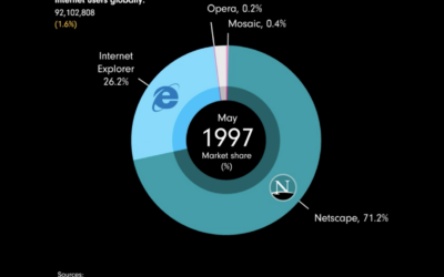
James Eagle used an animated donut chart to show browser share from 1996…
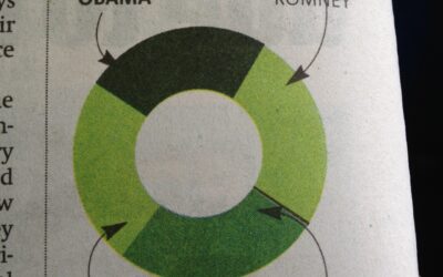
From the October 10 Boston Metro. Oops. [via]…
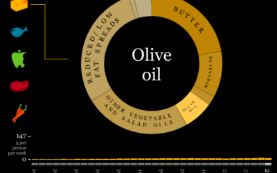
The Department for Environment, Food and Rural Affairs (DEFRA) keeps an archive of…