This issue of The Process is public.
Hi,
Nathan here. This is The Process, the weekly newsletter for FlowingData members where I look at charts closer.
This issue is public, but if you’d like to support FlowingData, becoming a member is the best way to do it. Membership keeps the blog running as a free resource for everyone and gets you bonus access to tutorials, courses, and more.
A new tutorial on animated charts went up yesterday. Maarten Lambrechts explains step-by-step, using the ggplot and gganimate packages in R.
This week, I follow up on the coronavirus visual rundown from two months ago, when there were only 1,190 confirmed cases in the United States. (omg.) A lot has happened since then.
Simulations and Pandemic Modeling
In mid-March the simulations and modeling ramped up. There was a lot we didn’t know about the virus (and still don’t), so there were a lot of what-ifs and simplified models of imaginary pandemics. We were learning about the now all too familiar social distancing and staying at home.
For The Washington Post, Harry Stevens used a simplified particle system to simulate social distancing and how it helped to flatten the curve:
It became the most read article of all time on The Post’s site.
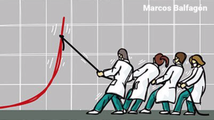
Speaking of flattening the curve, this comic by Marcos Balfagón showing four medical workers pulling down the curve struck a chord with me:
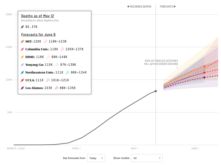
Forecasts were all very abstract for a while with wide bands of uncertainty, but as we learn more, those bands seem to be converging more. These days, I find myself referring to FiveThirtyEight’s model tracker, which currently shows seven models for forecasted number of deaths.
FiveThirtyEight also illustrated why it’s so hard to make a good model for the current situation. There are just so many unknowns and variations that add more complexity to modeling. It’s hard to feel certain about how this all turns out.
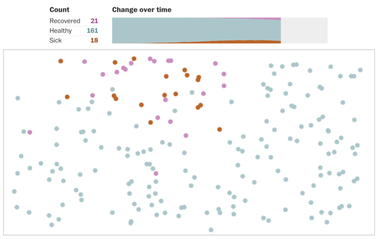
So we come back to social distancing. The New York Times, using simulation data from the Kyoto Institute of Technology, visualized how droplets spread when you sneeze:

There were also the more literal simulations that showed how fake germs spread when you don’t wash your hands for the recommended 20 seconds.
Looking for a Baseline to Compare
Instead of looking to the future, another route has been to look to the past. If we can find something similar in history, maybe we can make better decisions for the future.
For National Geographic, Nina Strochlic and Riley D. Champine looked at the curves for the 1918 flu pandemic:
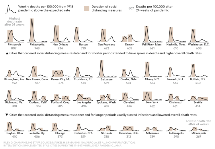
The points of interest are when social distancing started and began and how that relates to number of deaths. Cities eased up on social distancing, and it was not uncommon to see a second wave of deaths. To be honest, I’m more amazed that there is data for 1918.
Instead of comparing patterns over time, The Upshot compared infection and fatality rate for Covid-19 against other major killers, based on data from the Centers for Disease Control and Prevention:
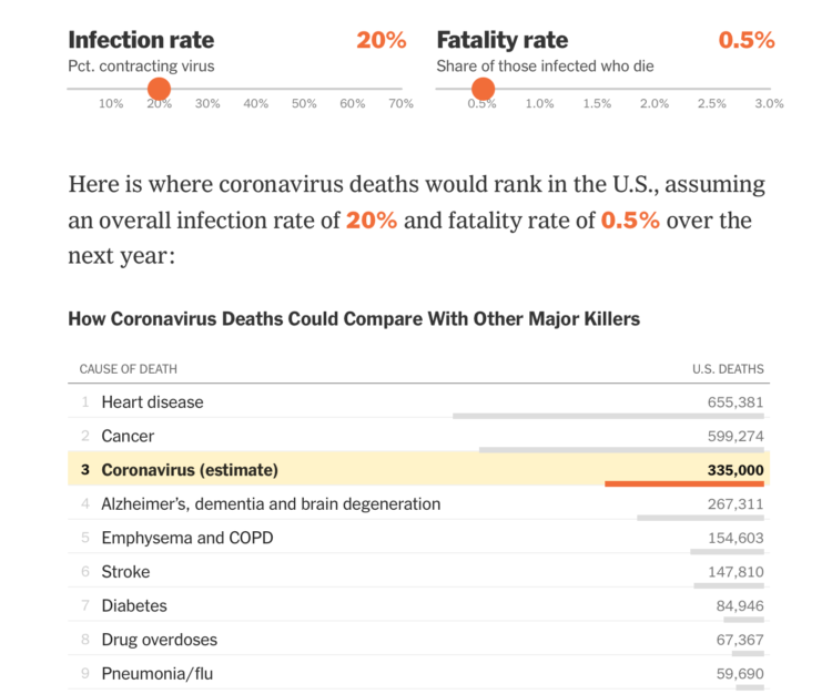
At the time of publication in mid-March, there was a wide range of possibilities, so The Upshot used a pair of sliders to let you change what happened when you changed the rates.
More recently, we’ve seen the comparison of confirmed Covid-19 deaths against the seasonal average. Here’s a chart from The Washington Post and the Yale School of Public Health:
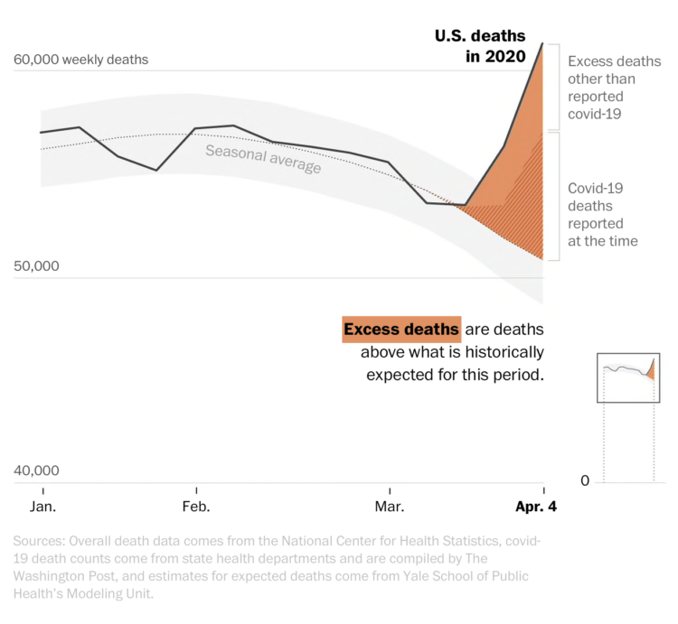
One of the challenges of making good estimates for coronavirus-related deaths is that the cause of death is sometimes not so straightforward. Some people might have pre-existing conditions. So some calculated excess deaths, which is total deaths minus Covid-19 and average deaths.
It could be a while, if ever, when we know the true numbers.
Shift in Daily Life
If you’re an essential worker, your life is probably more stressful than before. I hope you’re able to find some time to take a breath. Thank you for doing what you do.
More generally, priorities very obviously shifted during all of this. The shifts are visible from many angles.
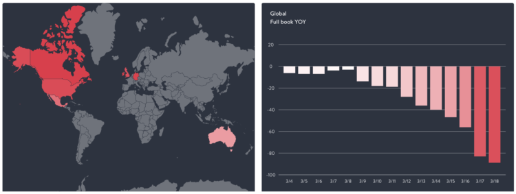
There was the change in consumer spending, as shown by Lauren Leatherby and David Gelles for The New York Times:
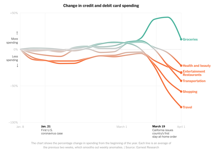
There was a lot more cooking at home and less of everything else, especially retail shopping and travel.
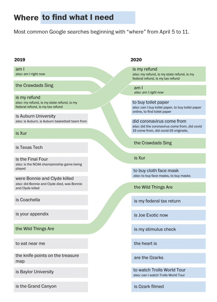
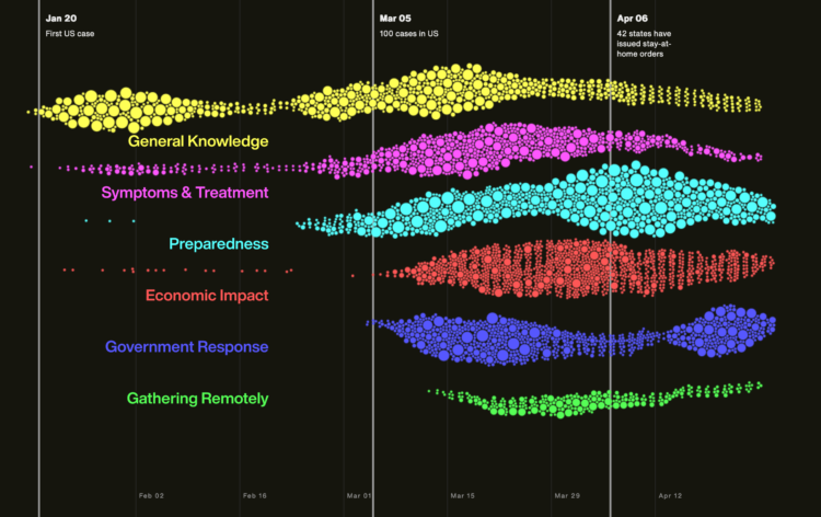
Popular Google searches went from school and events to all things coronavirus. For The Washington Post, Alyssa Fowers showed the changes:
The Google News Initiative and Axios also showed the change in search for specific search topics:
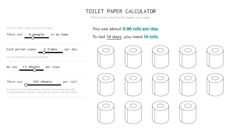
Heck, I even made a toilet paper calculator:
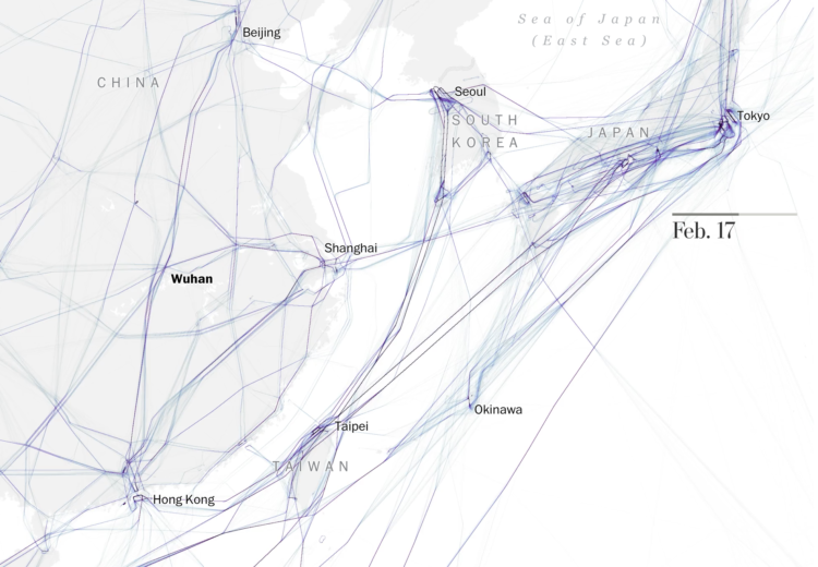
Stepping outside our home bubble, air travel of course went way down, as shown by The Washington Post:
The restaurant industry also took a big hit, which you can easily see in OpenTable’s reservation dataset:
Ugh.
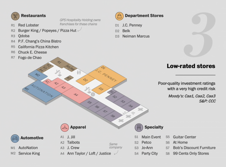
Major brands have also taken a hit. The Washington Post used a mall map metaphor to which ones are at risk:
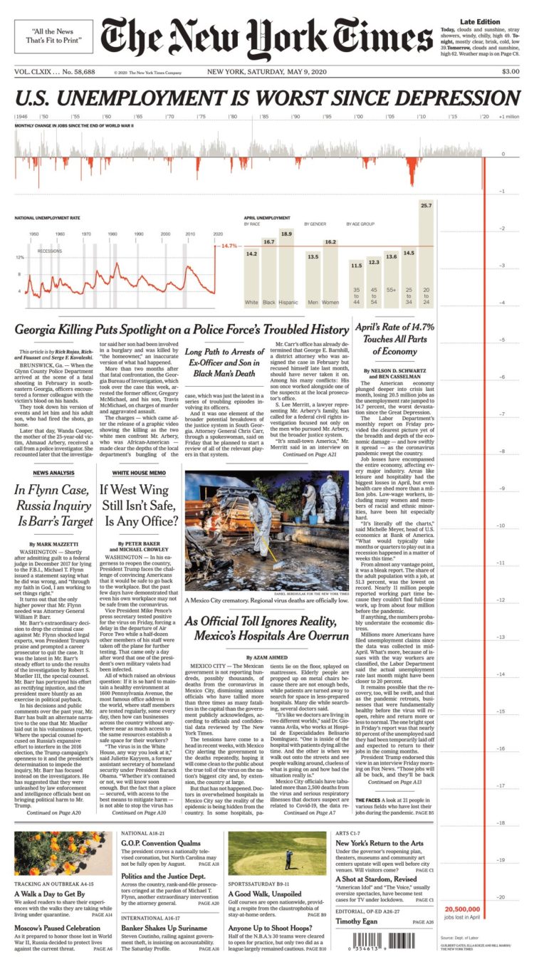
Then with so many businesses, such as restaurants, shutting down, unemployment rates came at unprecedented numbers. The New York Times front page made that obvious:
When you can start to see changes in seismic activity, you know something is up:

Here’s to hoping the curves find their way down.
Getting Back to (a Semblance of) Normal
I think most of us are eager to get back to how the day-to-day used to be. Even as an introvert and someone who has worked from home for years, I’m itching to sit down at a restaurant or go to a store without worrying about having to sanitize everything touched by human hands.
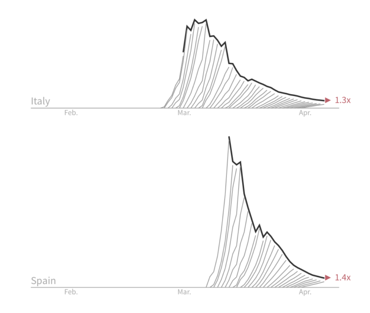
We have to use caution though. We have to make sure the data points in the right direction before we start gathering again. For Reuters, Jon McClure called it breaking the wave:
Getting back to “normal” also depends on whether there’s a vaccine. For NYT Opinion, Stuart A. Thompson looked at the hopeful timelines against the typical ones for a vaccine to become available:
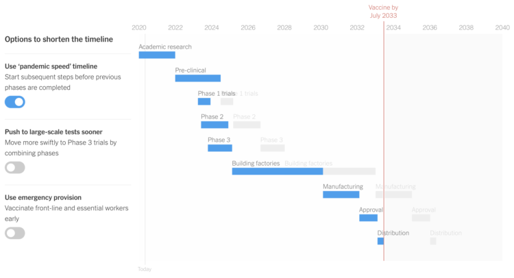
It might take longer than you think.
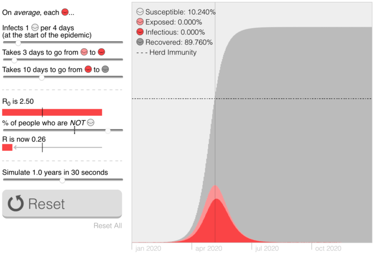
Marcel Salathé and Nicky Case made playable simulations, making an argument for contact tracing and staying at home:
Whether we’re ready to open or not, it looks like in some places things are starting up again.
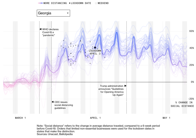
For Bloomberg, Mira Rojanasakul and Allison McCartney show the change in average distance traveled at the state level, compared against a 6-week period before Covid-19:
For The New York Times, Gabriel J.X. Dance and Lazaro Gamio looked at similar trends through the lens of recent movements that show people leaving home:
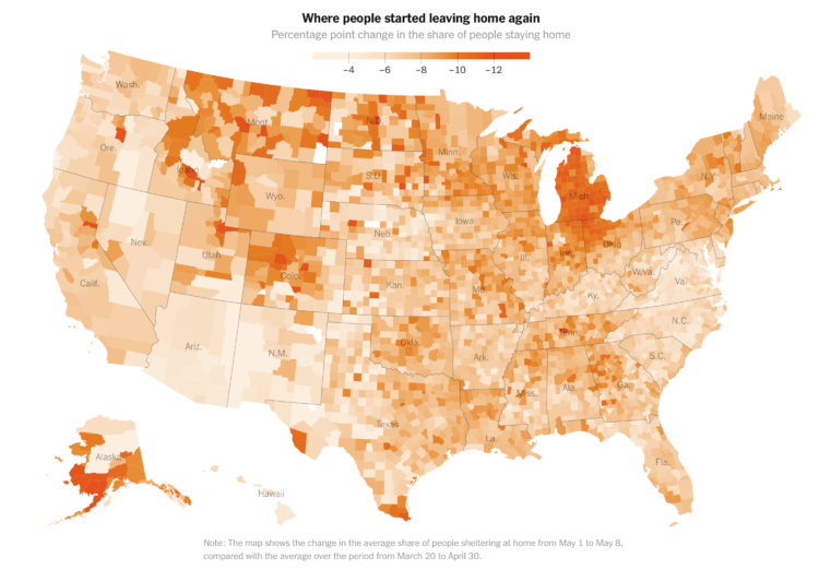
This map stresses me out.
I hope these are the right decisions, but I guess we’ll see soon enough.
Stay safe.
-Nathan
 Visualize This: The FlowingData Guide to Design, Visualization, and Statistics (2nd Edition)