The Microsoft Excel World Championship 2023 wrapped a couple weeks ago, and the…
Excel
-
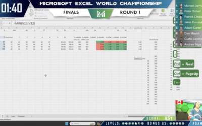
Excel World Championship
-
Python is coming to Excel
Excel is getting a bump in capabilities with Python integration. From Microsoft:
Excel… -
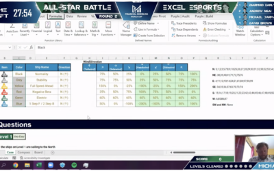
Spreadsheet esports
You’ve probably heard of esports, where people compete against each other in multiplayer…
-
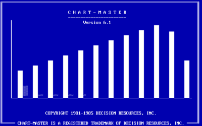
Charting software that pre-dates Excel
RJ Andrews digs up the PC archives of charting software. Scrolling through the…
-
Members Only
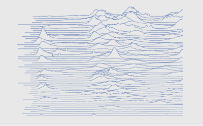
How to Make Frequency Trails in Excel
Also known as ridgelines, use the method to create a compact visualization where you can easily identify major patterns and outliers.
-
Members Only
How to Make Alluvial Diagrams
Here’s how to do it in R from start to finish, plus editing in illustration software. Make design choices and trade-offs for more readable charts.
-
Members Only
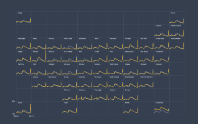
How to Make Small Multiples in Excel
Also known as trellis charts, lattice chart, or whatever you want to call them, the technique lets you compare several categories in one view.
-
Members Only
How to Make Marimekko Charts in Excel
Marimekko charts, or mosaic plots, allow you to compare categories over two quantitative variables.
-
Members Only
The Process 111 – Excel Limit
A row limit in Microsoft Excel led to an undercount of Covid-19 cases in the thousands. The root of the problem goes past the software though.
-
Excel spreadsheet limit leads to 16,000 Covid-19 cases left off daily count
Microsoft Excel is useful for many things, but it has its limitations (like…
-
Members Only
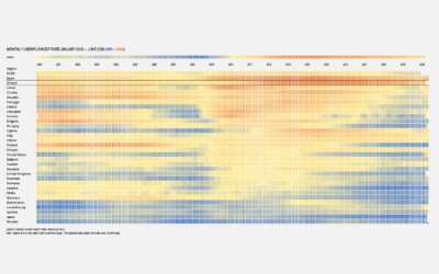
How to Make a Heatmap in Excel
Heatmaps quickly translate data tables into a visual form, making them a great tool to explore a new dataset.
-
Members Only
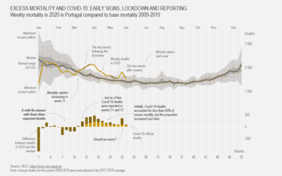
How to Make a Customized Excess Mortality Chart in Excel
Show current evolution against expected historical variability and add one or more series that could account for the difference.
-
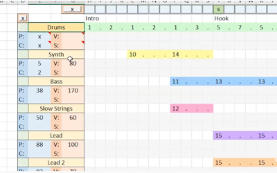
“Take On Me” by a-ha recreated in Excel
Dylan Tallchief recreated “Take On Me” by a-ha in Excel.
It’s not the… -
Members Only
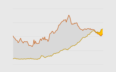
How to Make Difference Charts in Excel
Also known as a bivariate area chart, the plot type focuses on the comparison between two time series.
-

Making stupid Excel bar charts
I’m just gonna put this right here, from @_daviant: “Another day another stupid…
-
Members Only
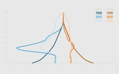
How to Make a Dynamic Multi-population Pyramid in Excel
Create better population pyramids that allow for improved comparisons between sexes and populations.
-
Members Only
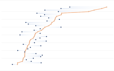
How to Make a Multi-Series Dot Plot in Excel
Easily compare multiple categories and spot differences between two or more series.
-
Cleaning your data with Excel and Google Spreadsheets
For Datawrapper, Lisa Charlotte Rost outlines the steps to prepare and clean your…
-
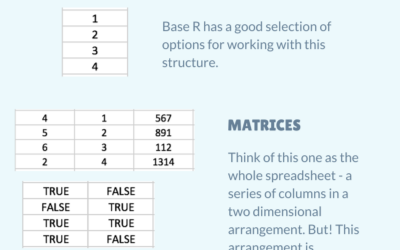
R data structures for Excel users
Introducing yourself to R as an Excel user can be tricky, especially when…
-

Microsoft Excel painter
Remember the artist Tatsuo Horiuchi who uses Microsoft Excel to paint scenery? Four…
Recently for Members
Second Edition
 Visualize This: The FlowingData Guide to Design, Visualization, and Statistics (2nd Edition)
 Visualize This: The FlowingData Guide to Design, Visualization, and Statistics (2nd Edition)
New tools, refined process.
Browse by Chart Type See All →


