• Membership
  • Newsletter
  • Projects
  • Learning
  • About
  • Member Login
  • Decline of key changes in popular music

    November 22, 2022

    Topic

    Statistics  /  Billboard, Chris Dalla Riva, keys, music, Tedium

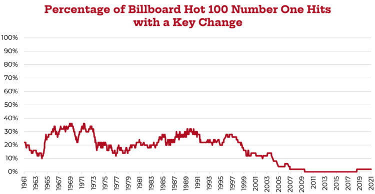
    Chris Dalla Riva analyzed key changes in songs that made the Billboard Hot 100, between 1958 and 2022. Key changes are near non-existent after 2010. The most interesting part is why:

    Thus, if you changed the key of “Juicy,” Biggie wouldn’t necessarily have to change how he raps, but if you changed the key of “Over the Rainbow,” Judy Garland would have to sing different pitches. If you picked the wrong key, those pitches might be outside of her vocal range. In short, key doesn’t matter as much in hip-hop.

    As hip-hop grew in popularity, the use of computers in recording also exploded too. Whereas the guitar and piano lend themselves to certain keys, the computer is key-agnostic. If I record a song in the key of C major into digital recording software, like Logic or ProTools, and then decide I don’t like that key, I don’t have to play it again in that new key. I can just use my software to shift it into that different key. I’m no longer constrained by my instrument.

    See also the increasing similarity of Billboard songs.

  • Shifts in European energy sources

    November 21, 2022

    Topic

    Statistical Visualization  /  energy, Europe, New York Times

    Mira Rojanasakul, for The New York Times, dug into current and historical energy sources in Europe. With the war in Ukraine, Russia cut off natural gas supplies to other countries, but based on estimates from Ember, it looks like the biggest shifts recently are in other energy categories.

    Monthly line charts are used for each country and energy source. Lines for previous years rest in the background in a light gray to serve as a point of comparison, whereas the lines for 2022 sit in the front with a bolder color and thicker width to indicate the point of interest.

  • $300b World Cup seen through satellite imagery

    November 18, 2022

    Topic

    Maps  /  Bloomberg, Qatar, satellite imagery, World Cup

    Qatar spent $300 billion with a ‘b’ over the past twelve years to host the World Cup. For Bloomberg, Simone Foxman, Adveith Nair, and Sam Dodge show what that money went towards through satellite imagery. The shift is striking with a transition from desert flat land to stadiums and high rises over a short period of time.

    These before-and-after satellite imagery pieces usually go the opposite direction, like after a natural disaster. So the sudden shift from nothing to a whole lot more is jaw-dropping.

  • Members Only

    Setting Axis Ranges

    November 17, 2022

    Topic

    The Process  /  axes, range

    Set the scales to highlight the changes in the data without abandoning the accuracy of the data.

  • All the parts of daily life in India controlled by Mukesh Ambani

    November 17, 2022

    Topic

    Infographics  /  illustration, India, Mukesh Ambani, Rest of World

    Mukesh Ambani has an estimated net worth of $90.7 billion, because his company controls many facets of Indian daily life:

    Ambani’s wealth comes from the enormous Reliance Industries conglomerate. Since taking over from his father, Ambani has turned Reliance — once known for textiles and petrochemicals — into a digital powerhouse. He’s grown the company’s reach through acquisitions and partnerships to reach retail, telecommunications, media, and so much more, creating an empire with unimaginable reach.

    The piece from Rest of World drives the point home with a stroll through illustrations that start with a single phone and keeps zooming out until you’re looking at the whole planet.

  • 8 billion population visualized

    November 16, 2022

    Topic

    Infographics  /  population, Washington Post

    Here’s a fun interactive from The Washington Post to earmark the world reaching 8 billion population. Enter age, country, and gender and you get a mosaic of quarter-circles, each representing 1 or 10 million people depending on the scale of the selected country’s population.

  • New Visualization in R Course, and Other Updates

    November 15, 2022

    Topic

    Site News  /  clarity, course, R

    I have two course-related updates on FlowingData. First, there’s a new course on visualizing data with R. Second, I updated the Visualization for Clarity course so that you can more easily get feedback from me on how to make a better chart.
    Read More

  • Sleuthing for birth dates, with just TikTok profiles as clue

    November 15, 2022

    Topic

    Data Sharing  /  notkahnjunior, privacy, TikTok

    TikTok user notkahnjunior figures out people’s birth dates through the psuedo-privacy of the internet. People give her their TikTok profile, and she takes it from there.

    @notkahnjunior Replying to @knoughpe ♬ original sound – kahn

    No special tools required. Just web searches coupled with interactions among those who don’t know or care about privacy on the internets. It seems too easy. But it is also entertaining.

  • Role of luck in football wins

    November 14, 2022

    Topic

    Statistical Visualization  /  football, luck, randomness

    NFL Football Operations calculated how much luck has contributed to team wins and losses this season. They considered four actions that involve a lot of randomness: dropped interceptions, dropped passes, missed field goals, and fumble recoveries. Then they took the difference between expected win probability and the chances of the actions to calculate lucky wins and losses.

    Normally I live in a football-free household, but someone joined a fantasy football league, which has a way of turning non-fans into obsessive stat checkers.

  • Exports through the Mississippi River

    November 11, 2022

    Topic

    Statistical Visualization  /  Bloomberg, drought, Mississippi, river

    Drought has caused water levels to drop in the Mississippi River, which is a problem when millions of tons of grain are moved for export via boat. Bloomberg Green breaks it down, including a flow-ish, river-like Sankey Diagram to show where grain exports go.

  • Deleting your tweets with R

    November 11, 2022

    Topic

    Coding  /  Julia Silge, R, Twitter

    Twitter isn’t in a great place right now, so maybe you want to do something with your account and your tweets. Julia Silge outlines how to delete your tweets with R:

    If you are looking to remove yourself from Twitter, you can delete your account, but I’ve seen some folks say a better initial move may be to delete the content from your account (perhaps including followers and following), and then take your account private or deactivate it. In this blog post, I’ll walk through how to use rtweet to automate some of these steps.

    Social media in general hasn’t been my thing for a few years now, so I’m not sure what I’m going to do, but you can find me on Mastadon. Or we can go back to blogs Xanga-style, and I’d be okay with that.

  • Members Only

    Using Visualization Feedback

    November 10, 2022

    Topic

    The Process  /  criticism, feedback

    The process of taking in visualization feedback to improve towards where you want to go.

  • Data Underload  /  age, time use, well-being

    Life Satisfaction and Age

    People were asked to score their life satisfaction from 0 to 10, where 10 is the best possible life and 0 is the worst possible life. This is the average score by age. It might be time to rethink life.

    Read More
  • Dashboard Design Patterns

    November 9, 2022

    Topic

    Design  /  dashboard

    Dashboards aren’t really my thing, but we’ve seen, especially over the past few years, that a quick view of data that is checked regularly for a current status can be useful in some contexts. Dashboard Design Patterns offers a collection of research, guidance, and cheatsheets for your dashboard designing needs.

  • History of wars and power in Europe, animated from 1500 to present

    November 8, 2022

    Topic

    Infographics  /  animation, Europe, war

    Agar.io is a multiplayer game where people control cells in a Petri dish-type environment. The animation above used the same visual metaphor to show power and war in Europe, from 1500 to 2022. Circles represent countries, and they split and collide with time.

    See also the history of America and East Asia in the same style.

  • Chance of rain and election turnout

    November 7, 2022

    Topic

    Maps  /  election, forecast, New York Times, weather

    There’s rain in the forecast tomorrow in some areas of the United States, which is worth noting because tomorrow is election day. Eve Washington and John Keefe, for The New York Times, picked out the overlap between competitive races and areas it’s likely to rain.

    Mainly I post for the A+ headline: “Will Rain Affect Turnout Tomorrow? The Answer Is Cloudy.” That, and I’m reminded of the ever important overlap between an eclipse and sasquatch sightings.

  • AI-based image generation ethics

    November 7, 2022

    Topic

    Statistics  /  AI, Andy Baio, art, ethics, Hollie Mengert, Stable Diffusion

    AI-based image generation is having a moment. Time some text and you can get a piece of art that resembles the style of your favorite artist. However, there’s an ethical dilemma with the source material. Andy Baio talked to Hollie Mengert, whose artwork was used to create a model for Stable Diffusion:

    “For me, personally, it feels like someone’s taking work that I’ve done, you know, things that I’ve learned — I’ve been a working artist since I graduated art school in 2011 — and is using it to create art that that I didn’t consent to and didn’t give permission for,” she said. “I think the biggest thing for me is just that my name is attached to it. Because it’s one thing to be like, this is a stylized image creator. Then if people make something weird with it, something that doesn’t look like me, then I have some distance from it. But to have my name on it is ultimately very uncomfortable and invasive for me.”

    AI-generated charts are only tangentially a thing so far. We humans still have a leg up in the context and meaning part of understanding data.

  • Procedurally generated driving game

    November 4, 2022

    Topic

    Data Art  /  driving, game, procedural

    Sometimes you need to slow down and go on a drive with no destination. Slow Roads by anslo is a procedurally generated game that lets you do that. Choose the scene, the road complexity, the weather, the time of day, planet, and vehicle. Then just drive.

  • Members Only

    The Process of Choosing the Better Chart

    November 3, 2022

    Topic

    The Process  /  chart types

    This is how I pick charts.

  • Daylight saving time and circadian rhythms

    November 3, 2022

    Topic

    Infographics  /  daylight saving, illustration, sleep, Washington Post

    Daylight saving time ends in the United States this weekend and ended already in other places. This can only mean one thing, which is that we must hem and haw about whether to shift our clocks or not. Aaron Steckelberg and Lindsey Bever, for The Washington Post, illustrated the sleep challenges that arise when we have to change measured time, which is easy to shift with button presses, against our less malleable internal time, which is more in tune with sunlight.

    Scrolling through, it started to feel like too many layers on top of that clock, but my main takeaway, and I think we can all agree on this, is that we should all get to sleep and wake whenever we want. Boom, problem solved.

  • Page 51 of 392
  • <
  • 1
  • ...
  • 48
  • 49
  • 50
  • 51
  • 52
  • 53
  • ...
  • 392
  • >

Analyze, visualize, and communicate data usefully, beyond the defaults.

Become a member →

Recently for Members

May 8, 2025
When the data is not what it seems

May 1, 2025
Finding the Right Charts

April 24, 2025
Visualization Tools, Datasets, and Resources – April 2025 Roundup

April 17, 2025
Breaking Out of Chart Software Defaults

April 15, 2025
Line Chart with Decorative Neon Accents

Browse by Chart Type See All →

Streamgraph Grid Map Beeswarm Choropleth Map Bar Chart Race Box Plot Network Graph Area Chart Scatter Plot Spiral Chart

Browse By Topic

  • Visualization

    Seeing data

  • Maps

    Seeing geographic data

  • Infographics

    Explaining data

  • Networks

    Connecting data

  • Statistics

    Analyzing data

  • Software

    Working with data

  • Sources

    Getting data

  • Design

    Making data readable

Get the Book

Visualize This: The FlowingData Guide to Design, Visualization, and Statistics

Available now.

Order: Amazon / Bookshop

Made by FlowingData

  • The Process

  • Data Underload

  • Chart Everything

  • Guides

  • Books

  • Shop

  • About
  • Contact
  • Newsletter
  • LinkedIn
  • Instagram
  • Bluesky
  • RSS
Copyright © 2007-Present FlowingData. All rights reserved.