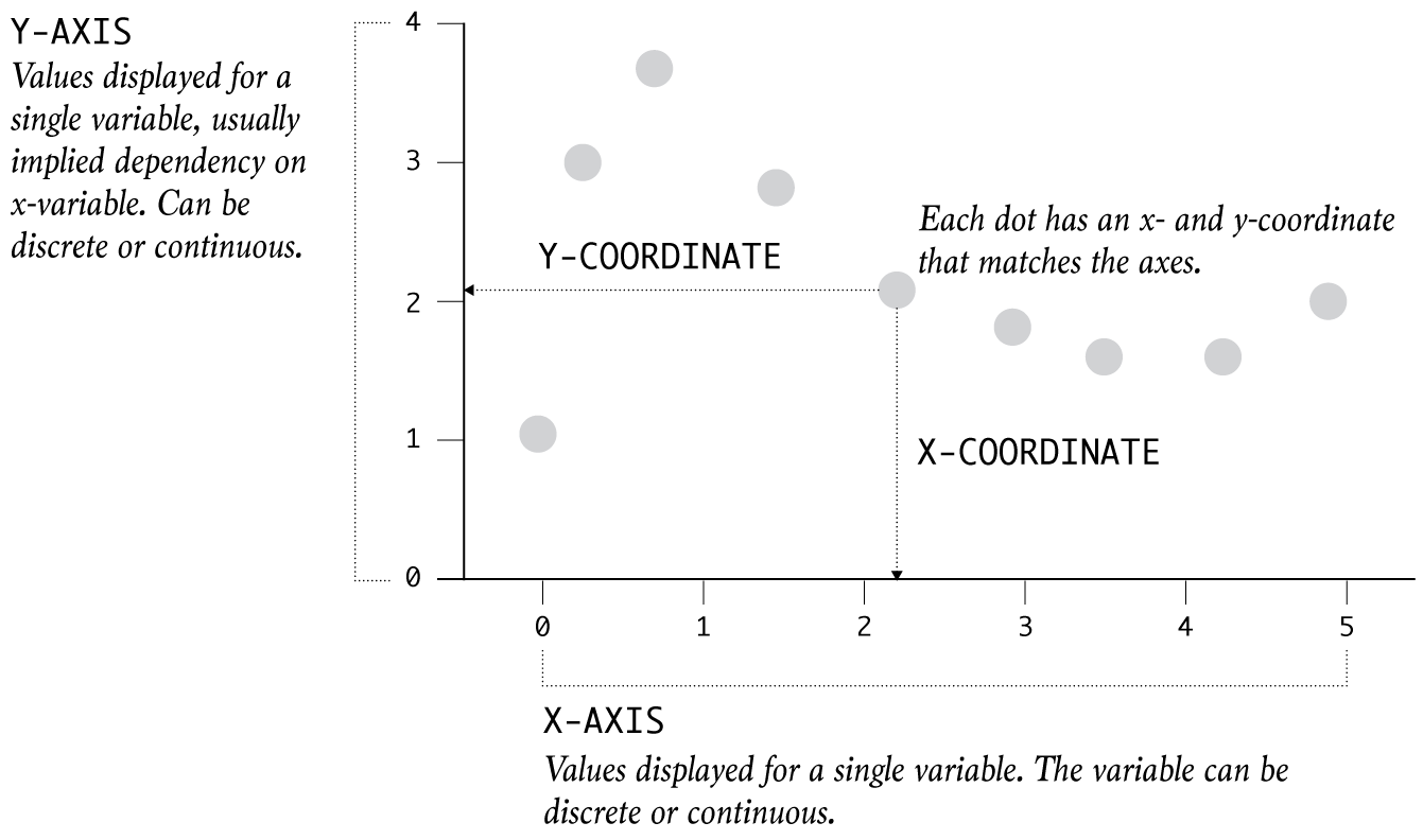
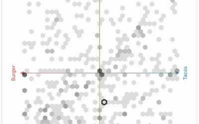
Dots are placed in an x-y coordinate system, based on two variables. The plot is often used when it is thought that the variables are correlated.
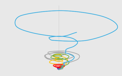
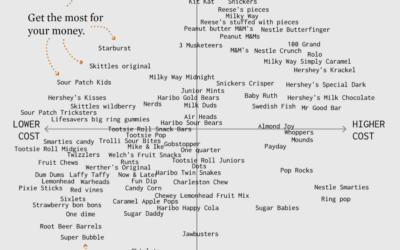
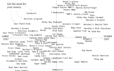
It looks like a tornado. It's messy. It's circular. It almost looks intentionally confusing. But how bad is it really?
Let's work through a practical example to see how asking and answering questions helps guide you towards more focused data graphics.
The combination of a time series chart and a scatter plot lets you compare two variables along with temporal changes.
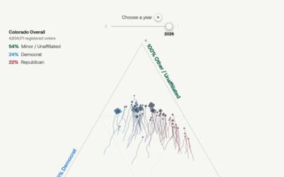
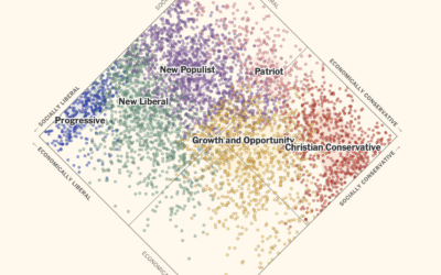
U.S. voters have historically stuck with two political parties, but that’s changing in…
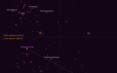
Some occupations have more turnover than others. See how it varies for your occupation and others.
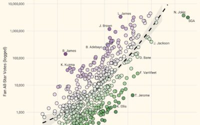
NBA all-star voting is mostly for the fans, which means some players can…
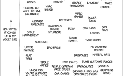
xkcd charted topics that seemed like they’d come up often with grown ups…
In the United States, a two-party system means that candidates, who are supposed…
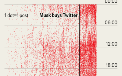
Not to dwell on Musk, but I was reminded of this dot plot…
Some jobs require a lot of standing, crouching, and climbing, whereas other jobs…
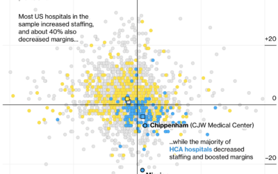
Many hospitals in the United States are for-profit, which itself is not a…
I made a chart about Halloween candy. Even dumb charts need attention and require that choices are made.
This is very important. How did your favorite candy rate?
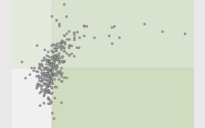
PerThirtySix made a communal plot that asks for your opinion via scatterplot and…
For NYT’s The Upshot, Aatish Bhatia and Emily Badger model how colleges might…
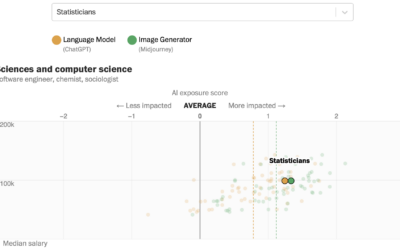
Research by Edward W. Felten, Manav Raj, and Robert Seamans provides estimates for…
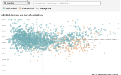
For the San Francisco Chronicle, Nami Sumida shows admission rates at University of…
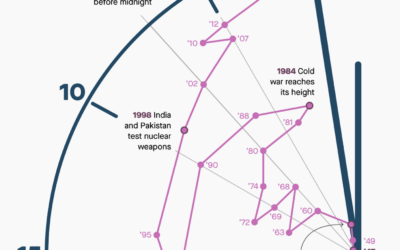
The Doomsday Clock is a metaphorical clock that symbolizes a catastrophic end to…
There are things that make us happy. There are things where we find meaning in the everyday. What are the things that give us both?