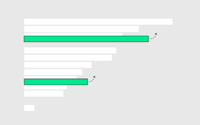
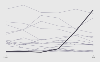
The standard bar chart is animated to show rankings and change over time. The alternative is a multi-line chart.
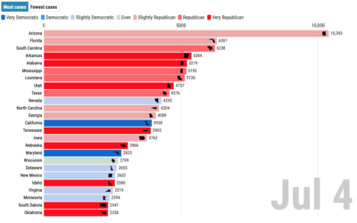
The dataisbeautiful subreddit announced a moratorium on the ever popular bar chart race. The frequency of submissions that used the method got out of hand and spam made it all the less savory. Still, the method holds value.
There's a new hotness in chart town. It's a bar chart. But it moves to show rankings over time.
In high school, we spend most of our days with friends and immediate family. But then we get jobs, start a family, retire, and there's a shift in who we spend our days with.
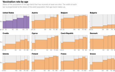
Elian Peltier and Josh Holder for The New York Times highlight the vaccination…
From Dan Goodspeed, the bar chart race is back. The length of the…
How do couples meet now and how has it changed over the years? Watch the rankings play out over six decades.