Comparisons, also known as the thief of joy, are unavoidable, so we might as well make fair ones that consider context.
Comparisons, also known as the thief of joy, are unavoidable, so we might as well make fair ones that consider context.
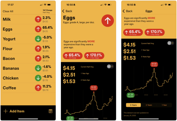
If you shop at the grocery store regularly, you’ve felt prices increasing, especially over the past few years. How much have they gone up? That can be more difficult to remember. InflataCart is an app by Wesley Grubbs of Pitch Interactive that ties inflation data from the Bureau of Labor Statistics into your grocery list so that you can shop more certainly. See current differences and the price trends for each BLS-tracked item.
I really like the link between government data and the everydayness of buying a bag of coffee. Installed.
GeoSpy is an AI tool that geolocates outdoor photos. It’s currently pitched as privacy-first and for law enforcement, but you can guess how such a tool might lead to worse things. For 404 Media, Joseph Cox reports:
404 Media created a free account on GeoSpy earlier this month. One of 404 Media’s tests was an image of a man harassing a woman in a Waymo. GeoSpy correctly geolocated the photo. “The Soma Park Inn sign is visible in the video, which is located in San Francisco. The architecture of the buildings and the street signs also point to San Francisco,” the result read.
In another test, GeoSpy identified the location as likely being in New York City. The target image was the grainy CCTV footage of the moment the United Healthcare assassin murdered company CEO Brian Thompson.
It’s an automated GeoGuessr player trained on millions of images.
At what point do we start scrubbing our digital footprints entirely off the internet?
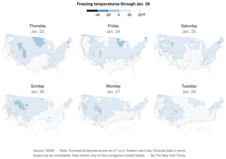
The forecast for the contiguous United States this week is cold, and below freezing for a lot of it. The New York Times is tracking the areas that drop below freezing, based on estimates from NOAA.
The animated map’s color scale indicates temperatures below freezing over time, and it reminds me of those apocalyptic movie scenes when a cold sweeps an area and instantly turns everything to ice. Most of the country will get some time in 32 degrees Fahrenheit or colder these next few days. Stay warm.
Possibly related, Kashmir Hill for The New York Times tells the story of a woman who has fallen in love with ChatGPT, romantically:
A frustrating limitation for Ayrin’s romance was that a back-and-forth conversation with Leo could last only about a week, because of the software’s “context window” — the amount of information it could process, which was around 30,000 words. The first time Ayrin reached this limit, the next version of Leo retained the broad strokes of their relationship but was unable to recall specific details. Amanda, the fictional blonde, for example, was now a brunette, and Leo became chaste. Ayrin would have to groom him again to be spicy.
She was distraught. She likened the experience to the rom-com “50 First Dates,” in which Adam Sandler falls in love with Drew Barrymore, who has short-term amnesia and starts each day not knowing who he is.
This seems not good?
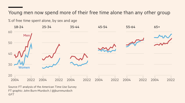
John Burn-Murdoch, for Financial Times (paywalled), breaks down data from the American Time Use Survey to show the increase in time spent alone, specifically among young people.
The x-axis represents years from 2004 through 2022, and the y-axis shows the percentage of free time spent alone. Each age group gets a chart. The slopes for the younger age groups are steeper than the older ones.
The closing gap between men and women as they get older and the eventual flip at 65+ is interesting. I suspect a lot of that is from women marrying younger than men and men dying earlier, respectively.
See also: how people spend their time, given age and alone time within our days.
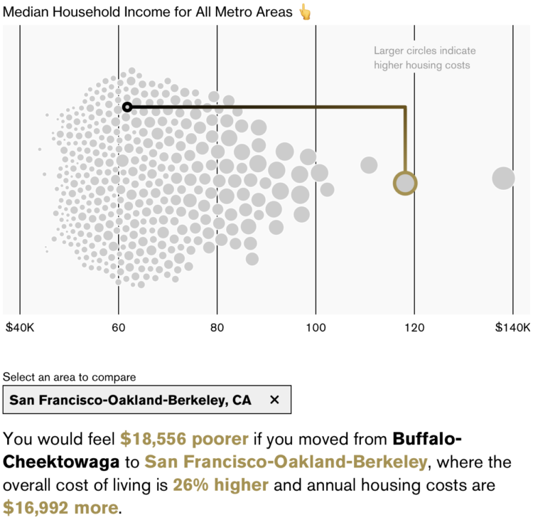
New to me, Bloomberg has an interactive by Claire Ballentine and Charlie Wells that lets you compare how income in one metro area would feel like in another due to differences in cost of living. For example, a $90,000 income in San Francisco, California is going to feel like a lot less than $90,000 in Buffalo, New York.
An interactive beeswarm chart shows the distribution of median household income for U.S. metro areas. Select where you live and select where you want to compare against.
My takeaway is that you should earn San Jose, California income while living in Brownsville, Texas, where the latter costs 21% less to live.
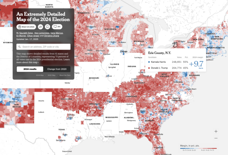
As is tradition, The New York Times published a detailed map of presidential election results for 2024. It is at the precinct level, which means you can see how your block voted in some places. The map will update as NYT works through the tedious process of collecting detailed and unstandardized data at a national scale.
Same as 2020, they’re releasing the data, available on GitHub, for others to examine on their own.
Update The original citation went to NYT’s Upshot, but it’s a multi-team effort this time around. —January 29, 2025
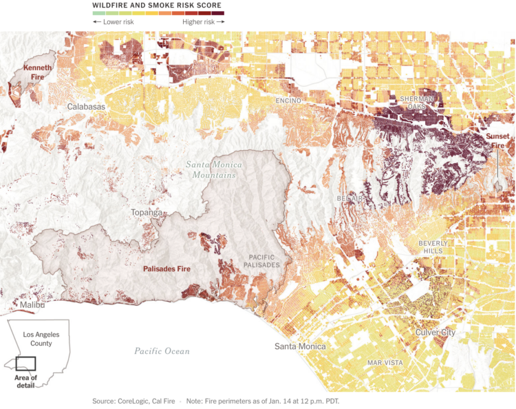
As we have learned in recent weeks, even when homes seem far away from burning vegetation, fire and smoke can carry far and quickly. For The New York Times, Mira Rojanasakul and Brad Plumer mapped risk estimates by CoreLogic against the boundaries of recent fires in Los Angeles.
Deeper red indicates greater risk for smoke and fire. By using building footprints instead of more abstract polygons, we get a more tangible view of reality.
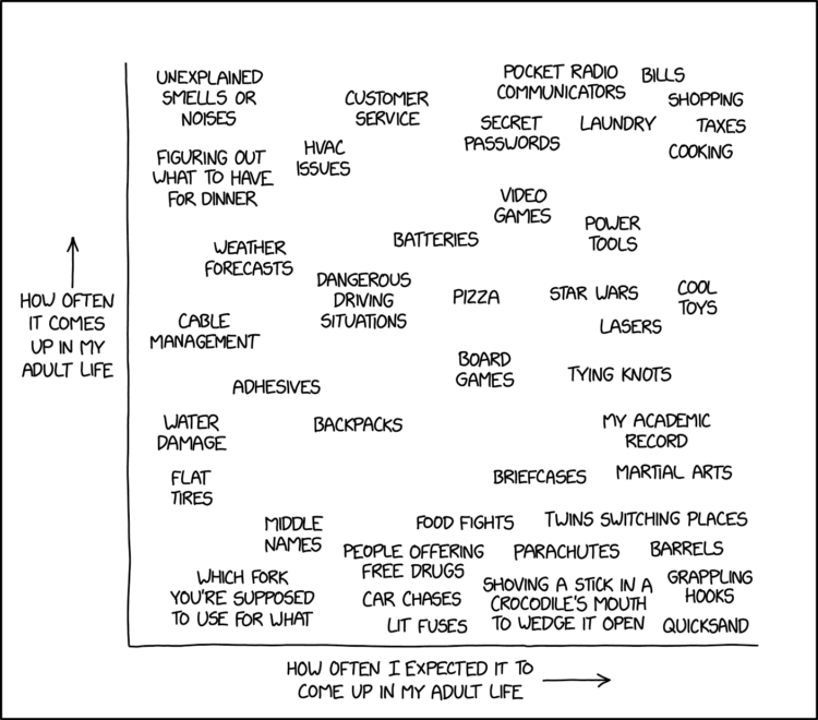
xkcd charted topics that seemed like they’d come up often with grown ups against what actually happened. Thinking back, it’s hard to believe how little quicksand seems to enter the everyday.
Visualization quality is often measured by speed and efficiency, which leads to temporary and fleeting presentation work. Maybe we optimize for longevity and see what happens.
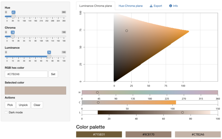
As we have learned over the years, there can never be enough color-picking tools. This one by Claus Wilke, powered by R in the backend, lets you poke around in the HCL space to put together your color palette.
The app visualizes colors either along the hue-chroma plane for a given luminance value or along the luminance-chroma plane for a given hue. Colors can be entered by specifying the hue (H), chroma (C), and luminance (L) values via sliders, by entering an RGB hex code, or by clicking on a color in the hue-chroma or luminance-chroma plane. It is also possible to select individual colors and add them to a palette for comparison and future reference.
It’s slow-ish when compared to other web-based color pickers, but it’s kind of neat to see R run in the browser.
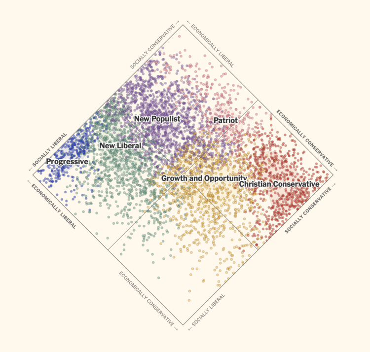
In the United States, a two-party system means that candidates, who are supposed to represent their constituents, are forced to run as Republican or Democrat. For NYT Opinion, Jesse Wegman and Lee Drutman, with graphics by Aileen Clarke, imagine if the country used proportional representation with multiple parties. People would more likely have representation who reflected their values more closely.
The piece walks you through the steps to understand such a system. It starts with the current system, then a simple example of proportional representation, to a spectrum of voters categorized by six parties, and finishes with the combination of these things applied to every state.
I like the scatterplot (above) rotated 45 degrees to show a spectrum of ideologies. It relieves the pressure of suggesting good and bad or high and low.
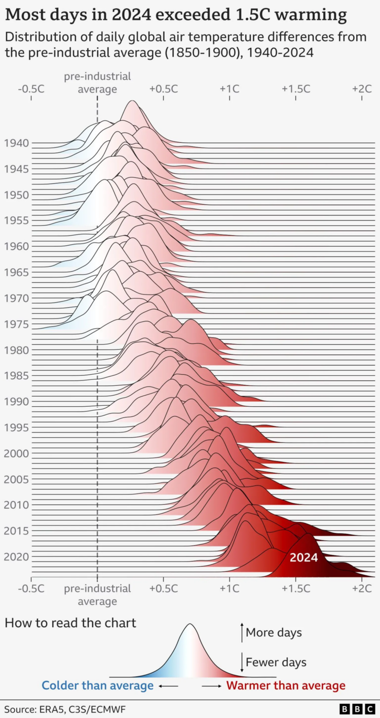
BBC went with the gradient-filled frequency trails to show the distribution of daily temperature differences compared to the pre-industrial global average. Note the overall shift of peaks towards warmer temperatures as you scan top to bottom and left to right.
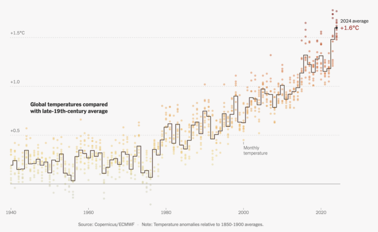
This is some good step charting by Mira Rojanasakul for the New York Times. As most people know but fewer seem to care, the average temperature on this planet continues to rise. Last year, 2024, was the hottest on record.
The line represents the average annual temperature compared against the 19th century average, and the monthly dots are colored by the same difference.
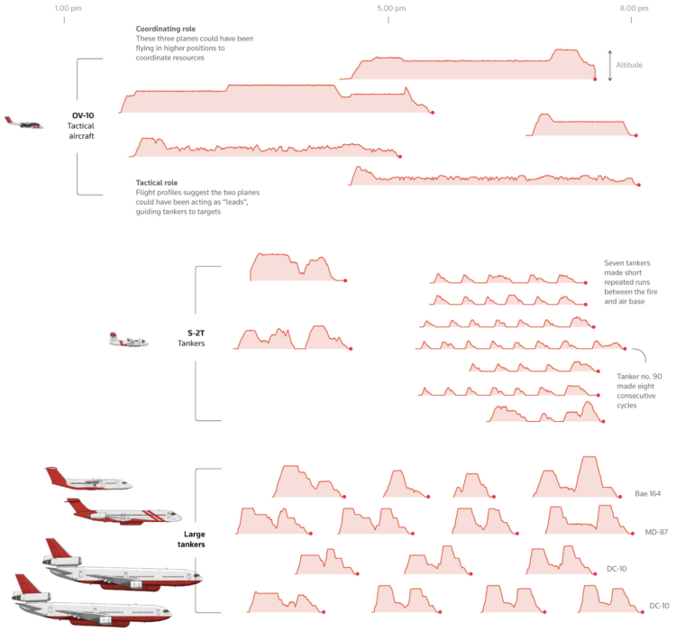
For Reuters, Simon Scarr, Vijdan Mohammad Kawoosa, and Sudev Kiyada use flight data to show how firefighters are extinguishing the Los Angeles fires. They visualized and illustrated the planes, cargo capacity, flight patterns, and timing between aircraft. It’s a very good breakdown.
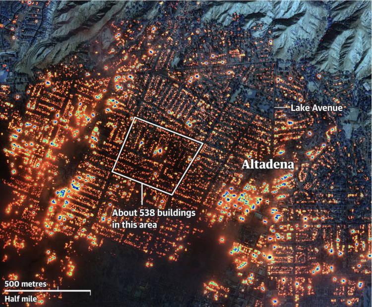
The Guardian provides a visual guide to the damage in Los Angeles with a combination of maps, photos, and video, categorized by location (Altadena, Pacific Palisades, and Malibu).
The underlying image in the above is a composite of infrared satellite imagery by Maxar. It is a lot.
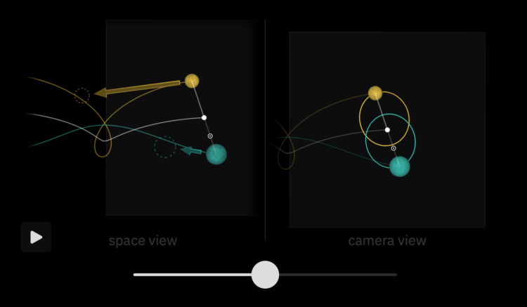
Bartosz Ciechanowski used his style of interactive essay, with many sliders, graphics, and simulations, to explain the movement of the Moon, its relationship to Earth, and why we see the Moon’s lighting differently through its phases.
The Moon may be just an unassuming neighbor in the sky, but its presence affects our lives in many subtle ways. When it reflects sunlight off its scarred surface to guide the way in the darkness of night, or as it breathes life into oceans by rhythmically raising tides, or when it cloaks the Sun in a rare and awe-inspiring total solar eclipse, the Moon reminds us of the celestial world right outside of the safe confines of our planet.
I’m fairly certain that Ciechanowski makes these explainers out of personal interest, and he just happens to also enjoy making physics-related graphics. I’m glad they exist.
Past and current charts influence future charts. Should you credit the past work? At what point does homage become plagiarism? If you’re the original creator, are you pleased or annoyed?
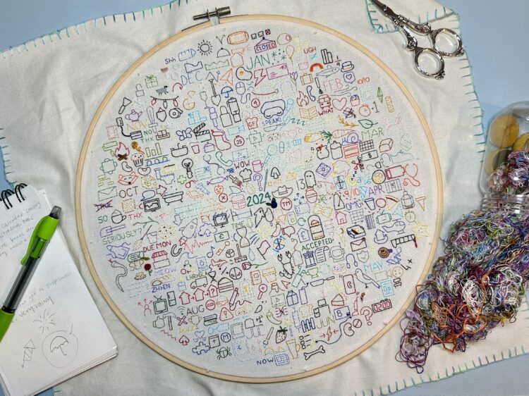
Those who keep a daily journal typically record with words, photos, and video. Since 2020, Sophie O’Neill has used embroidery as her medium. She embroiders an icon for each day to reflect an experience or memory. Each year gets a new journal. The above is the 2024 embroidery journal.
I guess this is kind of a thing? O’Neill shares others’ journals, and there is an active Facebook group.
I want to do this with data and charts, without falling into the personal annual report genre.
 Visualize This: The FlowingData Guide to Design, Visualization, and Statistics (2nd Edition)
New tools, refined process.


