BBC went with the gradient-filled frequency trails to show the distribution of daily temperature differences compared to the pre-industrial global average. Note the overall shift of peaks towards warmer temperatures as you scan top to bottom and left to right.
Distribution of days that were hotter than average
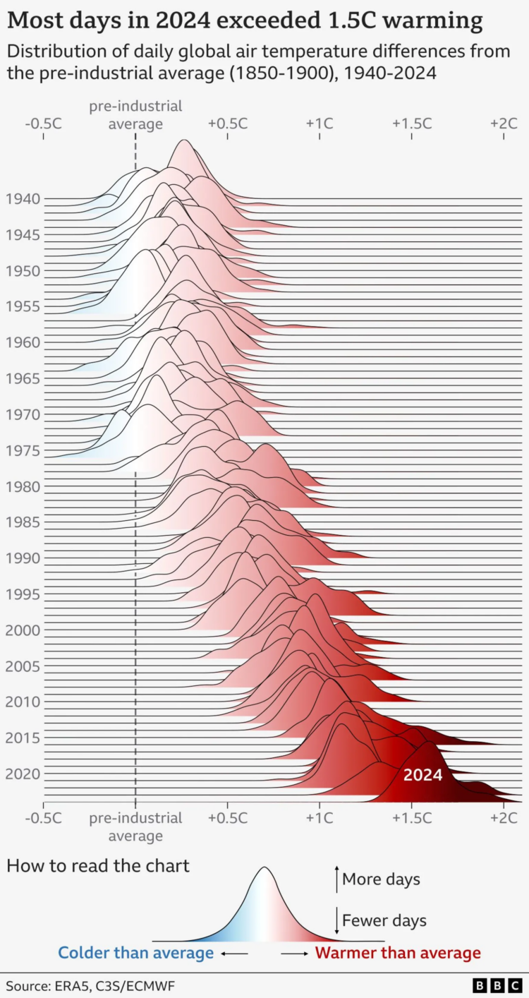
Chart Types Used


Second Edition
 Visualize This: The FlowingData Guide to Design, Visualization, and Statistics (2nd Edition)
 Visualize This: The FlowingData Guide to Design, Visualization, and Statistics (2nd Edition)
New tools, refined process.