Who is Older and Younger than You

Everyone seems old when you’re a kid. People tower over you and do things you can’t even fathom, like walk on just your feet. In high school, elementary school students look like babies, and college kids seem way more mature than they actually are. After college, the ideas of old and young start to get kind of fuzzy, especially a decade out, as I can tell you first-hand.

That feeling got me to thinking. How many people are still older than me? Who’s younger? I found out.

Based on the 5-year American Community Survey estimates from 2014, just over half of the US population was born before me. It’s just a couple of more years until I’m older than the majority of the population. Gulp.

Of course, my 50-year-old self is going to look back at this and laugh at how stupid I am.

This is your life.
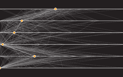
Years You Have Left to Live, Probably

Time is limited. Make the most of it, regardless of your age.

Nerd Notes

  • Data comes from the 2014 American Community Survey, 5-year estimates, which I pulled from the Integrated Public Use Microdata Series.
  • Analysis and tabulation was done in R and the interactive chart was made with d3.js.

Become a member. Support an independent site. Make great charts.

See What You Get

Learn to Visualize Data See All →

How to Make Variable Width Bar Charts in R

The code to create these bar chart variations is almost the same as if you were to make a standard bar chart. But make sure you get the math right.

How to Map and Use GeoTIFF Files in R

It’s like working with a bunch of tiny dots, and oh look, all of sudden patterns emerge.

Making an Interactive Map with Category Filters

Let readers focus on the regions they care about to make their own comparisons and conclusions.

Build Interactive Area Charts with Filters

When you have several time series over many categories, it can be useful to show them separately rather than put it all in one graph. This is one way to do it interactively with categorical filters.

Favorites

Jobs Charted by State and Salary

Jobs and pay can vary a lot depending on where you live, based on 2013 data from the Bureau of Labor Statistics. Here’s an interactive to look.

Reviving the Statistical Atlas of the United States with New Data

Due to budget cuts, there is no plan for an updated atlas. So I recreated the original 1870 Atlas using today’s publicly available data.

Unemployment in America, Mapped Over Time

Watch the regional changes across the country from 1990 to 2016.

19 Maps That Will Blow Your Mind and Change the Way You See the World. Top All-time. You Won’t Believe Your Eyes. Watch.

Many lists of maps promise to change the way you see the world, but this one actually does.