Government data is, shall we say, not the easiest to use and look…
-
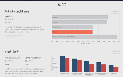
Data USA makes government data easier to explore
-

A visual recreation of the Porsche driving experience
This is beautiful work by digital art and design studio onformative. They recreate…
-

A Week with the WeMo Insight Switch
The WeMo Insight Switch from Belkin lets you remotely control a power outlet…
-
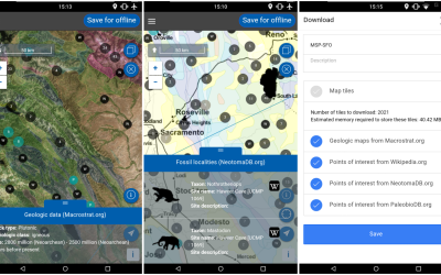
Flyover Country app tells you about the ground beneath as you fly
Before your next flight, road trip, or hike, download the Flyover Country app…
-

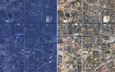
Changing river path seen through satellite images
Sedimentary geologist Zoltan Sylvester downloaded Landsat data using Earth Explorer and strung together…
-
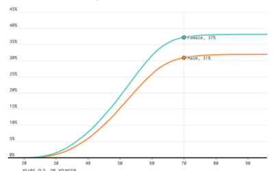
Divorce Rates for Different Groups
We know when people usually get married. We know who never marries. Finally, it’s time to look at the other side: divorce and remarriage.
-

Data Proofer automates the data checking process
Data checking is a pain and can be what stands between you and…
-
Practical guide for color correction of satellite images
Robert Simmon provides a hands-on guide to get true color from satellite imagery.…
-
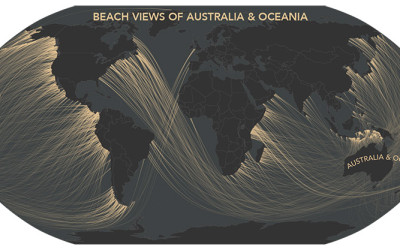
Coastline across the ocean, from where you’re standing
A couple of years ago, Eric Odenheimer wondered: If you stand on the…
-
Stephen Curry statistical dominance
Robert O’Connell for the Atlantic ponders basketball analytics and the rise of Stephen…
-
Visualization Books in the Queue
I don’t read visualization books nearly as much as I wish I did,…
-

Weather data basket weaving
“Weather data is this endless box of LEGO pieces that arise every day.…
-
Comparing ggplot2 and R Base Graphics
Figure out which is best with a side-by-side comparison.
-

Tarot cards for complex network concepts
Peter Dodds teaches a course on complex networks, and he put together a…
-
Link
What we’ve learned about sharing our data analysis →
“If an article includes our own calculations…then you should be able to see—and potentially criticize—how we did it.”
-
Link
Ye Olde Pie Chart Debate →
The arguments over pie charts dates back to 1914.
-
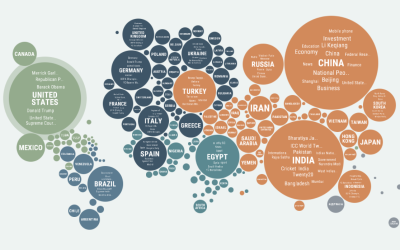
Regional news coverage around the world
Popular news topics change depending on where you are, as what’s important to…
-
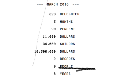
Counting the numbers in the news
Truth & Quantity by Gregor Hochmuth is what happens when you strip out…
-
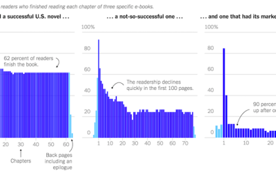
How people read books
Jellybooks is an analytics company that evaluates how people read book, in a…
-
Members Only
Adding Legends in R
Make sure you explain your visual encodings so that others can interpret them.
Recently for Members
Second Edition
 Visualize This: The FlowingData Guide to Design, Visualization, and Statistics (2nd Edition)
 Visualize This: The FlowingData Guide to Design, Visualization, and Statistics (2nd Edition)
New tools, refined process.
Browse by Chart Type See All →


