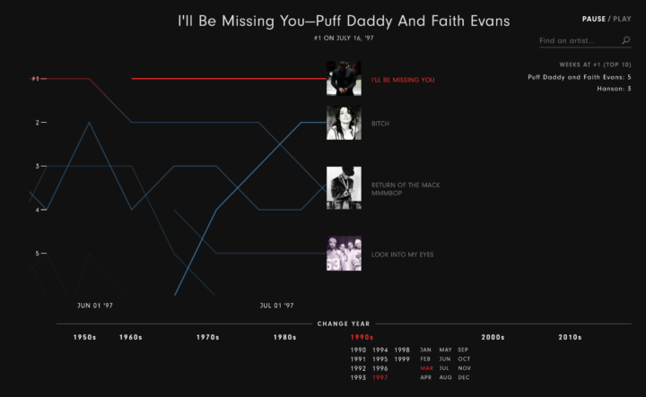
The Year that Music Died from Polygraph is an animated timeline that shows the Billboard top 5 songs since 1956, all the while playing the top song during a given week.
The visualization itself is fairly straightforward, but I like how everything shifts so smoothly. Artist thumbnails move up and down matching their position on the music chart, the number one songs play without sounding jerky, and a counter on the right keeps track of total weeks at number one per artist. [via Waxy]
 Visualize This: The FlowingData Guide to Design, Visualization, and Statistics (2nd Edition)