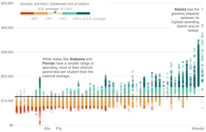
Wrapping up their week-long School Money project, NPR asks: Is there a better way to pay For America’s schools? The story leads with the chart above, which shows per student spending by district and state. Each dot represents a district, and each column represents a state. States are sorted by per student median spending.
So, you can see the spread in distribution for your state and how it compares to others, while the black baseline, plus color encoding, provides a point of reference against the national average.
Compare this with the map NPR started the education week with, which was the same data. Same data. Difference focus.
Then look at the New York Times’ recent work. It also charts per student district spending (from a different analysis) but also introduces race and educational attainment. Again, similar numbers here with similar sentiments, but the stories are different.
My main point: You can “let the numbers speak for themselves”, but you still have to translate.
 Visualize This: The FlowingData Guide to Design, Visualization, and Statistics (2nd Edition)