Working Parents

The role of mothers and fathers continues to evolve, as more of the former go to work and more of the latter (to a lesser degree) take care of household responsibilities. We saw the distribution shifts over the years. Now let’s zoom in on the present and the balance between household work, childcare, and paid work, and what that looks like for mothers and fathers.
Using data from the American Time Use Survey, from 2010 through 2014, we can estimate the number of hours parents put in on a random work day. From there, we can see the percentage of parents who work as much or more than we do. The interactive below lets you put in your own thresholds to make your own comparisons.
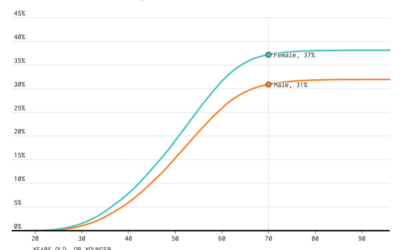
For example, about 40 percent of mothers, with at least 2 kids, take care of the household and children for at least 3 hours. Compare that to the 19 percent of fathers. On the other hand, when you look at parents with at least one kid, do at least an hour of household work and childcare in a day, and do paid work for at least 8 hours, you get 26 percent for mothers and 37 percent for fathers.
Starting at the beginning — those with at least one kid and both household/childcare and work set to zero — you get all mothers and fathers. Both 100 percent. Increase household work, and you see a quick drop for fathers and a lesser drop for mothers, showing the higher percentage of stay-at-home moms.
Introduce more work hours. The percentages start to balance out, suggesting a more even split of responsibilities when both parents work. This surprised me a bit, as I expected a higher percentage for mothers than for fathers, but I guess there are only so many hours in a day.
Personally, I’m more interested in the individual values that match my workload. With number two on the way, I’ll take any inkling that the balance between work and parenting won’t drive me totally nuts in these early years.
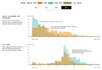 Shifting Parent Work Hours, Mom vs. Dad
See the change in responsibilities from 1965 to 2014.
Nerd Notes
- Data comes from the American Time Use Survey. I downloaded it from the American Time Use Survey Data Extract System, which is maintained by the University of Minnesota. If you’re interested beyond aggregates, use this to get the microdata. It’s way easier.
- Only parents who were 15 or older between 2010 and 2014 were counted for these percentages. I only look at survey responses for weekdays for a more accurate idea of work hours.
- Analysis and tabulation was in R. The interactive was made with d3.js.
Chart Type Used

Become a member. Support an independent site. Get extra visualization goodness.
See What You Get