• Membership
  • Newsletter
  • Projects
  • Learning
  • About
  • Member Login
  • Total refugees from Ukraine, compared to other countries

    March 23, 2022

    Topic

    Statistical Visualization  /  New York Times, refugees, scale, Ukraine, war

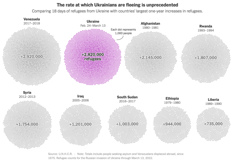
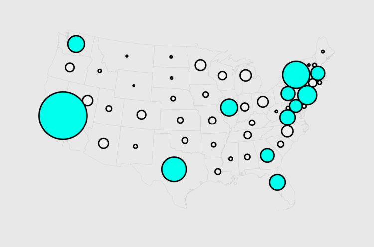
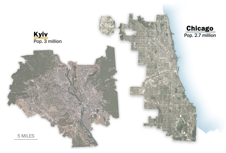
    Millions of Ukrainians (over three million as of this writing) have left their homes for other countries in a relatively short period of time. Sara Chodosh, Zach Levitt and Gus Wezerek for NYT Opinion put the total as of March 13 into perspective. Over just an 18-day period, Ukraine refugee counts have surpassed counts during those of other refugee crises over one-year periods, since 1975.

  • Data Underload  /  childcare

    Who Takes Care of the Kids, By Household Income

    Childcare is expensive in the United States. So as you would expect, higher-income households tend to use non-parental childcare more, whereas lower-income households tend more towards only parental care. Here are the percentages, based on 2019 estimates from the National Center for Education Statistics.

    Read More
  • Imports to Russia from countries that imposed sanctions and not

    March 22, 2022

    Topic

    Statistical Visualization  /  imports, Russia, sanctions, Washington Post

    For The Washington Post, Andrew Van Dam, Youjin Shin and Alyssa Fowers plotted the value of imports to Russia by country and whether that country has imposed sanctions or not.

    The bumpy alluvial diagram shows values and rank over time with “other countries” split out on the bottom. I wonder if it would’ve been worth splitting no-sanction and sanction countries for the top and bottom instead.

  • US spending on Ukraine

    March 21, 2022

    Topic

    Statistical Visualization  /  spending, Ukraine, Upshot, war

    For NYT’s The Upshot, Bianca Pallaro and Alicia Parlapiano break down the United States’ $13.6 billion in emergency spending to help Ukraine against Russia.

    They start with an overview treemap and then zoom in on each spending category with a new section. A thumbnail for each section keeps you oriented with each static image.

    Over the years, the treemap has been NYT’s clear go-to for showing any kind of spending categories. You can see an evolution from interactive tool meant for exploration and the desktop to this most recent piece made to read and work on mobile. It seems like a pretty good indicator for visualization on the web as a whole.

  • Sunrise times with permanent Day Light Saving

    March 18, 2022

    Topic

    Maps  /  daylight saving, sunrise, Washington Post

    Changing the clocks twice a year can be a hassle, so some people in the United States want to permanently keep Daylight Saving Time. However, that also means some areas in the country end up with late sunrise, which means going to work or school in the dark. For The Washington Post, Justin Grieser, Joe Fox, and Tim Meko mapped how sunrise times would change.

  • Members Only

    For Your Own Approval – The Process 181

    March 17, 2022

    Topic

    The Process  /  learning, rules

    Eventually you gotta make the charts for yourself and not for some expert’s approval.

  • Abortion restrictions in the U.S. mapped

    March 17, 2022

    Topic

    Maps  /  abortion, FiveThirtyEight

    For FiveThirtyEight, Anna Wiederkehr and Amelia Thomson-DeVeaux, with illustrations by Nicole Rifkin, delve into the varying restrictions in each state. Laws based on fetus viability, distance to clinics, waiting periods, and cost must all be factored in with women’s decisions.

  • How to Make Cartograms in R

    While the reshaped geography doesn’t work all the time, the use of size to show data can be more intuitive in some cases.

  • Your place in the world population

    March 16, 2022

    Topic

    Statistical Visualization  /  age, population, World Data Lab

    Population.io by World Data Lab asks your birthday, country of residence, and gender. It spits out tidbits comparing your age to the rest of the world population, such as how old you are compared to others and how many people you might share a birthday with. Fun.

    It also provides a few back-of-the-napkin calculations for life expectancy based on averages, with maybe a bit too much certainty for your expected date of death. For more uncertainty but more accuracy for what is known, see also this look at mortality.

  • NameGrapher to explore past baby name trends

    March 15, 2022

    Topic

    Statistical Visualization  /  baby names, Laura Wattenberg, Martin Wattenberg

    NameGrapher is an interactive chart that lets you explore historical trends for baby names in the United States. Search for a name, and the chart updates as you enter more letters.

    The chart is from Martin and Laura Wattenberg, and if it looks familiar to you, it’s because it’s an updated version of the now defunct NameVoyager they made in 2005. The new version, which also uses a stacked area chart to show name totals for boys and girls over time, also provides a few more search options and lets you compare multiple time series at once.

    I’m glad it’s back. The NameVoyager was one of the first visualizations I ever saw, and it felt like something special was lost when the site shut down.

  • Increasing mortality baseline

    March 15, 2022

    Topic

    Statistics  /  Atlantic, baseline, coronavirus, mortality

    There was a time not that long ago when a hundred covid deaths seemed like a lot, but now the United States is getting closer to one million deaths with over a thousand deaths per day. The country is unmasking and re-opening. For The Atlantic, Ed Yong discusses the shifting baseline and our perception of these big numbers:

    The United States reported more deaths from COVID-19 last Friday than deaths from Hurricane Katrina, more on any two recent weekdays than deaths during the 9/11 terrorist attacks, more last month than deaths from flu in a bad season, and more in two years than deaths from HIV during the four decades of the AIDS epidemic. At least 953,000 Americans have died from COVID, and the true toll is likely even higher because many deaths went uncounted. COVID is now the third leading cause of death in the U.S., after only heart disease and cancer, which are both catchall terms for many distinct diseases. The sheer scale of the tragedy strains the moral imagination. On May 24, 2020, as the United States passed 100,000 recorded deaths, The New York Times filled its front page with the names of the dead, describing their loss as “incalculable.” Now the nation hurtles toward a milestone of 1 million. What is 10 times incalculable?

  • Percentage breakdowns of pandemic life

    March 14, 2022

    Topic

    Infographics  /  coronavirus, pandemic, Washington Post

    To broadly show how people have lived in the U.S. during these past two years, The Washington Post shows percentages for various questions, such as “Have you had long covid?” and “Did you work from home?” But instead of using something like pie charts, they used people icons in illustrated unit charts.

    In the above, each person represents a percentage point. There’s also a multiple-choice element to the piece, which helps readers relate personally, but I think it’s mostly there as a way to reveal the full answer breakdowns.

    Projects like this one always remind me of World of 100.

  • Wordle analysis through the lens of 15m tweets

    March 11, 2022

    Topic

    Statistical Visualization  /  Robert Lesser, Twitter, Wordle

    I don’t know if you’ve heard of it, but there’s this game called Wordle. You get a certain number of guesses to figure out a five-letter word each day. Apparently a lot of people play it, so much so that Robert Lesser collected 15 million Wordle-related tweets since January. Then he analyzed the popularity and difficulty levels of all the daily words.

    The above chart shows the daily words sorted by difficulty level. “Swill” gave people the most trouble, but contrary to common belief, the words do not appear to be getting more difficult.

    Anyway, check out this Wordle game. It’s not the word cloud thing anymore (tear).

  • Members Only

    Stepping Towards a Finished Chart – The Process 180

    March 10, 2022

    Topic

    The Process  /  exploration

    Thinking about the tiny steps along the way to making a chart, even a relatively straightforward one.

  • Price increases people have noticed

    March 10, 2022

    Topic

    Infographics  /  inflation, money, Upshot

    Inflation is high. For NYT’s The Upshot, Emily Badger, Aatish Bhatia and Quoctrung Bui busted out the word cloud to show the price increases people noticed in February. As you might expect, the things that people purchase more often appear higher on the list, because the changes are easier to track.

  • World Bank’s Gender Data Portal

    March 9, 2022

    Topic

    Data Sources  /  gender, World Bank

    In an effort to make gender inequalities more obvious, World Bank updated their Gender Data Portal:

    The World Bank Group has redesigned its Gender Data Portal with these audiences in mind by offering over 900 gender indicators in different formats, ranging from raw data to appealing visualizations and stories. Making sex-disaggregated data easier to analyze, interpret and visualize will bring into focus gender issues that are frequently invisible, including on topics such as digital development, transport, and water. It will highlight existing gender gaps as well as gaps in the availability of gender data.

  • Data Underload  /  family, kids

    Oldest, Youngest, and Middle Children, in Differently Sized U.S. Households

    When talking to someone new, the conversation often leads to your family when you were growing up. Do you have siblings? Older than you? Younger? I thought I’d try answering the questions for everyone in the United States. The chart below shows the distribution of kids younger than 18 by birth order and number of kids in the household.

    Read More
  • Scale of Ukrainian cities

    March 8, 2022

    Topic

    Maps  /  satellite imagery, scale, Ukraine, Washington Post

    When you look inside the cities around the world, you will often find familiarity to where you live. For The Washington Post, Bonnie Berkowitz, Dylan Moriarty and Hannah Dormido look for the familiarity in the attacked cities in Ukraine. With side-by-side comparisons to U.S. cities, Ukraine feels less distant.

    See also Scale-a-Tron, which lets you compare the scale of anywhere in the world against anywhere else in the world.

  • Reducing the risk of nuclear war

    March 7, 2022

    Topic

    Statistical Visualization  /  nuclear, Our World in Data, risk, war

    For Our World in Data, Max Roser discusses the risk and possible destruction of nuclear war, along with suggestions on how to reduce that risk:

    An escalating conflict between nuclear powers – but also an accident, a hacker, a terrorist, or an irresponsible leader – could lead to the detonation of nuclear weapons.

    Those risks only go to zero if all nuclear weapons are removed from the world. I believe this is what humanity should work towards, but it is exceedingly hard to achieve, at least in the short term. It is therefore important to see that there are additional ways that can reduce the chance of the world suffering the horrors of nuclear war.

  • Inflation explained with eggs

    March 7, 2022

    Topic

    Statistics  /  economics, eggs, inflation, Vox

    The prices of everything seem to be rising a lot lately. Why? For Vox, Emily Stewart uses eggs as a case study to explain:

    “There are different ways of thinking about the inflation issue, and economists by default tend to think about macroeconomic issues such as inflation in macroeconomic terms,” said Isabella Weber, an economist at UMass Amherst. “In this current situation that we are facing, we basically have very strong micro dynamics, that is dynamics on the level of specific sectors that translate into a more general kind of price pressure.”

    Eggs don’t paint the full inflation picture in the US, but they do a part of it — it’s more expensive to feed chickens and move eggs around, so it’s more expensive to produce and move eggs, so it’s more expensive for consumers to buy eggs.

  • Page 64 of 391
  • <
  • 1
  • ...
  • 61
  • 62
  • 63
  • 64
  • 65
  • 66
  • ...
  • 391
  • >

Analyze, visualize, and communicate data usefully, beyond the defaults.

Become a member →

Recently for Members

May 8, 2025
When the data is not what it seems

May 1, 2025
Finding the Right Charts

April 24, 2025
Visualization Tools, Datasets, and Resources – April 2025 Roundup

April 17, 2025
Breaking Out of Chart Software Defaults

April 15, 2025
Line Chart with Decorative Neon Accents

Browse by Chart Type See All →

Donut Chart Stacked Bar Chart Stacked Area Chart Bar Chart Race Variable Width Bar Chart Heatmap Cartogram Frequency Trails Parallel Sets Surface Plot

Browse By Topic

  • Visualization

    Seeing data

  • Maps

    Seeing geographic data

  • Infographics

    Explaining data

  • Networks

    Connecting data

  • Statistics

    Analyzing data

  • Software

    Working with data

  • Sources

    Getting data

  • Design

    Making data readable

Get the Book

Visualize This: The FlowingData Guide to Design, Visualization, and Statistics

Available now.

Order: Amazon / Bookshop

Made by FlowingData

  • The Process

  • Data Underload

  • Chart Everything

  • Guides

  • Books

  • Shop

  • About
  • Contact
  • Newsletter
  • LinkedIn
  • Instagram
  • Bluesky
  • RSS
Copyright © 2007-Present FlowingData. All rights reserved.