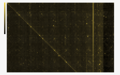
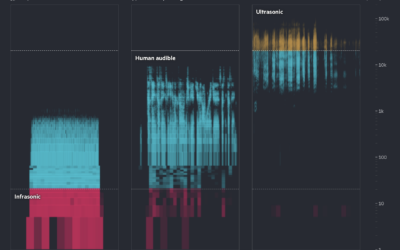
Cells or bins are colored based on data. As with all visualization types that use color as the main visual encoding, choose shades carefully.
With color as the visual encoding, choose the scales that allow you to see actual patterns.
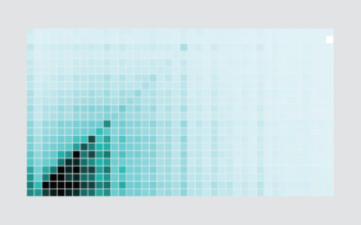
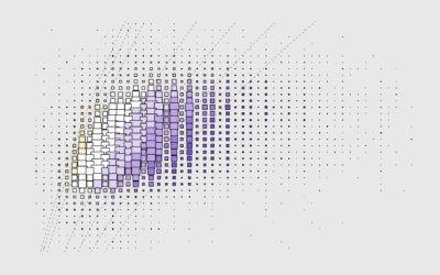
There are existing functions and packages to make heatmaps in R, but when the data is irregular, it's worth going custom.
Heatmaps quickly translate data tables into a visual form, making them a great tool to explore a new dataset.
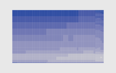
Using color as the visual encoding, show changes over time in two dimensions.
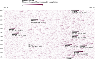
Things have a way of repeating themselves, and it can be useful to highlight these patterns in data.
Add interaction so that you can show different segments of the data and allow comparisons.
You probably don’t need me to tell you this, but recent data suggests…
About 1 in 10 people use the same four-digit PIN, based on an…
See how many people are in various work cohorts, given education, annual income, weekly hours, and commute time.
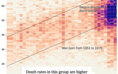
For NYT’s the Upshot, Josh Katz, Margot Sanger-Katz, and Nick Thieme report on…
New York City recently issued a drought warning because of an abnormally dry…
As the 2024 Summer Olympics wrap up, medal trackers will fade from homepages…
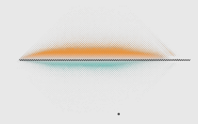
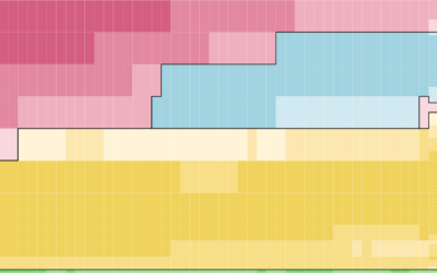
Using body mass index (BMI), which is calculated with height and weight, most people fall into the categories of overweight or obese.
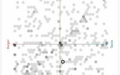
PerThirtySix made a communal plot that asks for your opinion via scatterplot and…
How common are wide age gaps between spouses? These are the age differences through the lens of the 2022 five-year American Community Survey.
For NPR, Juliana Kim reports: Deep Sea Vision, an ocean exploration company based…
Financial Times highlights how researchers are using AI to try to learn what…
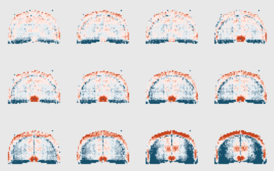
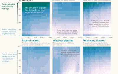
This is how the most common causes have changed over time for people aged 0 to 85.
As we get older, our life expectancy declines. But when and how quickly the decline happens and how it happens has changed over the years.
Saloni Dattani, for Our World in Data, used a set of heatmaps to…
It’s been raining a lot here in California, which is helpful, because most…
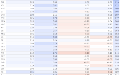
NFL Football Operations calculated how much luck has contributed to team wins and…