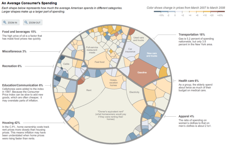
In a deviation from the usual pie chart and standard tree map, this graphic from The New York Times resembles something of a stained glass window – a really pretty piece of work. Amanda Cox, with Matthew Bloch and Shan Carter, designed the interactive graphic that lets you explore how American consumers spend their money.
Did you know that Americans spent more on cheese (0.3%) than on computers (0.2%)? Mmm, nothing like a block of smoked cheddar and some cracked pepper water crackers. I digress.
Click on the spending categories to zoom in and center on sections and scroll over for more details. Colors show change in prices between March 2007 and March 2008 while the size of each section represents percentage of spending.
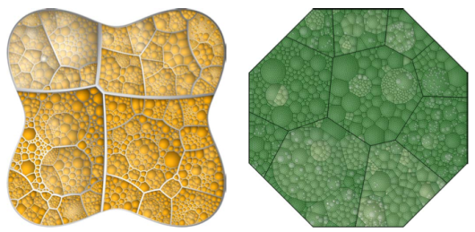
Voronoi Treemaps
The implementation is an application of the Voronoi Treemap (pdf) from Balzer and Deussen, introduced at InfoVis 2005. In a nutshell, the Voronoi treemap algorithm allows a use of polygons, as opposed to the rectangles that you’re used to seeing. The use of polygons helps take care of some of the problems with aspect ratio and hierarchical relationships when limited to rectangles.
Really nice results:
In any case, it’s nice to see this researchy stuff applied to really interesting data and done with the style that we’ve learned to expect from The Times graphics department.

 Visualize This: The FlowingData Guide to Design, Visualization, and Statistics (2nd Edition)