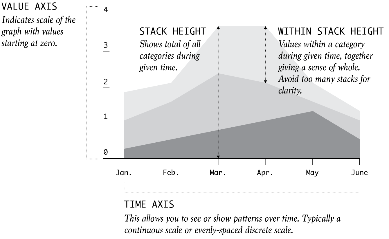
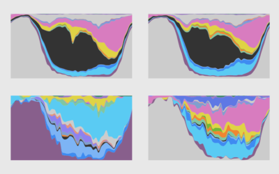
Place multiple categories on top of each other for a sense of distribution and overall change. Watch out for large counts eclipsing the small ones.
You could use a package, but then you couldn't customize every single element, and where's the fun in that?
There are many ways to show parts of a whole. Here are quick one-liners for the more common ones.
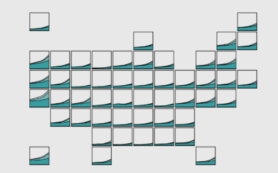
Stacked area charts let you see categorical data over time. Interaction allows you to focus on specific categories without losing sight of the big picture.
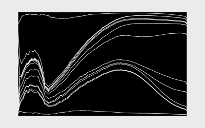
From the basic area chart, to the stacked version, to the streamgraph, the geometry is similar. Once you know how to do one, you can do them all.
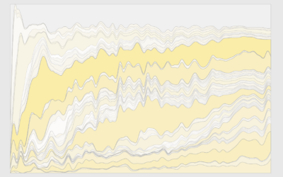
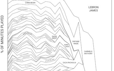
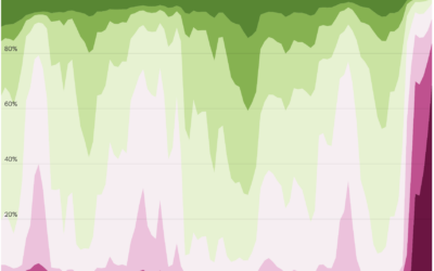
Fun stacked area chart by Todd Whitehead for Sportradar, showing the share of…
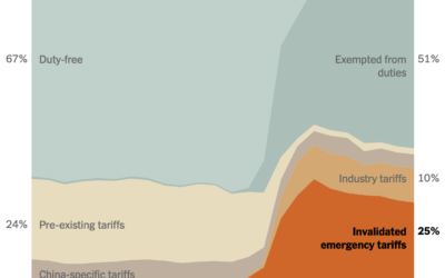
The U.S. Supreme Court ruled the administration’s “emergency” tariffs to be illegal. This…
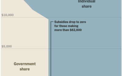
In January, the scale for U.S. healthcare subsidies changed, which reintroduced a cliff.…
At the beginning of this year, most people probably had little awareness or…
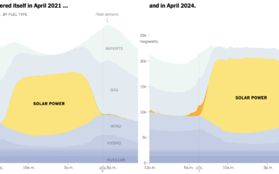
When there is an excess of solar energy during the day, it can…
Because everyone who is 30 years and older loves getting asked when they're going to settle down and get married.
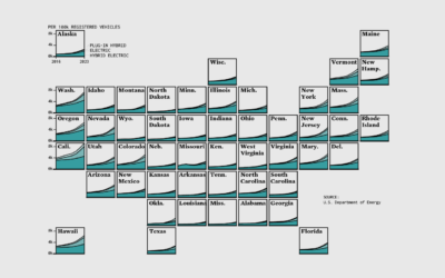
About 4% of registered light-duty vehicles in the United States are either electric,…
Breaking it down to the small steps and choices with data, code, and editing that lead to a finished chart.
One-third of households are rented and the other two-thirds are owned or in the process. However, the difference between renting and owning changes with age.
To capture solar energy for use in the evening, batteries have grown in…
For The Upshot, Emily Badger and Francesca Paris compare the rates of existing…
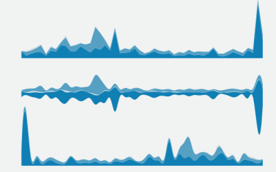
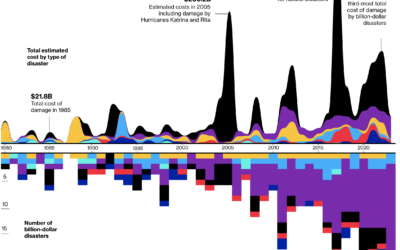
For Bloomberg, Rachael Dottle and Leslie Kaufman go with the combo stacked area…
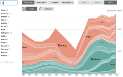
NameGrapher is an interactive chart that lets you explore historical trends for baby…
For Our World in Data, Max Roser discusses the risk and possible destruction…
Here's how the distribution of genres has changed since 1945 up to present.
Using an oldie but goodie visualization format to look at time use between different groups.