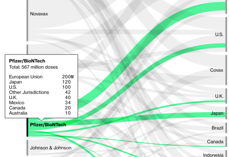
Bloomberg is tracking nine coronavirus vaccines around the world. In addition to the approval process, they’re also tracking the procurement and distribution from companies to countries. Billions.
Bloomberg is tracking nine coronavirus vaccines around the world. In addition to the approval process, they’re also tracking the procurement and distribution from companies to countries. Billions.
Eugene Wei looks closer at the algorithms that drive TikTok and how its design provided an effective feedback loop:
But for TikTok (or Douyin, its Chinese clone), who needed an algorithm that would excel at recommending short videos to viewers, no such massive publicly available training dataset existed. Where could you find short videos of memes, kids dancing and lip synching, pets looking adorable, influencers pushing brands, soldiers running through obstacle courses, kids impersonating brands, and on and on? Even if you had such videos, where could you find comparable data on how the general population felt about such videos? Outside of Musical.ly’s dataset, which consisted mostly of teen girls in the U.S. lip synching to each other, such data didn’t exist.
In a unique sort of chicken and egg problem, the very types of video that TikTok’s algorithm needed to train on weren’t easy to create without the app’s camera tools and filters, licensed music clips, etc.
At first I was confused by TikTok. I’m still confused by TikTok. But one thing that is for sure is that the system knows how to serve up videos that one might find interesting. Whether that’s good in the long run is anyone’s guess.

It might be tricky. It might be tedious. But it’ll make your process more straightforward when it’s time to visualize.
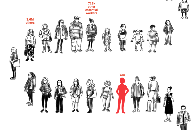
Using estimates from the Surgo Foundation and Ariadne Labs, Stuart A. Thompson for NYT Opinion shows how many people are in front of you to get the coronavirus vaccine. Just enter your age, if you’re an essential worker, and the county you live in for an idea of where you are.
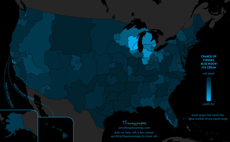
Daniel Huffman grew up with an ice cream flavor called Blue Moon. Where he’s from, it’s a common menu item, so he figured it was common nationally. Nope. So Huffman did some cartographic sleuthing:
In recent years, I have come to learn that it’s not widely available throughout the United States. It is, instead, a regional flavor, with various articles describing it as a “Midwestern favorite,” and an “iconic Midwestern frozen treat.” But nothing I read was able to give more detail about where blue moon was found — only anecdotal, unsatisfying generalizations about the Midwest. No one had hard data, and, most importantly, no one had maps. The true distribution of this flavor was a mystery that I needed to solve.
Now I want ice cream.
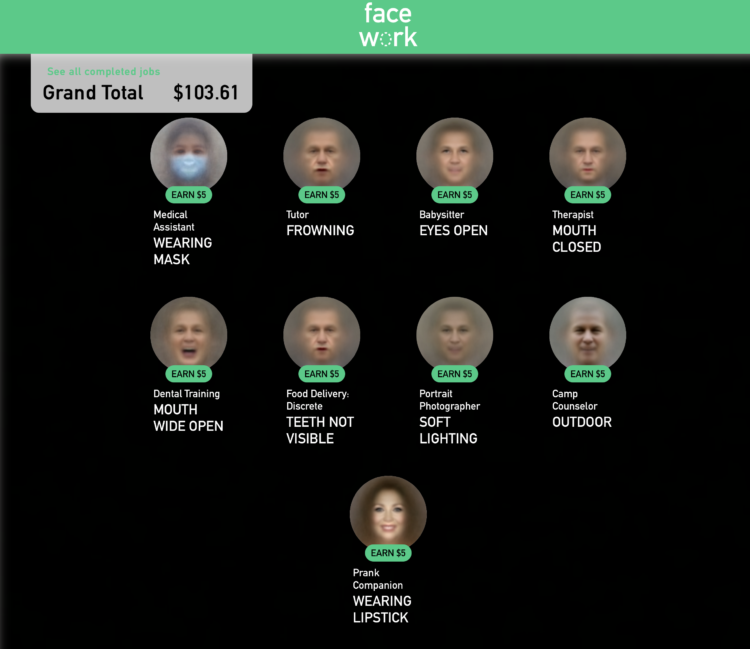
Kyle McDonald, in collaboration with Greg Borenstein, Evelyn Masso, and Fei Lui, made Facework. It’s a game that imagines a platform where people use their faces in a gig economy and you’re encouraged to trick the AI that you’re something you’re not — with your face.
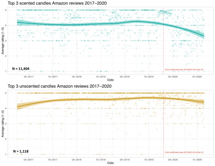
Prompted by a tweet about scented candles without smell and Covid-19, Kate Petrova plotted Amazon reviews for scented and unscented candles over time. Notice the downward trend for scented candles after the first confirmed case for Covid-19.
Interesting if true. I’m imagining a bunch of people opening their new scented candles, taking a big whiff, and not smelling anything.
But I wonder if there are outside forces (a.k.a. confounding factors) at work here. For example, Petrova only looked at reviews for the “top 3” scented candles. What do we see with other candles? Maybe a higher demand for scented candles from more people staying at home put a strain on the manufacturer. Maybe there was a shortage of some scented ingredient, which led to less potent candles. Maybe new scented candles customers have unrealistic expectations of what candles smell like.
I don’t know.
Maybe the decreasing average review really is related to Covid-19 symptoms.
Petrova put up the code and data, in case you want to dig into it.
Update: In my original post, I unknowingly used an offensive word unfit for usage. Thank you to those who pointed it out to me.
Roger Peng outlines four main roles of a data scientist:
If you’re reading this and find yourself saying “I’m not an X” where X is either scientist, statistician, systems engineer, or politician, then chances are that is where you are weak at data science. I think a good data scientist has to have some skill in each of these domains in order to be able to complete the basic data analytic iteration.
The good thing about data science is that you can apply the skills to different fields and tasks. It’s also one of the challenges when you’re in the early phases of learning, because you have to figure out what to work on. This should point you in the right direction.
See also: Peng’s tentpoles of data science.
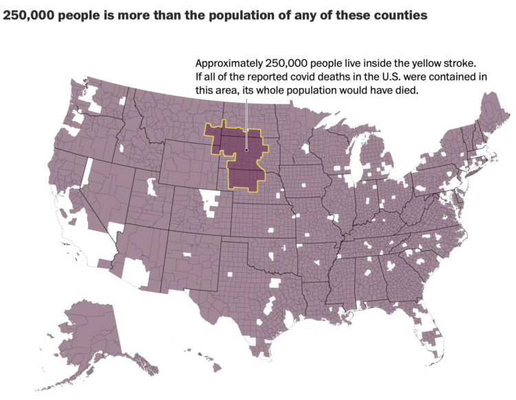
As we’ve talked about before, it can be hard to really understand the scale of big numbers. So when we hear that over 250,000 people died because of the coronavirus, it can be hard to conceptualize that number in our head. Lauren Tierney and Tim Meko for The Washington Post provide a point of comparison by highlighting counties that have have populations under 250,000.
Whole counties, or whole clusters of counties, that would be completely wiped out.
It’s a lot.

I roasted a turkey. There were a lot of leftovers. But my mom taught me to never waste.
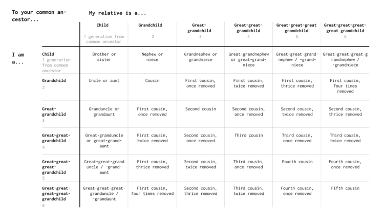
When you have a big family, it’s a challenge to figure out how everyone is related. So here are some charts to help you figure it out.
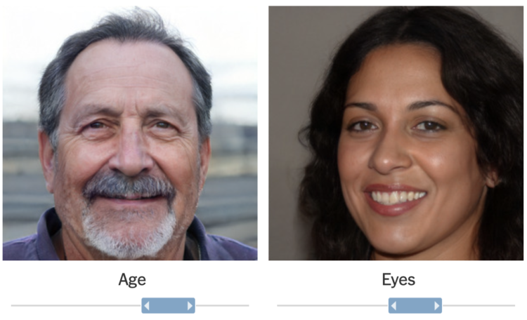
It’s grown easier and easier to generate fake faces with AI. For The New York Times, Kashmir Hill and Jeremy White demonstrate the tech with a slick interactive. Quickly adjust age, eye, mood, and gender. All fake.
It was only a few years ago when the idea seemed novel. One year later, there were guides (and warnings) for spotting fake faces. By 2019, there was a marketplace for fake faces (of course). Sometimes it’s scary to think about what the internet will be in five years.
In any case, check out the NYT piece. The smooth transitions between faces, one facial aspect at a time, is mesmerizing.
Reporting for NPR, Sean McMinn and Selena Simmons-Duffins on staffing shortages:
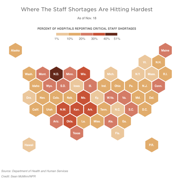
On data availability:
This is the first time the federal agency has released this data, which includes limited reports going back to summer. The federal government consistently started collecting this data in July. After months of steadily trending upward, the number of hospitals reporting shortages crossed 1,000 this month and has stayed above since.
The data, however, are still incomplete. Not all hospitals that report daily status COVID-19 updates to HHS are reporting their staffing situations, so it’s impossible to tell for sure how much these numbers have increased.
The first time.
It was back in March, a few lifetimes ago, when we were talking about flattening the curve so that hospitals could provide care to those who needed it. This federal dataset is just coming out now in November? Obscene.
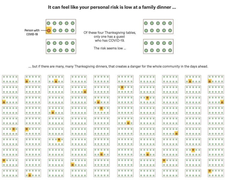
A small gathering of 10 people or fewer can seem like a low-risk activity, and at the individual level, it’s lower risk than going to a big birthday party. But when a lot of people everywhere are gathering, small or large, the collective risk goes up. For FiveThirtyEight, Maggie Koerth and Elena Mejía illustrate the reasoning.
The collective part is where many seem to get tripped up. “Flattening the curve” only works when everyone works together. Lower your risk, and you lower the collective risk. You’re helping others. You’re helping those you care about.
Then, collectively, we all get out of this mess.
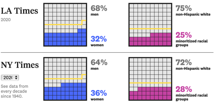
For The Pudding, Michelle McGhee analyzed representation in crossword puzzles. Some crossword publications do better than others.
As of December 2019, The USA Today puzzle is edited by Erik Agard, a 27-year old crossword champ who told me, “bringing some balance on the representation front is something I actively try to do.” A prominent crossword blogger called USA Today’s puzzle “the most interesting, innovative, and provocative daily crossword” out right now. Let’s take a look at how USA Today, and other publications, are taking a puzzle that’s been called too old, too white, too male, and changing it up.
The story also comes with playable, data-generated puzzles so that you can feel the difference over decades.
Here’s the good stuff for November.
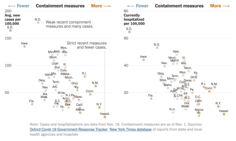
The University of Oxford’s Blavatnik School of Government defined an index to track containment measures for the coronavirus. For The New York Times, Lauren Leatherby and Rich Harris plotted the index against cases and hospitalizations:
When cases first peaked in the United States in the spring, there was no clear correlation between containment strategies and case counts, because most states enacted similar lockdown policies at the same time. And in New York and some other states, “those lockdowns came too late to prevent a big outbreak, because that’s where the virus hit first,” said Thomas Hale, associate professor of global public policy at the Blavatnik School of Government, who leads the Oxford tracking effort.
A relationship between policies and the outbreak’s severity has become more clear as the pandemic has progressed.
States with more restrictions tend to have lower rates.
From these plots, it seems clear what we need to do. But I think most people have made up their minds already, and the interpretation of the data leads people to different conclusions.
With the holidays coming up, I just hope you lean towards clarity.
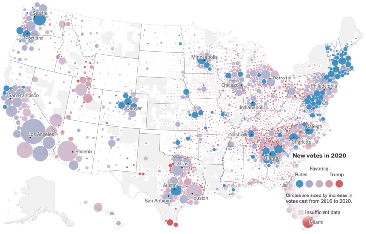
For The New York Times, Ford Fessenden, Lazaro Gamio and Rich Harris go with a Dorling cartogram to look at the votes gained per county in the 2020 election, compared against the 2016 election.
As you’d expect, voting overall was up just about everywhere this year. Some counties shifted left. Some shifted right. The key points of interest come about when the the map starts zooming into specific regions.
See also: the election wind map.
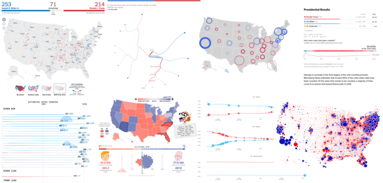
Alan McConchie from Stamen recaps the wide array of maps and charts that came out before, during, and after election night:
This year we saw continued refinement of traditional election maps styles, and an exciting (and nerve-wracking) new frontier developed with the visualization of post-election ballot counting. Dataviz practitioners are struggling with challenges of how to show uncertainty and how much uncertainty can be shown while still making our visualizations clean and easy to understand. Election cartographers are dealing with their own dilemma of how much to show the polarization and inequality that currently exists in our electoral system (with the risk of reinforcing it) versus making counterfactual maps of systems that could or should be.
[via Co.Design]
Joseph Cox, reporting for Motherboard:
Some app developers Motherboard spoke to were not aware who their users’ location data ends up with, and even if a user examines an app’s privacy policy, they may not ultimately realize how many different industries, companies, or government agencies are buying some of their most sensitive data. U.S. law enforcement purchase of such information has raised questions about authorities buying their way to location data that may ordinarily require a warrant to access. But the USSOCOM contract and additional reporting is the first evidence that U.S. location data purchases have extended from law enforcement to military agencies.
Oh.


 Visualize This: The FlowingData Guide to Design, Visualization, and Statistics
Available now.