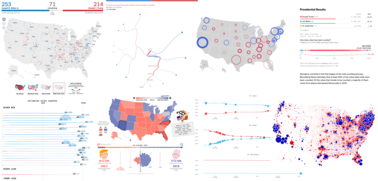
Alan McConchie from Stamen recaps the wide array of maps and charts that came out before, during, and after election night:
This year we saw continued refinement of traditional election maps styles, and an exciting (and nerve-wracking) new frontier developed with the visualization of post-election ballot counting. Dataviz practitioners are struggling with challenges of how to show uncertainty and how much uncertainty can be shown while still making our visualizations clean and easy to understand. Election cartographers are dealing with their own dilemma of how much to show the polarization and inequality that currently exists in our electoral system (with the risk of reinforcing it) versus making counterfactual maps of systems that could or should be.
[via Co.Design]
 Visualize This: The FlowingData Guide to Design, Visualization, and Statistics (2nd Edition)