• Membership
  • Newsletter
  • Projects
  • Learning
  • About
  • Member Login
  • 1 in 5 prisoners had Covid-19, a grid map

    December 18, 2020

    Topic

    Maps  /  Associated Press, coronavirus, Marshall Project, prison

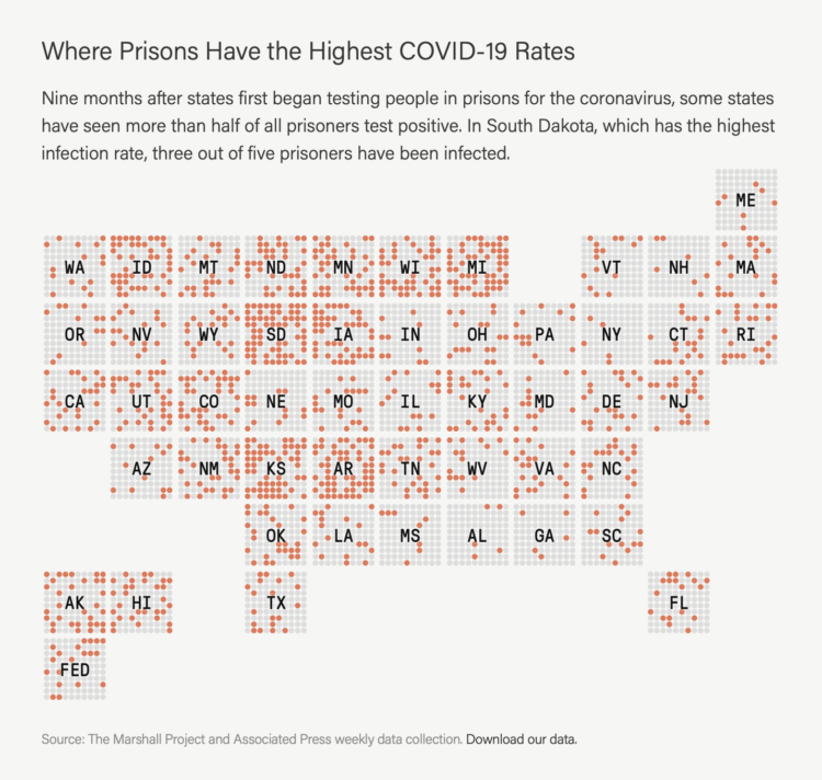
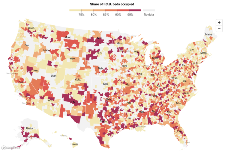
    The Marshall Project and The Associated Press report on the Covid-19 rates in prison, which are multiple times greater than the general population. Katie Park shows the regional variation with this cross between a dot density map and a grid map.

    They’ve made the data available here.

  • Tracking world’s biggest iceberg

    December 18, 2020

    Topic

    Maps  /  iceberg, Reuters, scale

    The world’s biggest iceberg, A68a, is on track to crash into a remote island in the Atlantic. For Reuters, Marco Hernandez and Cassandra Garrison show the path, the scale, and what might happen with A68a:

    The iceberg is comparable in size to many well-known islands. A68a is very similar in size and shape to Jamaica, almost as long as the U.S. territory Puerto Rico, and dwarfs China’s Hong Kong Island as well as the Southeast Asian city state of Singapore.

    Observers from the British Antarctic Survey told media that a flight last year over the A68a took about one and a half hours. The berg is so big, Royal Air Force pilots this week were unable to capture it all in one, single photograph.

  • Members Only

    Knowing Nothing (Process 119)

    December 17, 2020

    Topic

    The Process  /  beginners, learning

    Obviously, knowing nothing can be a negative, but some of my favorite work came about when I didn’t know how to do something or what to expect.

  • Blob Opera is a machine learning model you can make music with

    December 17, 2020

    Topic

    Statistics  /  blob, David Li, Google, machine learning, opera

    David Li, in collaboration with Google Arts and Culture, made a fun experiment to play with:

    We developed a machine learning model trained on the voices of four opera singers in order to create an engaging experiment for everyone, regardless of musical skills. Tenor, Christian Joel, bass Frederick Tong, mezzo‑soprano Joanna Gamble and soprano Olivia Doutney recorded 16 hours of singing. In the experiment you don’t hear their voices, but the machine learning model’s understanding of what opera singing sounds like, based on what it learnt from them.

    So smooth. So blobby.

  • Basketball court designed as a national park map

    December 16, 2020

    Topic

    Maps  /  basketball, Kirk Goldsberry, park

    Kirk Goldsberry, whose basketball charts you might recognize, made the Naismith International Park Map:

    This map blends two of my passions: cartography and hoops. The elevation surface on the map is derived from the most common scoring areas in the NBA during the 2019-20 season. Higher places indicate the areas where NBA scorers scored the most from. Naturally this includes the areas near the rim and the areas just outside the 3-point line.

    The original plan was to make a fun map poster emphasizing the best scorers from the 2019-20 season, but the project quickly spiraled out of control as I started to label more and more historic places.

    So good.

  • How to Make an Animated Beeswarm Chart

    Beeswarm charts are useful to highlight individual categories or entities. Animating them can help highlight change over time.

  • Data for all of the referee calls in NBA games

    December 15, 2020

    Topic

    Data Sources  /  basketball, Owen Phillips, referee

    Owen Phillips compiled per game and cumulative foul calls for all NBA referees between the 2016-17 and 2019-20 seasons. On its own, I’m not sure it’s that exciting, but if you’re into basketball analytics, it might be fun to tie in with other data.

  • Infrared to show air particles from your talk hole

    December 15, 2020

    Topic

    Infographics  /  coronavirus, droplets, infrared, Washington Post

    I’m sure you know this already, but just in case, air particles come out of your mouth when you talk, cough, etc. The Washington Post used an infrared camera to demonstrate:

    To visually illustrate the risk of airborne transmission in real time, The Washington Post used an infrared camera made by the company FLIR Systems that is capable of detecting exhaled breath. Numerous experts — epidemiologists, virologists and engineers — supported the notion of using exhalation as a conservative proxy to show potential transmission risk in various settings.

  • Data Underload  /  coronavirus, unemployment, work

    Unemployment and Occupation

    Unemployment has hit some industries more than others. Here’s how the most recent estimates compare against last year’s.

    Read More
  • Charting and ranking apocalyptic events

    December 11, 2020

    Topic

    Infographics  /  apocalypse, Domain of Science

    [arve url=”https://www.youtube.com/watch?v=Htf0XR6W9WQ” loop=”no” muted=”no” /]

    For Domain of Science, Dominic Walliman attempts to chart all of the deadly events that threaten humanity on a scatterplot. On the horizontal axis he places number of casualties. On the vertical he places likelihood. So something like, oh, say, a global pandemic ends up in the top middle of the plot.

    See also Walliman’s video of the same flavor where he attempts to illustrate everything in the known universe.

  • Members Only

    The Process 118 – Maybe a Bar Chart Really Would Be Better

    December 10, 2020

    Topic

    The Process  /  experiment, traditional

    As visualization practitioners, we tend to sway towards the novel, but bar charts are still good.

  • Visualizing 16th century letter correspondence of the Tudor government

    December 10, 2020

    Topic

    Network Visualization  /  letters, Tudor

    Kim Albrecht, Ruth Ahnert, and Sebastian Ahnert visualized the network of communications over time and space:

    The Tudor government maintained a communication network that criss-crossed the globe. This visualisation brings together 123,850 letters connecting 20,424 people from the United Kingdom’s State Papers archive, dating from the accession of Henry VIII to the death of Elizabeth I (1509-1603).

  • Where ICUs are near capacity

    December 9, 2020

    Topic

    Maps  /  coronavirus, Health and Human Services, hospital, ICU, New York Times

    The New York Times mapped the seven-day average of ICU bed occupancy rates:

    More than a third of Americans live in areas where hospitals are running critically short of intensive care beds, federal data show, revealing a newly detailed picture of the nation’s hospital crisis during the deadliest week of the Covid-19 epidemic.

    Hospitals serving more than 100 million Americans reported having fewer than 15 percent of intensive care beds still available as of last week, according to a Times analysis of data reported by hospitals and released by the Department of Health and Human Services.

    Oh.

    It only took HHS many months into a pandemic to release the facility-level dataset.

    You can download the data here.

  • Data Underload  /  basketball, trading

    NBA Players Traded, Historical Percentages

    It seems like there’s been more player movement than usual over the years. Didn’t players used to play on a single team for the entirety of their careers?

    Read More
  • Bill Nye on masks, with a map and some props

    December 9, 2020

    Topic

    Infographics  /  Bill Nye, coronavirus, mask

    Talking about the effectiveness of masks on TikTok, Bill Nye uses a map and some props to show mask-wearing against infection. He uses two transparent slides where the first shows mask-wearing and the second is an overlay that shows Covid-19 rates.

    It seems so simple.

  • House raided of fired Florida data manager in charged of Covid-19 dashboard

    December 8, 2020

    Topic

    News  /  coronavirus, Florida, raid, Rebekah Jones

    Jeffrey Schweers for Tallahassee Democrat:

    State police brandishing firearms Monday raided the Tallahassee home of Rebekah Jones, the former Department of Health employee who built the state’s much-praised COVID-19 dashboard before being fired over what she said was refusing to “manipulate data.”

    “They pointed a gun in my face. They pointed guns at my kids,” Jones tweeted shortly before 5 p.m.

    After her firing in May, Jones started her own Covid-19 dashboard independently and has been maintaining it daily.

    Strange.

  • Interactive explainer for how cameras and lenses work

    December 8, 2020

    Topic

    Infographics  /  Bartosz Ciechanowski, camera, lens

    We use our cameras all of the time, and it almost seems like magic when you press that button and somehow an image is captured. But of course it’s not magic. Bartosz Ciechanowski provides a detailed interactive explainer on how the camera and lens record light.

    There are a lot of satisfying sliders to adjust dimensions and see how the mechanics change. It reminds me of those exhibits at kid science museums with the big knobs and handles.

    See also Ciechanowski’s explainer of a similar flavor on how gears work.

  • Defining “essential worker” to distribute vaccine

    December 7, 2020

    Topic

    Statistical Visualization  /  coronavirus, essential, New York Times, vaccine

    Matthew Conlen, in an article by Abby Goodnough and Jan Hoffman for NYT, charted essential and frontline workers by industry.

    With limited doses, states have to decide who gets the vaccine after healthcare workers and the most vulnerable elderly. You’ve probably heard mentions of essential workers to be next in line, but under the CDC’s definition, 70 percent of workers are essential.

  • Data Sketches, the book

    December 7, 2020

    Topic

    Data Art  /  book, Nadieh Bremer, Shirley Wu

    Data Sketches was a one-year visualization collaboration between Nadieh Bremer and Shirley Wu that started in 2016. Each month they separately visualized a topic, and at the end of each month they’d have two very different pieces that were visually unique and showed different angles of the same thing.

    They also documented their process and design decisions for every project, which provided another layer of depth to the work.

    Now it’s a book and available for pre-order. Very cool.

    (I’m trying to get over that this project started more than four years ago. Time has been moving slow these days, but also. Time. Passes. Fast.)

  • Vaccine contracts

    December 4, 2020

    Topic

    Statistical Visualization  /  Bloomberg, coronavirus, vaccine

    Bloomberg is tracking nine coronavirus vaccines around the world. In addition to the approval process, they’re also tracking the procurement and distribution from companies to countries. Billions.

  • Page 90 of 392
  • <
  • 1
  • ...
  • 87
  • 88
  • 89
  • 90
  • 91
  • 92
  • ...
  • 392
  • >

Analyze, visualize, and communicate data usefully, beyond the defaults.

Become a member →

Recently for Members

May 8, 2025
When the data is not what it seems

May 1, 2025
Finding the Right Charts

April 24, 2025
Visualization Tools, Datasets, and Resources – April 2025 Roundup

April 17, 2025
Breaking Out of Chart Software Defaults

April 15, 2025
Line Chart with Decorative Neon Accents

Browse by Chart Type See All →

Line Chart Connected Scatter Plot Pie Chart Spike Map Unit Chart Network Graph Cartogram Table Chord Diagram Timeline

Browse By Topic

  • Visualization

    Seeing data

  • Maps

    Seeing geographic data

  • Infographics

    Explaining data

  • Networks

    Connecting data

  • Statistics

    Analyzing data

  • Software

    Working with data

  • Sources

    Getting data

  • Design

    Making data readable

Get the Book

Visualize This: The FlowingData Guide to Design, Visualization, and Statistics

Available now.

Order: Amazon / Bookshop

Made by FlowingData

  • The Process

  • Data Underload

  • Chart Everything

  • Guides

  • Books

  • Shop

  • About
  • Contact
  • Newsletter
  • LinkedIn
  • Instagram
  • Bluesky
  • RSS
Copyright © 2007-Present FlowingData. All rights reserved.