Here’s the good stuff for January.
Here’s the good stuff for January.
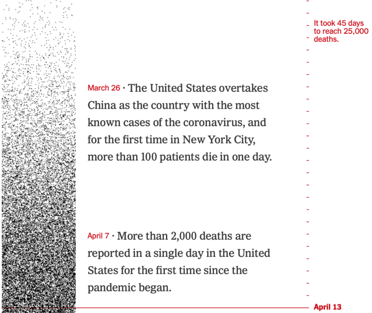
The United States passed 425,000 coronavirus deaths this week. For The New York Times, Lazaro Gamio and Lauren Leatherby used dot density over time to show how we got to this point.
Each dark pixel represents a death, and each tick mark represents a day. So the strip starts light with sparsely placed dots, and then it gets darker and darker. Get to present day, and there’s hardly any white space.
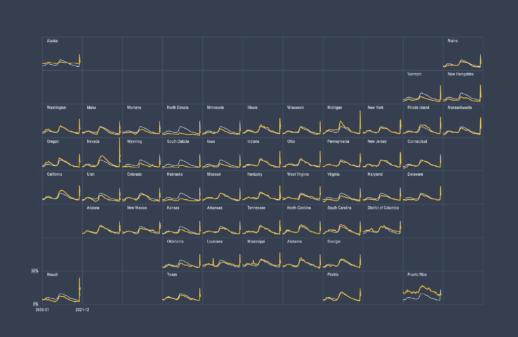
Also known as trellis charts, lattice chart, or whatever you want to call them, the technique lets you compare several categories in one view.
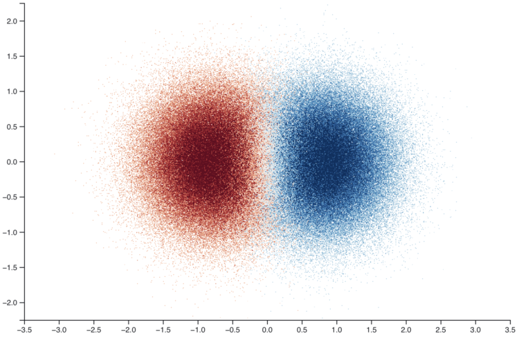
Twitter released a small JavaScript library to make density plots — for when you have a lot of overlapping points and could use some granular binning. Feed a method an array of thousands of x-y coordinates, and the library takes care of the rest.
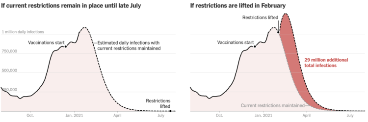
With vaccines, we might be tempted to jump back into “normal” life before it’s really safe. The New York Times reports on why waiting until March instead of February might be the way to. This is based on estimates from Columbia University researchers, and you can read the preprint here (pdf) by Jeffrey Shaman et al.
We’ve come this far already…

Maybe you remember the SimCity-like views through satellite imagery from a few of years ago. Robert Simmon from Planet Labs returns to the topic discussing practical use cases and advantages over a top-down view:
Satellite imagery surrounds us — from Google Maps and daily weather forecasts to the graphics illustrating news stories — but almost all of it is from a map-like, top-down perspective. This view allows satellite data to be analyzed over time and compared with other sources of data. Unfortunately, it’s also a distorted perspective. Lacking many of the cues we use to interpret the world around us, top-down satellite imagery (often called nadir imagery in remote sensing jargon) appears unnaturally flat. It’s a view that is disconnected from our everyday experience.
Thomas Mock explains how to extract and parse data tables in image files via ImageMagick and R:
There are many times where someone shares data as an image, whether intentionally due to software constraints (ie Twitter) or as a result of not understanding the implications (image inside a PDF or in a Word Doc). xkcd.com jokingly refers to this as .norm or as the Normal File Format. While it’s far from ideal or a real file format, it’s all too common to see data as images in the “wild”. I’ll be using some examples from Twitter images and extracting the raw data from these. There are multiple levels of difficulty, namely that screenshots on Twitter are not uniform, often of relatively low quality (ie DPI), and contain additional “decoration” like colors or grid-lines. We’ll do our best to make it work!
You can never have too many tools to grab data from various, inconvenient file formats.
[arve url=”https://www.youtube.com/watch?v=gFFj22kjlZk&feature=emb_title” loop=”no” muted=”no” /]
Jon Schwabish has a new book coming out: Better Data Visualizations. To kick things off, he’s running a video series on the many different chart types. There will be 50 videos released daily, each with an invited practitioner to briefly talk about what the chart is and how it’s used. They’re already 10 videos into it.
Should be informative.
I make most of my static charts in R, but I always bring them into Illustrator for polish, layout, and readability. Here’s my process.
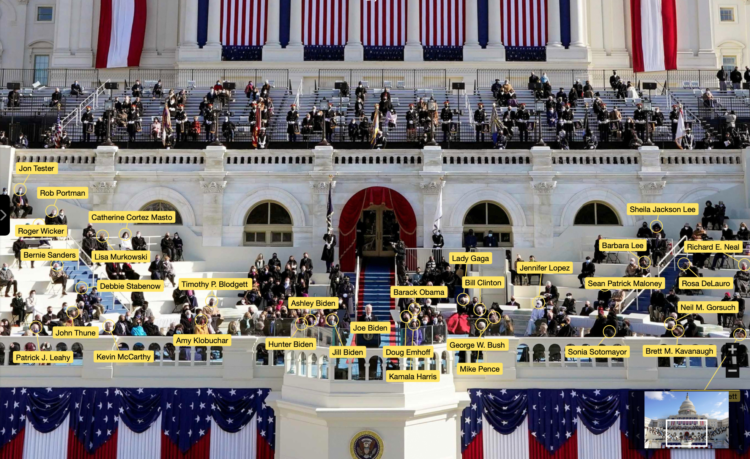
The New York Times labeled all of the people sitting behind Joe Biden during the inauguration. It’s a straightforward but slick interactive that lets you pan and zoom the photograph. Click on a name for more details or use the list of names in a sidebar.
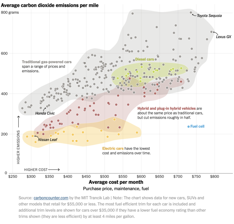
Based on estimates from the MIT Trancik Lab, The New York Times plotted average carbon dioxide emissions against average cost per month for electric, hybrid, and gas vehicles. Each dot represents a vehicle type. While electric vehicles cost more upfront, the lower maintenance and electric costs make up the difference in the long run.
The chart above only shows vehicles that retail for $55,000 or less, but you can see more vehicles in the original version.

For Bloomberg, Jeremy C.F. Lin and Rachael Dottle show what Joe Biden’s inauguration will look like, given all of the recent events and 2020. No public access and 25,000 National Guard personnel.
For NYT’s The Upshot, Kevin Quealy has been cataloging all of the insults Trump tweeted over the past five years. The project is complete:
As a political figure, Donald J. Trump used Twitter to praise, to cajole, to entertain, to lobby, to establish his version of events — and, perhaps most notably, to amplify his scorn. This list documents the verbal attacks Mr. Trump posted on Twitter, from when he declared his candidacy in June 2015 to Jan. 8, when Twitter permanently barred him.

As you probably know, there was a big Parler data scrape before the app and site went down. ProPublica spliced Parler video posts, sorting them by time and location. The result is basically a TikTok-style video feed of what happened.
[arve url=”https://www.youtube.com/watch?v=1cUUfMeOijg” loop=”no” muted=”no” /]
Tom Scott explains how Cloudflare uses a wall of lava lamps to generate random numbers. A video camera is pointed at the wall, and the movement in the lamps plus noise from the video provides randomness, which is used to secure websites.
Even though computers can do many things on their own, they still need help from the physical world for true unpredictability. The robot overlords aren’t here yet. [via kottke]
The best way to make charts more interesting is to provide lots of details, which requires more work on your end but pays off in the end result.

In an effort to preserve part of her family’s culture, Jane Zhang designed recipe cards illustrating foods from her mother and grandmother. They provide ingredients and steps, but they also provide illustrations and diagrams that represent cuisine style, cooking method, texture, and taste.
My grandma spoke little English and I speak little Cantonese, so we often communicated through the language of food. So this project really speaks to me. I wish I had this for my own family.

Just before the social network Parler went down, a researcher who goes by the Twitter username @donk_enby scraped 56.7 terabytes of data from the site via a less-than-secure API. Motherboard reports on what some researchers are doing with the data:
One technologist took the scraped Parler data, took every file that had GPS coordinates included within it, formatted that information into JSON, and plotted those onto a map. The technologist then shared screenshots of their map with Motherboard, showing Parler posts originating from various countries, and then the United States, and finally in or around the Capitol itself. In other words, they were able to show that Parler users were posting material from the Capitol on the day of the rioting, and can now go back into the rest of the Parler data to retrieve specific material from that time.
I’ve only seen some quick maps so far, but I imagine there’s much more to come in terms of closer analysis and visualization.
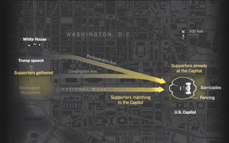
The New York Times outlined the minutes from the speech leading to the mob at the Capitol. By now you’ve probably seen the videos and pictures and have an idea of what happened. But the timeline of events both inside and outside of the building really underscores how much worse it could’ve been.


 Visualize This: The FlowingData Guide to Design, Visualization, and Statistics
Available now.