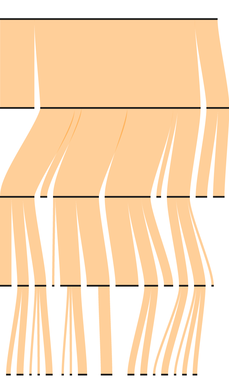
Leftover Turkey Flowchart
I roasted a turkey for Thanksgiving. It tasted good. The problem is that there were not many people to eat it, and it was a big bird. But my mom taught me to never waste food. So, this is how the leftovers get used, without having to eat the same thing for a week.

For Enjoyment
Eaten
Cheese in Between Meat
Out of Obligation
Actual Sandwich
Grilled Cheese
TLT
Meat Between Bread
Sandwich
With a Moist Maker
Congee
Plain White Bread
Leftover Thanksgiving Plate
Toasted
THANKSGIVING
TURKEY
Noodle Soup
Like Cambell’s
Ramen
Turkey Stock
Frozen for Later
Leftovers
By J. Kenji López-Alt
Serious Eats
YouTube
Following Recipes
Random Search
AllRecipes
Discussion Forum
America’s Test Kitchen
Involving Tortillas
Cold Out of Tupperware
Involving Cheese
Involving Chips
Involving Bacon
With Rice
With Sauce
Given to Others
Food Hacks
Fried Rice
Fried
THANKSGIVING TURKEY
Given to Others
Leftovers
Eaten
Thanksgiving Mini-plate
Cold from Tupperware
Following Recipes
Out of Obligation
For Enjoyment
Turkey Stock
Food Hacks
Sandwich
Cheese in Between Meat
America’s Test Kitchen
Meat Between Bread
Involving Cheese
Actual Sandwich
Frozen for Later
Random Search
Noodle Soup
Serious Eats
With Rice
Congee
Fried
By J. Kenji López-Alt
With a Moist Maker
Involving Tortillas
Plain White Bread
Discussion Forum
Involving Bacon
Involving Chips
Grilled Cheese
Like Cambell’s
With Sauce
AllRecipes
Fried Rice
YouTube
Toasted
Ramen
TLT
That — that’s about it.
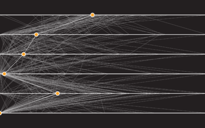
Chart Type Used

Become a member. Support an independent site. Get extra visualization goodness.
See What You Get