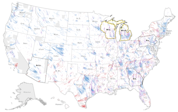
The Washington Post goes with a wind metaphor to show the change in voting activity between 2016 and 2020. The up and down direction represents change in turnout, and the left and right direction represents change in vote margin.
A fun riff on the classic Viégas and Wattenberg wind map and the Bostock and Carter election map from 2012.
 Visualize This: The FlowingData Guide to Design, Visualization, and Statistics (2nd Edition)