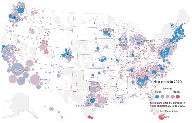
For The New York Times, Ford Fessenden, Lazaro Gamio and Rich Harris go with a Dorling cartogram to look at the votes gained per county in the 2020 election, compared against the 2016 election.
As you’d expect, voting overall was up just about everywhere this year. Some counties shifted left. Some shifted right. The key points of interest come about when the the map starts zooming into specific regions.
See also: the election wind map.

 Visualize This: The FlowingData Guide to Design, Visualization, and Statistics (2nd Edition)