• Membership
  • Newsletter
  • Projects
  • Learning
  • About
  • Member Login
  • Minute-by-minute timeline for what happened at the Capitol

    January 12, 2021

    Topic

    Maps  /  Capitol, mob, New York Times

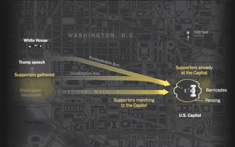
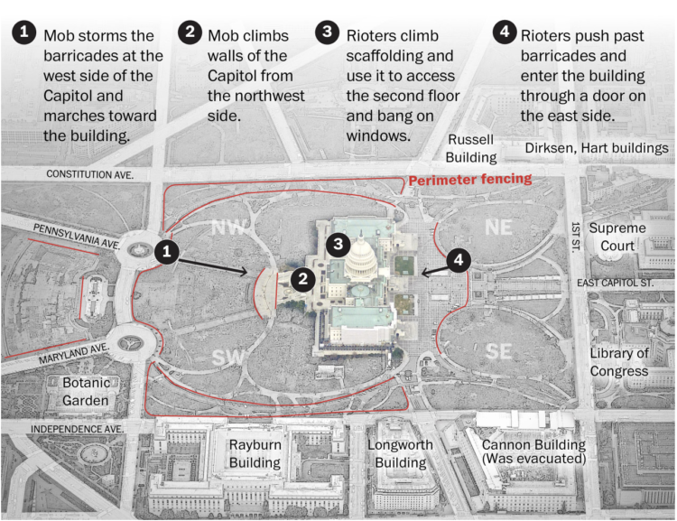
    The New York Times outlined the minutes from the speech leading to the mob at the Capitol. By now you’ve probably seen the videos and pictures and have an idea of what happened. But the timeline of events both inside and outside of the building really underscores how much worse it could’ve been.

  • Not so likely life of The Simpsons

    January 12, 2021

    Topic

    Statistics  /  Atlantic, median, money, The Simpsons, work

    For The Atlantic, Dani Alexis Ryskamp compares the financials of The Simpsons against present day medians, arguing that the fictional family’s lifestyle is no longer attainable:

    The purchasing power of Homer’s paycheck, moreover, has shrunk dramatically. The median house costs 2.4 times what it did in the mid-’90s. Health-care expenses for one person are three times what they were 25 years ago. The median tuition for a four-year college is 1.8 times what it was then. In today’s world, Marge would have to get a job too. But even then, they would struggle. Inflation and stagnant wages have led to a rise in two-income households, but to an erosion of economic stability for the people who occupy them.

    Someone should take this a step further and look at distributions and time series to show the shift, with The Simpsons as baseline.

  • Machine learning to find a recipe for a baked good that’s half cake and half cookie

    January 12, 2021

    Topic

    Statistics  /  baking, food, machine learning, recipe

    Last year, around the time when people were baking a lot of things, Sarah Robinson used machine learning to find a recipe for a “cakie”:

    Like many people, I’ve been entertaining myself at home by baking a ton and talking about my sourdough starter as if it were a real person. I’m pretty good at following recipes, but I decided I wanted to take things one step further and understand the science behind what differentiates a cake from a bread or a cookie. I also like machine learning so I thought: what if I could combine it with baking??!

    Robinson provides the final recipe at the end, so first, I need to try this recipe. Second, what other foods and beverages can this apply to?

  • What is a particle?

    January 10, 2021

    Topic

    Infographics  /  particle, physics, Quanta Magazine

    Natalie Wolchover for Quanta Magazine asked several physicists what a particle is. She came away with several points of view. For example, the particle as a “irreducible representation of a group”:

    It’s the standard deep answer of people in the know: Particles are “representations” of “symmetry groups,” which are sets of transformations that can be done to objects.

    Take, for example, an equilateral triangle. Rotating it by 120 or 240 degrees, or reflecting it across the line from each corner to the midpoint of the opposite side, or doing nothing, all leave the triangle looking the same as before. These six symmetries form a group. The group can be expressed as a set of mathematical matrices — arrays of numbers that, when multiplied by coordinates of an equilateral triangle, return the same coordinates. Such a set of matrices is a “representation” of the symmetry group.

    Oh boy. A lot of this was over my head, as I nearly failed physics in college, but the various explanations with basic diagrams taught me a few new things.

  • Map of the voting in Georgia, the runoff vs. the general election

    January 7, 2021

    Topic

    Maps  /  election, Georgia, runoff, Senate, Upshot

    For NYT’s The Upshot, Nate Cohn explains how Warnock and Ossoff won Georgia. The accompanying map by Charlie Smart provides a clear picture of swooping arrows that show the shifts from the general election to the runoff.

  • Members Only

    Looking Forward – Process 121

    January 7, 2021

    Topic

    The Process  /  goals

    I’m not one for new year’s resolutions, but this year seems different and requires some goals.

  • How the mob broke into the U.S. Capitol

    January 6, 2021

    Topic

    Infographics  /  Capitol, government, mob, Washington Post

    The Washington Post pieced together video footage from multiple sources for a timeline of the events. Terrible.

  • Neural network creates images from text

    January 6, 2021

    Topic

    Statistics  /  images, neural network, OpenAI, text

    OpenAI trained a neural network that they call DALL·E with a dataset of text and image pairs. So now the neural network can take text input and output random combinations of descriptors and objects, like a purse in the style of Rubik’s cube or a teapot imitating Pikachu.

  • Turn images into LEGO builds in R

    January 5, 2021

    Topic

    Software  /  brickr, LEGO, R, Ryan Timpe

    The brickr package in R by Ryan Timpe takes an image, converts it to a mosaic, and then provides a piece list and instructions for the build. While not officially affiliated with the LEGO group, Timpe is a data scientist for LEGO, so it’s probably as close as you’re going to get to real deal.

    Timpe made a package a couple of years back, but when I went to use it, the link was broken and I assumed it was defunct. This is a nice surprise.

    My kids are deep into LEGO these days. We just finished watching the LEGO Masters show. I have LEGO minifigures on my office wall. I’m definitely making use of this.

  • How the Census translates to power, a cat comic

    January 4, 2021

    Topic

    Infographics  /  census, comic, government, NPR

    State population dictates the number of seats in the House of Representatives, so ideally, the decennial Census counts everyone and power is fairly distributed. On the surface, that seems straightforward? For NPR, Connie Jin and Hansi Lo Wang explain with a cat comic.

    Because cats.

    See also the cat guide on spotting misinformation.

  • Pollution exposure plotted, a comparison between two kids’ day

    December 31, 2020

    Topic

    Infographics  /  India, New York Times, pollution

    The New York Times measured pollution exposure during the day for two kids who live in New Delhi. Usually just described in terms of micrograms of particulate matter, the piece puts in more effort to give a feel for each person’s day-to-day. Side-by-side video along with a scrolling line chart provide a clear contrast between the two lives.

  • Mapping disappearing beaches in Hawaii

    December 30, 2020

    Topic

    Maps  /  beach, Hawaii, Honolulu Star-Advertiser, ProPublica, wall

    Ash Ngu for ProPublica and Sophie Cocke for Honolulu Star-Advertiser show the harm of building seawalls on Hawaii’s beaches. The walls protect luxury beachfront properties, but they have been built through administrative loopholes and destroy beaches, which are owned by the public.

    I like the combination of video footage and map, providing a scroll along the coastline. It provides an anchor for where you are and what you’re looking at.

  • 2020.

    December 29, 2020

    Topic

    Site News  /  annual review

    Last year, in 2019, my main goals for FlowingData and work were to stay focused and make charts. I was satisfied with my progress, and for 2020, I had hoped to step that up with more depth and more play.

    But you know what happened. The year was challenging for many reasons, and it was hard to concentrate or to think of much else other than the day’s current events.

    I’m lucky to be able to work from home though, and I am thankful for that. So FD was able to roll on.

    As I do every year, I like to bookend with an annual review, so here we go.
    Read More

  • Reconstructing the killing of Breonna Taylor

    December 28, 2020

    Topic

    Infographics  /  Breonna Taylor, New York Times, reconstruction

    The New York Times reconstructed the night. Based on a collection of court documents, ballistics reports, body camera footage, and interviews, they built a 3-D model of the scene depicting what appears to be an unorganized and unexpected raid.

  • Climate change in 2020

    December 28, 2020

    Topic

    Statistical Visualization  /  climate change, Reuters

    It used to be that climate changed seemed like something far off in the future, like something that would only affect future generations. But it’s looking more urgent these days. For Reuters, Chris Canipe, Matthew Green and Sam Hart show the “fingerprints of climate change” we saw this year.

  • Members Only

    Visualization Tools and Resources Roundup – December 2020

    December 24, 2020

    Topic

    The Process  /  roundup

    Here’s the good stuff for December in the last issue of the year.

  • Visualization  /  best-of

    Best Data Visualization Projects of 2020

    It’s been a year. We saw a lot of charts. These are the best ones.

    Read More
  • Evolution of coronavirus strains

    December 23, 2020

    Topic

    Statistical Visualization  /  coronavirus, Reuters, strains

    Reuters looked at how seven main strains of the virus evolved around the world:

    The analysis shows there are currently seven main strains of the virus. The original strain, detected in the Chinese city of Wuhan in December 2019, is the L strain. The virus then mutated into the S strain at the beginning of 2020. That was followed by V and G strains. Strain G mutated yet further into strains GR, GH and GV. Several other infrequent mutations were collectively grouped together as strain O.

    It’s interesting to see the continent multiples. Different approaches to the pandemic led to different rates of mutations and a different spread of strains.

  • Historical cost of light

    December 22, 2020

    Topic

    Infographics  /  cost, light, Pudding, work

    These days, most of us don’t have to do much to turn on a light when it’s dark out. But what if I told you it used to take a lot more time and money to get that sweet artificial light? For The Pudding, Ilia Blinderman and Jan Diehm equate scrolling down one pixel to one second for an average waged worker. See how much you have to scroll/work to earn one hour of light.

  • Who catches the most fish

    December 21, 2020

    Topic

    Maps  /  Bloomberg, fishing, Global Fishing Watch

    Using data from Global Fishing Watch, Hayley Warren and Ian Wishart for Bloomberg mapped the predominant country for fishing in European Union and British waters. There’s disagreement between the U.K. and the EU about who gets to fish where.

  • Page 89 of 392
  • <
  • 1
  • ...
  • 86
  • 87
  • 88
  • 89
  • 90
  • 91
  • ...
  • 392
  • >

Analyze, visualize, and communicate data usefully, beyond the defaults.

Become a member →

Recently for Members

May 8, 2025
When the data is not what it seems

May 1, 2025
Finding the Right Charts

April 24, 2025
Visualization Tools, Datasets, and Resources – April 2025 Roundup

April 17, 2025
Breaking Out of Chart Software Defaults

April 15, 2025
Line Chart with Decorative Neon Accents

Browse by Chart Type See All →

Bubble Chart Choropleth Map Scatter Plot Bump Chart Cartogram Unit Chart Dot Map Moving Bubbles Surface Plot

Browse By Topic

  • Visualization

    Seeing data

  • Maps

    Seeing geographic data

  • Infographics

    Explaining data

  • Networks

    Connecting data

  • Statistics

    Analyzing data

  • Software

    Working with data

  • Sources

    Getting data

  • Design

    Making data readable

Get the Book

Visualize This: The FlowingData Guide to Design, Visualization, and Statistics

Available now.

Order: Amazon / Bookshop

Made by FlowingData

  • The Process

  • Data Underload

  • Chart Everything

  • Guides

  • Books

  • Shop

  • About
  • Contact
  • Newsletter
  • LinkedIn
  • Instagram
  • Bluesky
  • RSS
Copyright © 2007-Present FlowingData. All rights reserved.