What to Call Your Distant Relative

When you have a big family, it’s a challenge to figure out how everyone is related. So here are some charts to help you figure it out.

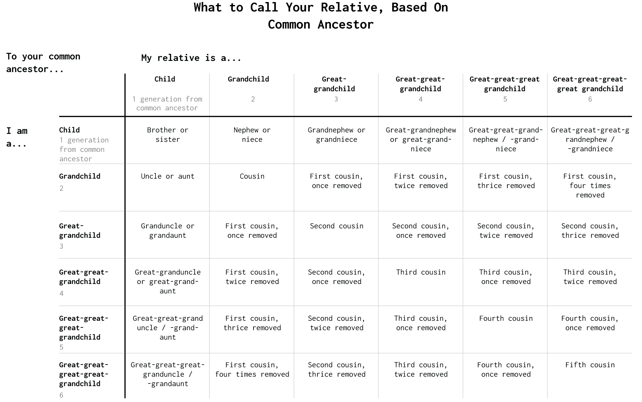
The most straightforward way to find the common ancestor between you and a relative. Maybe the common ancestor is a grandparent or a great-grandparent.

Then figure out how many generations out you are from the common ancestor. Do the same for the relative. As shown below, you can then figure out what to call each other.
 

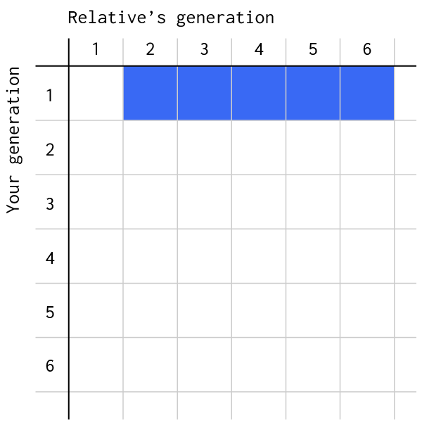
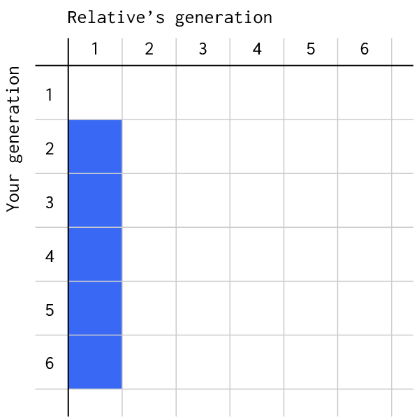
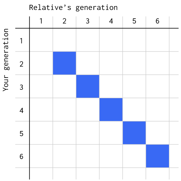
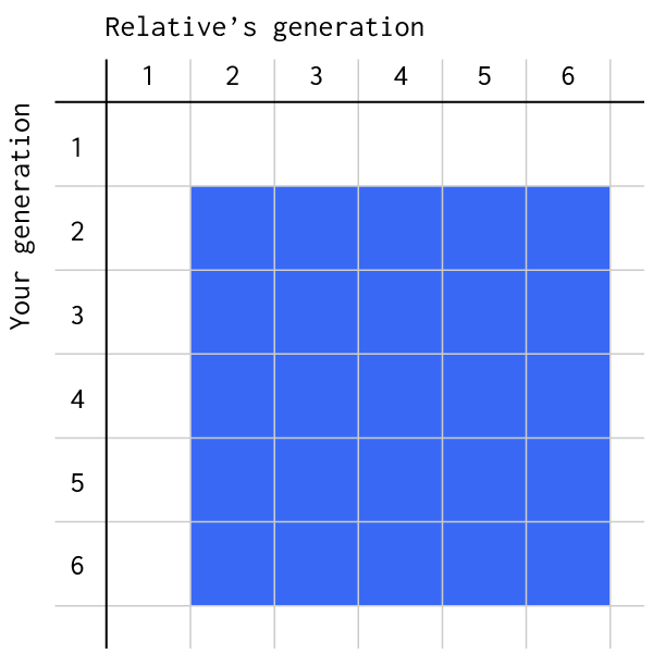
Keep selecting different people, and you’ll probably start to notice repeats and maybe pull out some patterns. Here are the above labels in a grid format that shows what you call your relatives, again based on the common ancestor.


In the first row of the grid, you have the nephews and nieces. Add “grand” and then “great” as you look at generations beyond your own.
Conversely, in the first column, you have the uncles and aunts. Again, you add “grand” and then “great” if you yourself are one who is generations out from the common ancestor.
On the diagonal, after brother and sister, it’s just cousin, second cousin, third cousin, etc. So if you’re comparing yourself to a relative who is the same generation as you, but they’re not you’re sibling, they’re your cousin. The first, second, third, etc comes from the number of generations in between you and your common ancestor.
But really, once you get past the first row and column, everyone is your cousin. If you want to say once, twice, thrice removed, you just count the number of generations that separate you and the other relative.


Or, if you don’t want to figure it out, just use the dropdown menus at the beginning. That’s what I’m gonna do.

Become a member. Support an independent site. Make great charts.

See What You Get

Learn to Visualize Data See All →

How to Visualize and Compare Distributions in R

Single data points from a large dataset can make it more relatable, but those individual numbers don’t mean much without something to compare to. That’s where distributions come in.

How I Made That: Interactive Heatmap

Add interaction so that you can show different segments of the data and allow comparisons.

How to Make (and Animate) a Circular Time Series Plot in R

Also known as a polar plot, it is usually not the better option over a standard line chart, but in select cases the method can be useful to show cyclical patterns.

Mapping With Shapefiles in R – Getting Started

Geographic data is often available as a shapefile, and there’s plenty of heavy software to get that data in a map. R is an open source option, and as a bonus, much of the work can be done in a few lines of code.

Favorites

Years You Have Left to Live, Probably

The individual data points of life are much less predictable than the average. Here’s a simulation that shows you how much time is left on the clock.

Data, R, and a 3-D Printer

We almost always look at data through a screen. It’s quick and good for exploration. So is there value in making data physical? I played around with a 3-D printer to find out.

Most popular porn searches, by state

We’ve seen that we can learn from what people search …

Sleep Schedule, From the Inconsistent Teenage Years to Retirement

From the teenage years to college to adulthood through retirement, sleep is all over the place at first but then converges towards consistency.