There’s always room for improvement — no matter how long you’ve been at it.
-
 Introduction to Data Science, by Harvard biostatistics professor Rafael A. Irizarry, is an open source book that provides, as you might have guessed, an introduction to data science:
The demand for skilled data science practitioners in industry, academia, and government is rapidly growing. This book introduces concepts and skills that can help you tackle real-world data analysis challenges. It covers concepts from probability, statistical inference, linear regression, and machine learning.
-
There was a government-run lottery in the Philippines with a $4 million jackpot, and two improbable things happened. First, the numbers selected were all multiples of nine: 9, 45, 36, 27, 18, and 54. Second, 433 people won. The natural reaction from the public was that something sketchy happened, especially since the government has a history of sketchiness.
However, as statisticians and mathematicians do when rare and improbable events occur, they setup hypotheses and calculate probabilities. Terence Tao calculated the odds and noted that the lottery outcome was a highly improbable event under certain assumptions. But:
So this clearly demands some sort of explanation. But in actuality, many purchasers of lottery tickets do not select their numbers completely randomly; they often have some “lucky” numbers (e.g., based on birthdays or other personally significant dates) that they prefer to use, or choose numbers according to a simple pattern rather than go to the trouble of trying to make them truly random.
Nine happens to be a lucky number in some cultures. Also, as Tao notes, the multiples of nine form a diagonal line on the physical lottery ticket, which could lend to more people just going with simple geometry.
The chances of each winning number being a multiple of nine is improbable, but any other individual number selection is equally improbable.
So if you assume one improbable event, the winning lottery numbers, paired with a less improbable event, the players’ selection of their own numbers, it doesn’t seem that unbelievable, statistically speaking.
-
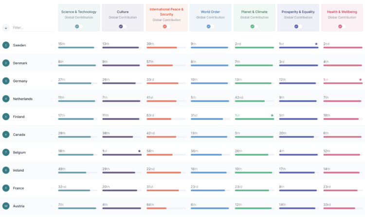
The Good Country Index is an effort to highlight and rank the countries that are doing good for the rest of the world. Select the metrics that are pertinent to you, and the ranks adjust accordingly.
I just heard about this project, but it’s been around since 2014. Still relevant.
-
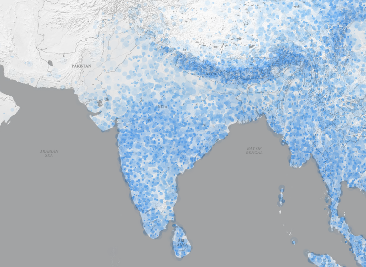
The monsoon season in South Asia brings water to the people and land, but signs point to more intense rain as overall temperatures go up. To show the change in rain, Zach Levitt and Jeremy White, for The New York Times, go with a rain drop aesthetic. The density of animated dots represents future rainfall and resembles drops of rain falling on the ground. Also wind maps with lines that resemble wind.
-
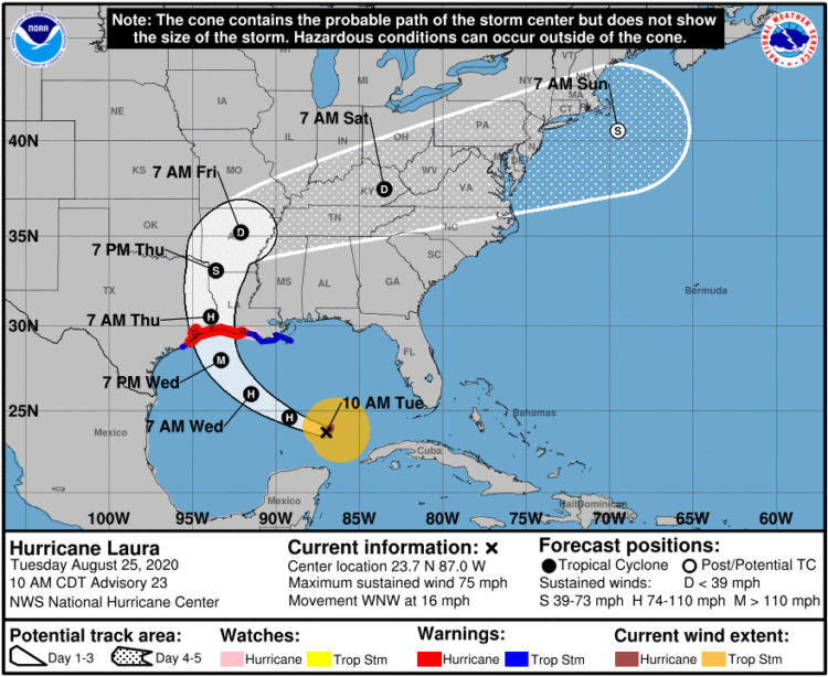
It seems that there is always surprise when a hurricane makes landfall in some areas, which some attribute to poor forecast communication with the cone on a map that shows possible paths. Scott Dance and Amudalat Ajasa for The Washington Post discuss the challenges that people have reading the cone of uncertainty:
Indeed, many residents and authorities have said Ian’s track surprised them, even though the cone for days included the storm’s eventual landfall point on its southern edge. So some meteorologists and social scientists are saying the disaster is only the latest evidence that the Hurricane Center should revamp the way it depicts forecasts — communicating the scope and intensity of a storm’s threats, rather than just the expected path of a single point at its center.
Maybe, when it comes to communicating hurricane forecasts, we should get rid of possible-paths maps altogether and focus on possible outcomes. The shape and direction of a storm matters a lot less than the chances the storm hits your town. So no path, just choropleth map that shows probabilities.
-
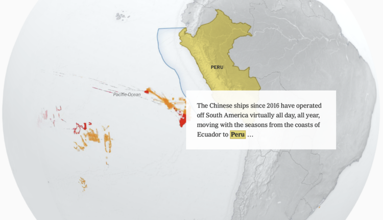
China’s fish supply is running low along its own coast, so they’ve shifted their fishing activities globally. The New York Times visualized the shift with animated maps.
-
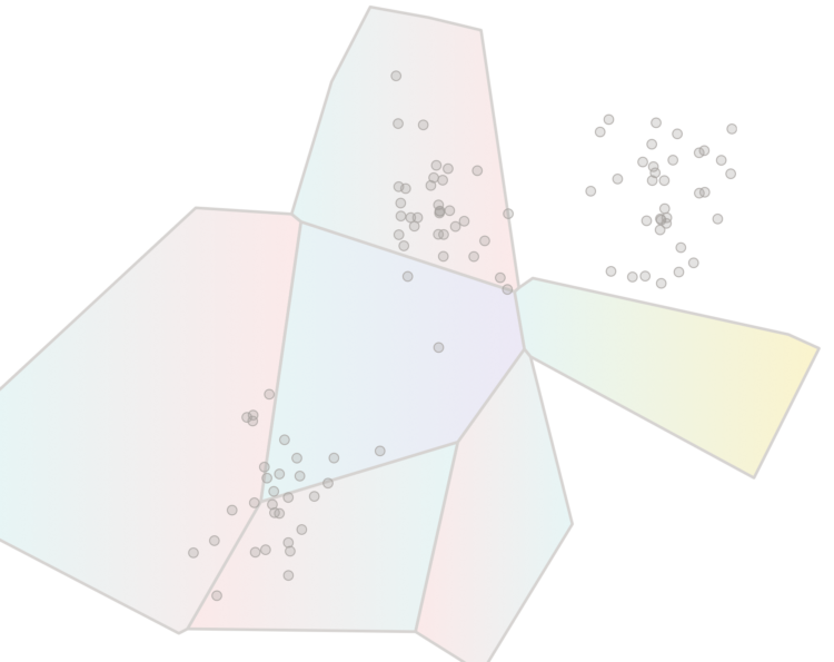
Say you want to identify clusters in a scatterplot of points. K-Means is commonly used method that might get you there. Yi Zhe Ang explains how the method works with a visual and interactive essay.
-

Anahad O’Connor, Aaron Steckelberg and Garland Potts, for The Washington Post, made charts that compare the benefits of coffee and tea. But let’s be honest here. All we really want to see in a battle between coffee and tea is an anthropomorphic bean and leaf wrestle.
-
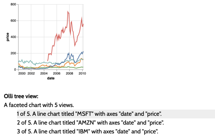
The Olli library aims to make it easier for developers to improve the accessibility of existing charts:
Olli is an open-source library for converting data visualizations into accessible text structures for screen reader users. Starting with an existing visualization specification created with a supported toolkit, Olli produces a keyboard-navigable tree view with descriptions at varying levels of detail. Users can explore these structures both to get an initial overview, and to dive into the data in more detail.
-
Simon Willison asked a straightforward question about the tools people use:
If someone gives you a CSV file with 100,000 rows in it, what tools do you use to start exploring and understanding that data?
Then he expanded the question asking what people use for files with 1 million rows, 10 million rows, and 1 billion rows.
Browse the thousands of replies, and you quickly see that (1) there are many options to explore a dataset and (2) many people feel that what they’re using is the best option. There’s click-and-play programs, web-based products, programming languages, and command-line options. Some use a combination of whatever works for them at a given time for a certain dataset.
This is why when people ask me what the “best” tool is, I usually have to follow up with what they know already and what they want to do with the tool. It’s also why best-of lists for data exploration are usually not worth your time, unless you account for the assumptions about usage.
-
It seems a lot of data scientists have either left or were laid off from their jobs during the past few months. Jacqueline Nolis and Emily Robinson, data scientists who hosted a podcast and wrote a book on building a career in the field, happened to be in the lot. So naturally, they brought back the podcast for a bonus episode on their experiences with sudden unemployment and the job search.
I’ve never had a “real” job (as some tend to tell me), so workplace experiences are always interesting to me, like peering into an aquarium. The layoff process seems not fun.
-
Kelton Sears used a vertical scroll upwards to think about trees and time.
-
Bringing in data from various federal agencies:
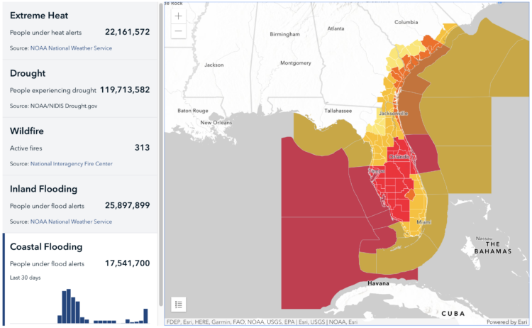
Climate Mapping for Resilience and Adaptation (CMRA) integrates information from across the federal government to help people consider their local exposure to climate-related hazards. People working in community organizations or for local, Tribal, state, or Federal governments can use the site to help them develop equitable climate resilience plans to protect people, property, and infrastructure.
-
Members Only

Here’s the good stuff for September.
-
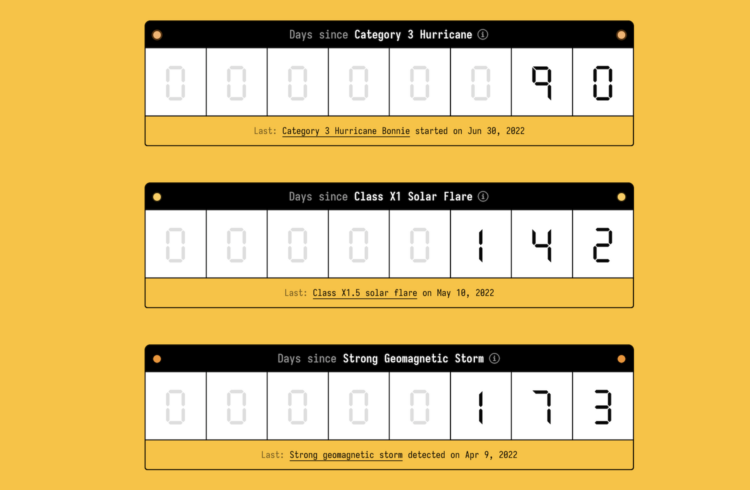
You know those signs in workplaces that keep track of days since injury? Making use of NASA APIs, Neal Agarwal used that concept to keep track of natural disasters. As of this writing, it’s been 9,691,764 since the last Apocalyptic Volcanic Eruption (VEI 8). Pretty good.
-

How to Draw and Use Polygons in R
R provides functions for basic shapes, but you can also draw your own for maximum fun.
-
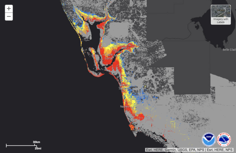
NOAA provides a map of potential flooding due to Hurricane Ian headed towards Florida. Red indicates greater than 9 feet of flooding above ground.
-
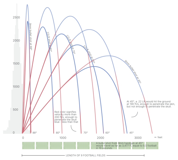
When someone fires a gun into the air, the bullet travels thousands of feet in elevation. Gravity pulls the bullet back down, and it accelerates fast enough to penetrate a human skull by the time it reaches ground-level. Acceleration and trajectory vary by type of gun and the shot angle. 1Point21 Interactive shows the variation and dangers with a visual explainer.

Recently for Members
Second Edition
 Visualize This: The FlowingData Guide to Design, Visualization, and Statistics (2nd Edition)
 Visualize This: The FlowingData Guide to Design, Visualization, and Statistics (2nd Edition)
New tools, refined process.
Browse by Chart Type See All →


