Pizza Exchange Rate
This is a story about pizza and geometry. Roy Chandan ordered a 9-inch pizza, and the waiter brought him two 5-inch pizzas instead. Chandan was getting an inch for free, the waiter said, to which he replied:
I gave him the mathematical formula to calculate the area of a circle.
Circle Area = π r²
where π = 3.1415926,
r is the radius of the circle.
So, a 9-inch circle area = 63.62 https://t.co/Fkg3nywqwc.
while
a 5-inch circle area is 19.63 https://t.co/Fkg3nywqwc.2/3
— roychandan (@cretiredroy) June 30, 2022
The seller mistakenly assumed a linear increase in area with diameter. This is not the case.
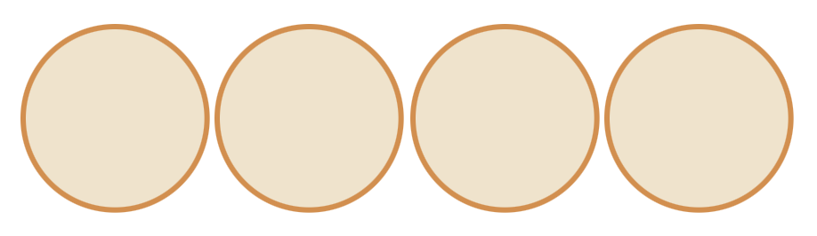
Going by area, which is the measurement you care about when eating pizza, two 5-inch pizzas would be like getting a 9-inch pizza with 38% of it removed. After showing the math, Chandan received four small pizzas, and the world rejoiced.
Honestly, I’m more surprised that a sit-down pizza place with a waiter would run out of a certain size of pizza.
But what if the same thing, with different pizza sizes, happens to you? What would be the fair exchange? You could punch the numbers into your calculator for areas, but time is essential to get your point across to a busy, skeptical waiter who has other pies to serve.
I got you covered. Enter the pizza sizes below for the proper exchange.
How Many Pizzas You Should Get
Make sure you get a fair exchange.
May you always get the pizza that you paid for and more.
In visualization, sizing linearly instead of by area is a common mistake, except the linear sizing increases area too quickly.
For example, if you increase the radius of a circle by 10 percent, you increase the circle’s area by 21 percent (1.1 * 1.1 = 1.21). You get the same issue if you increase the side of a square instead of its area. It’s how you end up with bubbles or two-dimensional symbols that are more giant than they should be. It pays to know your encodings.
What I’m trying to say is that if you order two 5-inch pizzas, and the pizza place wants to make you a single 10-inch pizza instead, you should take the deal.
Become a member. Support an independent site. Make great charts.
See What You GetFlowingData is made possible by supporting members. Since 2007, I, Nathan Yau, a real person, have been analyzing and visualizing data to help more people understand and appreciate it in their everyday lives.
If you liked this or want to make similar data things, please consider supporting this small corner of the internet. You get unlimited access to visualization courses, tutorials, and extra resources. Thanks. — Nathan
Chart Type Used
