
Same old chart, but make it move for another dimension.
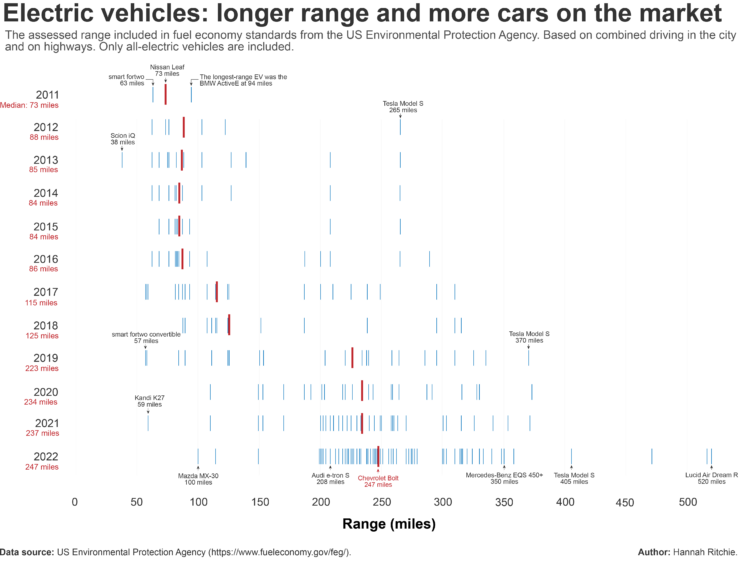
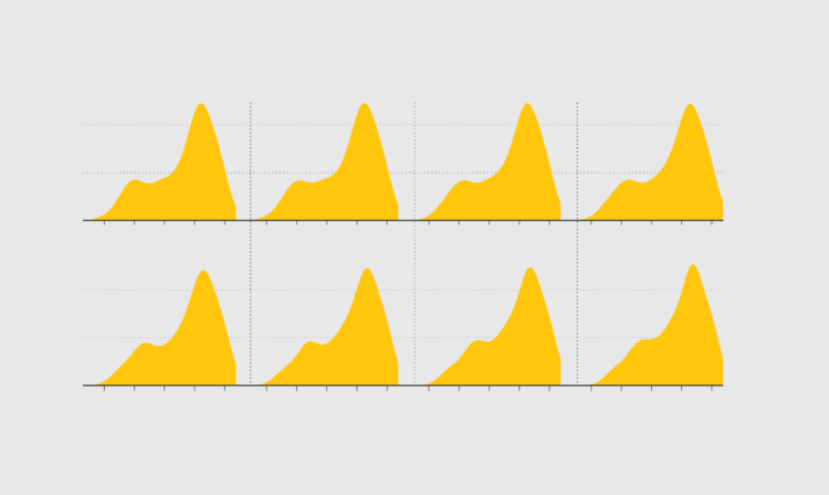
Hannah Ritchie compared electric vehicle range over the years:
The median range of EVs has increased 3.5-fold since 2011. You can see the median increasing as the red line shifts further to the right. The mid-range car in 2011 was the Nissan Leaf, where you could get 73 miles on a single charge. In 2022 this was the Chevrolet Bolt, at 247 miles.
Each line represents a vehicle type, and the red lines indicate the median range. The distributions expand and shift towards longer range.
When we hear about household income, it’s usually in an overall context that considers all households at once. However, you can group households in various ways, which can give you a better idea of how your situation might compare to others.
Here’s household income by number of earners in the household, based on data from the 2022 Current Population Survey. The values are adjusted for 2023 dollars.
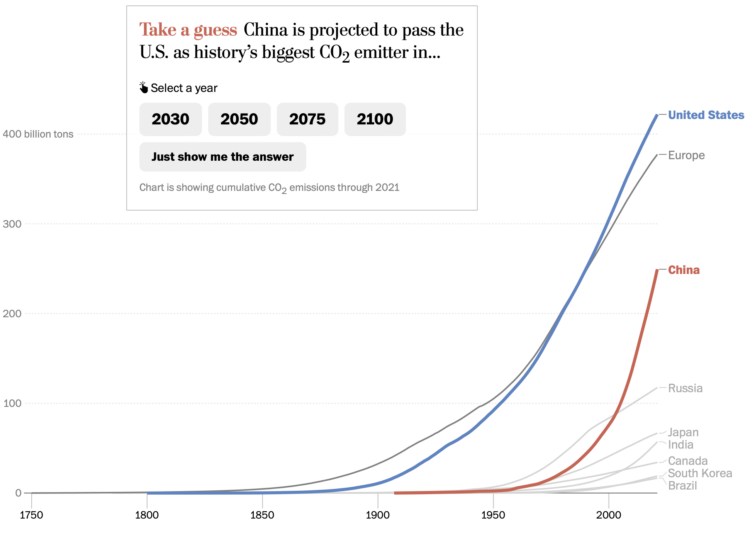
For The Washington Post, Harry Stevens used the line chart equivalent of a bar chart race to show when China is projected to pass the United States in total emissions. There is some quiz action to pique your interest.
Despite the popularity of the bar chart race, some hold a high level of disdain for the method, because it’s hard to pick out an overall pattern. It also takes more time to animate rankings when you can often see the same thing much quicker with a line chart.
The line chart race, which I think popped up a bit after the bar chart race, also takes time to show all the data. However, it comes with a bonus that the vertical scale can adjust to the current segment of data displayed, which lets you see how the patterns evolve.

Asian characters in American films are historically less integral to the stories and written with less depth. However, things have noticeably shifted over the past few years, which you can see through the history of Oscar nominations. For The New York Times, K.K. Rebecca Lai provides a rundown Asian actor nominations.
[arve url=”https://www.youtube.com/watch?v=ZoLk6GUKzU0″ /]
As a world population, we’re growing taller, but South Koreans seemed to grow a lot quicker over the past century. Vox breaks down height distributions and explains the increased rate in South Korea in their Vox-y combination of paper, slides, and digital. Wealth and improved food supply appears to have helped things along.
There’s one part when the narrator Alvin Chang says he has to adjust the vertical axis to see the change in height better. My chest might have tightened as my mind went to bar-charts-start-at-zero land, but the bar chart in the video switches from height to change in height, so it was all okay. Phew.
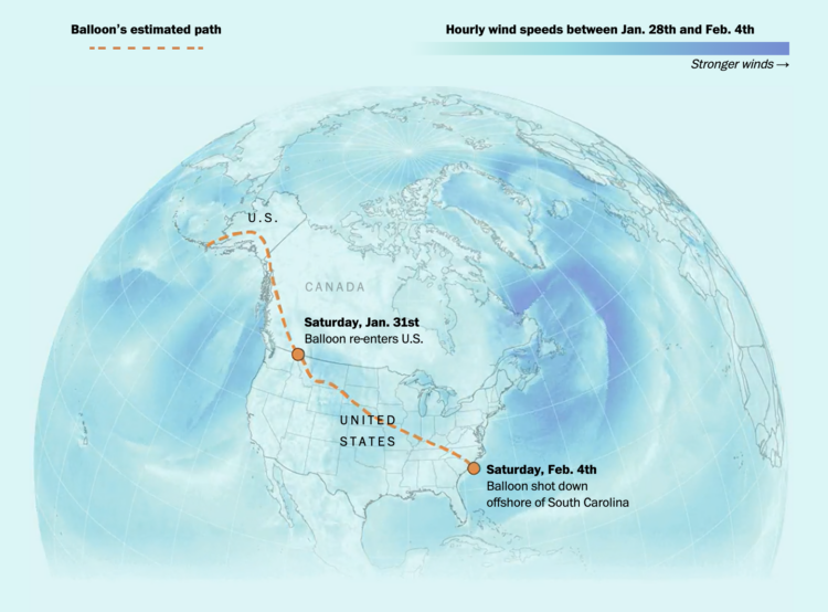
Shooting down a floating balloon out on its lonesome seems like a straightforward task. It’s just a balloon after all. But it seemed to take a while to get that Chinese spy balloon down. For The Washington Post, William Neff, Leslie Shapiro and Dylan Moriarty explained the challenges and timing behind the task.
In a sea of endless possibilities, narrow down your visualization options by looking for what works instead of looking for what is the best.
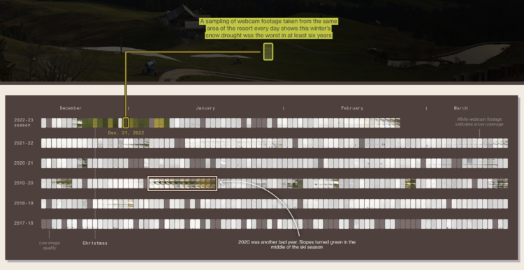
For Bloomberg Green, Jin Wu, Laura Millan and Hayley Warren, on the challenges ski resorts face with rising temperatures:
Artificial snowmaking has become more efficient, so it uses less water and electricity. But even with advanced technology, fake snow can’t always be deployed — and climate change is creating a more difficult environment, making water more scarce and temperatures too high for it to freeze. This year, skyrocketing energy prices forced some resorts in Japan to shut down their snow cannons and wait for natural flakes to fall.
The piece starts with a horizontal scroll through the mountains and then transitions to the chart above. There’s a nice flow between the photo into the abstract view, so they don’t seem like two separate things.
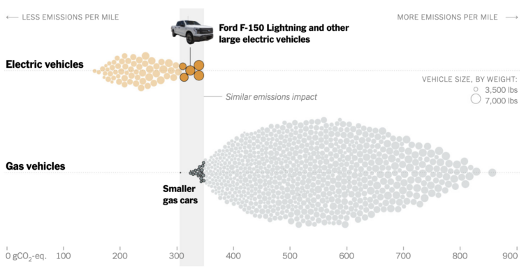
Based on estimates from CarbonCounter by the MIT Trancik Lab, electric vehicles typically produce less emissions than gas vehicles when you account for battery production and charging. However, when the batteries get bigger, like they do with large electric trucks, you start to see some overlap. Elena Shao, for The New York Times, used a beeswarm chart to compare the vehicle groups.

Show change over time and geography with smooth transitions.
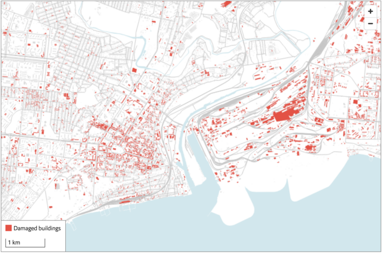
The Economist combined two satellite imagery sources, one that estimates fire events and one that estimates building damage, to assess the extent of damage in Ukraine:
Both approaches have weaknesses. NASA’s firms cannot see through cloud cover, a particular problem in winter. sar can pick up damage even through clouds, but is much less sensitive to changes outside of urban areas. But by combining the two datasets, we can form a fuller picture of the war. Our study shows that rather than being limited to a few big offensives and grinding battles, the war has left a brutal mark on large swathes of Ukraine. Fighting has reached 14% of municipalities, and damaged nearly half the built-up area in the hardest-hit cities.
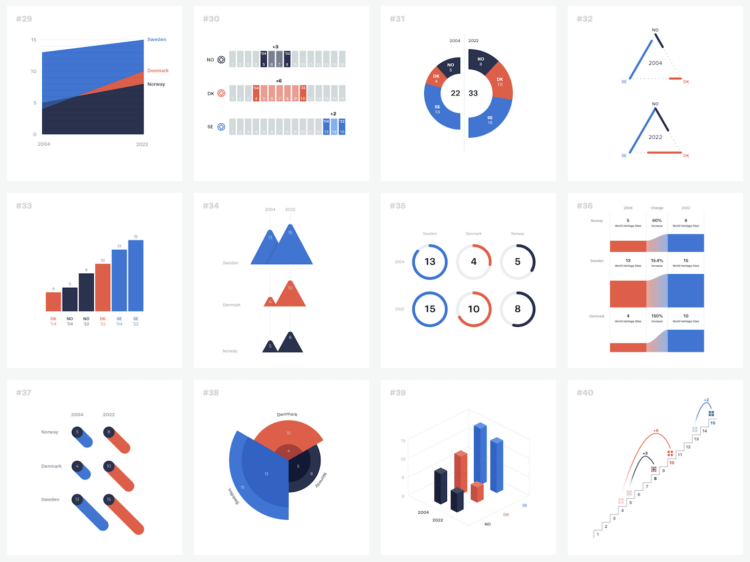
The structure of a dataset can help you pick a visualization method or chart type, but it only takes you part of the way there. To demonstrate, Ferdio started with a simple dataset with six data points and made 100 charts with it:
Every time we turn a set of data into a visual depiction, hundreds of design choices have to be made to make the data tell the best story possible. Many of the choices are unconscious, often resulting in similar solutions. The obvious and uninspired. This project goes beyond common solutions and best practice. It demonstrates how even the simplest dataset can be turned into 100 proper data visualizations telling different stories, using very limited visual properties and assets.
[arve url=”https://www.youtube.com/watch?v=jV49bDzkQhY” /]
This is a fun one from Russell Samora and Reshad Malekzai for The Pudding. When watching basketball, one of the best things is when a player has an unexpectedly great game, so Samora looked for the greatest and most unexpected game based on data.
The video is also a nice example of how distributions and outliers can be applied in an analysis. Check out the data yourself on GitHub.
Here’s the good stuff for February.
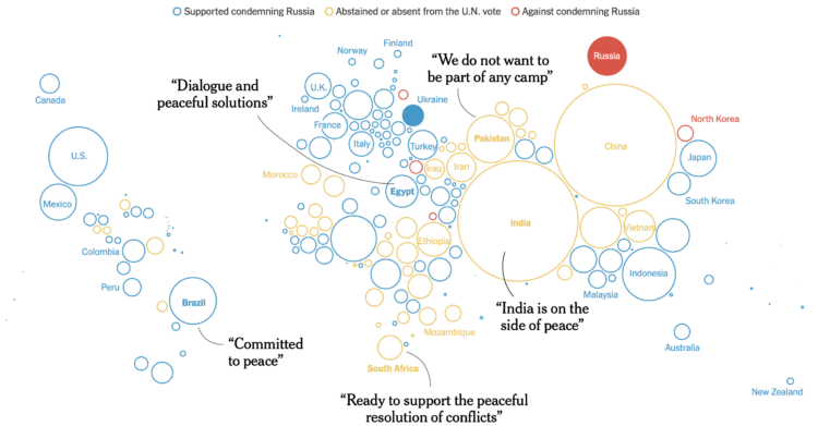
The New York Times shows how the west tried to isolate Russia and how things haven’t gone as expected. A series of packed bubbles, cartograms, and flowcharts provide a visual timeline for each country’s reactions.
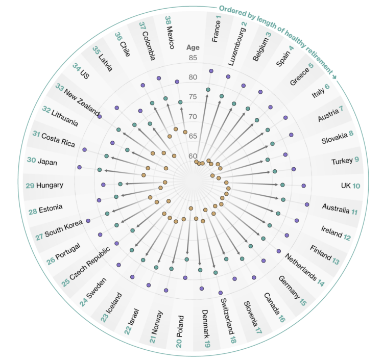
Bloomberg compared retirement years in the context of life expectancy and healthy life expectancy. The latter represents how long the average person stays healthy, which is shorter than the former.
The data are clear on one thing though: it’s pensioners in Western Europe who enjoy the longest, healthy retirement periods. The Americas, by contrast, have some of the shortest.
In the above, the yellow dots represent retirement age, the green dots represent healthy life expectancy, and the purple dots represent regular life expectancy. Starting at the top and going clockwise, countries are ordered by the difference between healthy life expectancy and retirement age.
I like circles, but I think I would’ve gone with a more list-like layout here. The patterns and reference points get lost in all the dots and spokes.
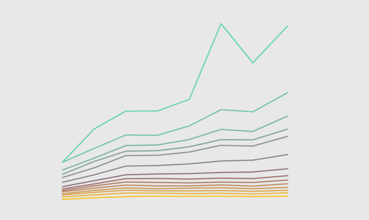
The rich continue to get richer, and everyone else either only kind of earns more or stays where they’re at. This chart shows how Americans in the 99th percentile, or the top 1%, separated from the bottom more over the years.
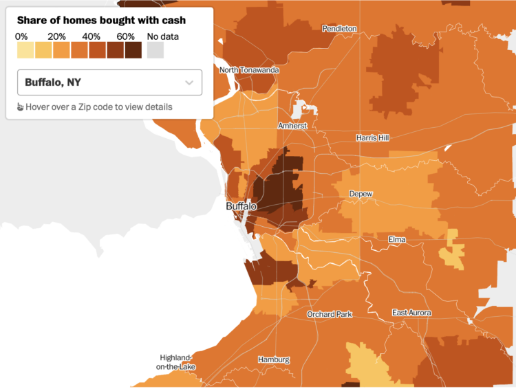
For The Washington Post, Emmanuel Martinez, Kevin Schaul and Hamza Shaban mapped the share of houses bought with all cash in 2022. It was about a third of all homes, which was an 8% increase from 2021, meaning owning a house continues a trend towards the rich.

For The New York Times, Eleanor Lutz illustrated things in the sky, because there are other objects up there other than spy balloons and UFOs. A long vertical scale is used to represent altitude. Bonus points for moving the objects around to give a floating effect.


 Visualize This: The FlowingData Guide to Design, Visualization, and Statistics
Available now.