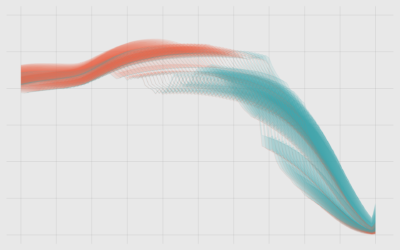
A cross between a scatterplot and a time series. Show two variables over time.
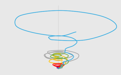
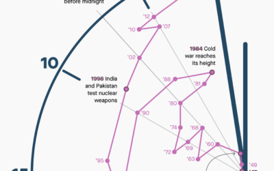
It looks like a tornado. It's messy. It's circular. It almost looks intentionally confusing. But how bad is it really?
Let's work through a practical example to see how asking and answering questions helps guide you towards more focused data graphics.
The combination of a time series chart and a scatter plot lets you compare two variables along with temporal changes.
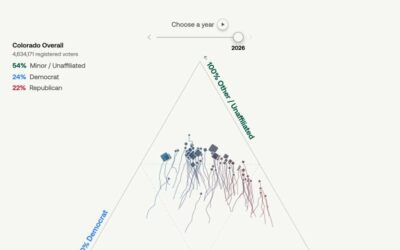
U.S. voters have historically stuck with two political parties, but that’s changing in…
The Doomsday Clock is a metaphorical clock that symbolizes a catastrophic end to…
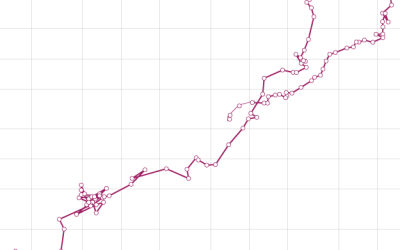
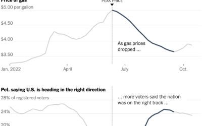
Everywhere you go, gas prices show up on big boards, like a proxy…
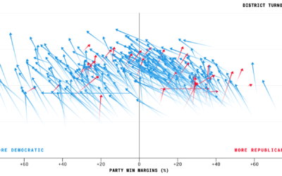
Bloomberg charted voter turnout for the just past midterm elections, comparing 2018 against…
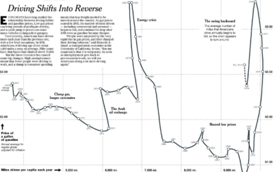
Hannah Fairfield of the New York Times looks at driving habits and gas…