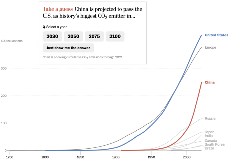
For The Washington Post, Harry Stevens used the line chart equivalent of a bar chart race to show when China is projected to pass the United States in total emissions. There is some quiz action to pique your interest.
Despite the popularity of the bar chart race, some hold a high level of disdain for the method, because it’s hard to pick out an overall pattern. It also takes more time to animate rankings when you can often see the same thing much quicker with a line chart.
The line chart race, which I think popped up a bit after the bar chart race, also takes time to show all the data. However, it comes with a bonus that the vertical scale can adjust to the current segment of data displayed, which lets you see how the patterns evolve.

 Visualize This: The FlowingData Guide to Design, Visualization, and Statistics (2nd Edition)